Aquifer
Comprehensive rebrand for an innovative healthcare education organization
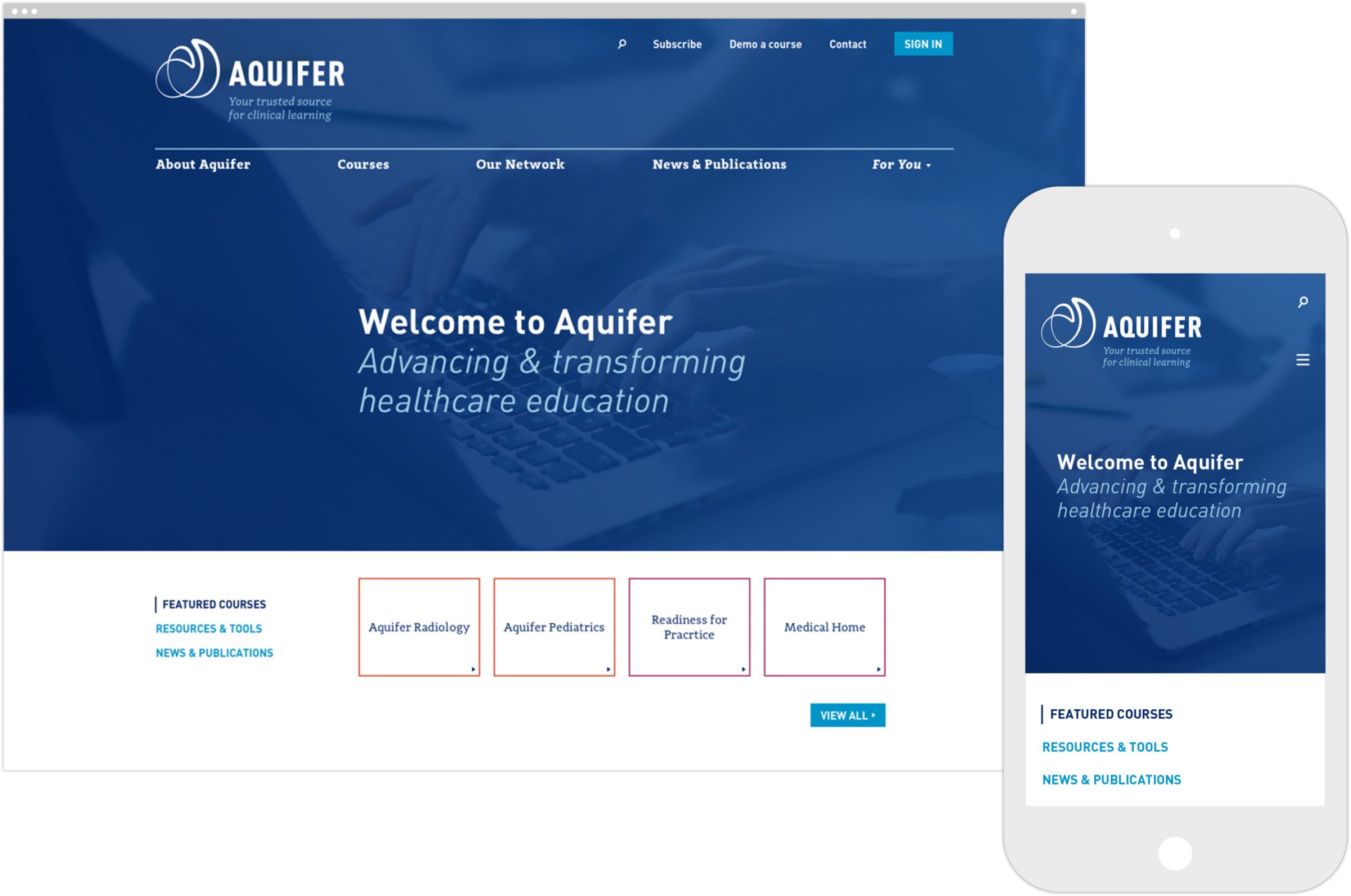
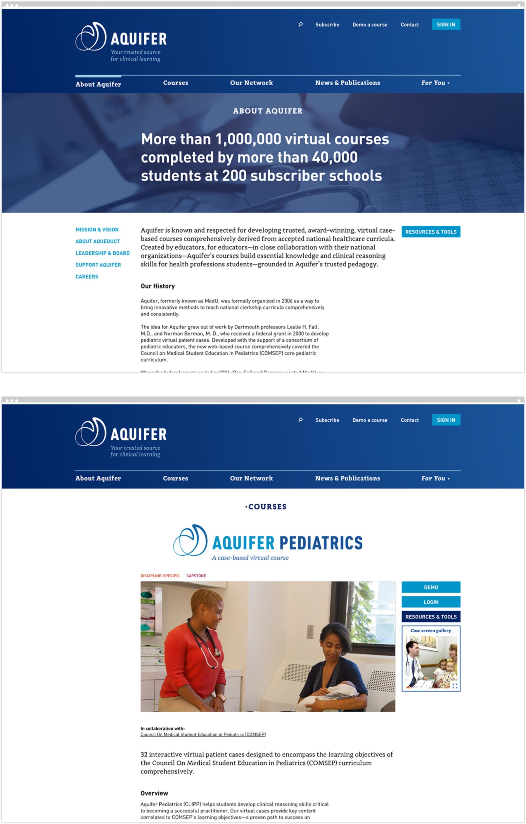
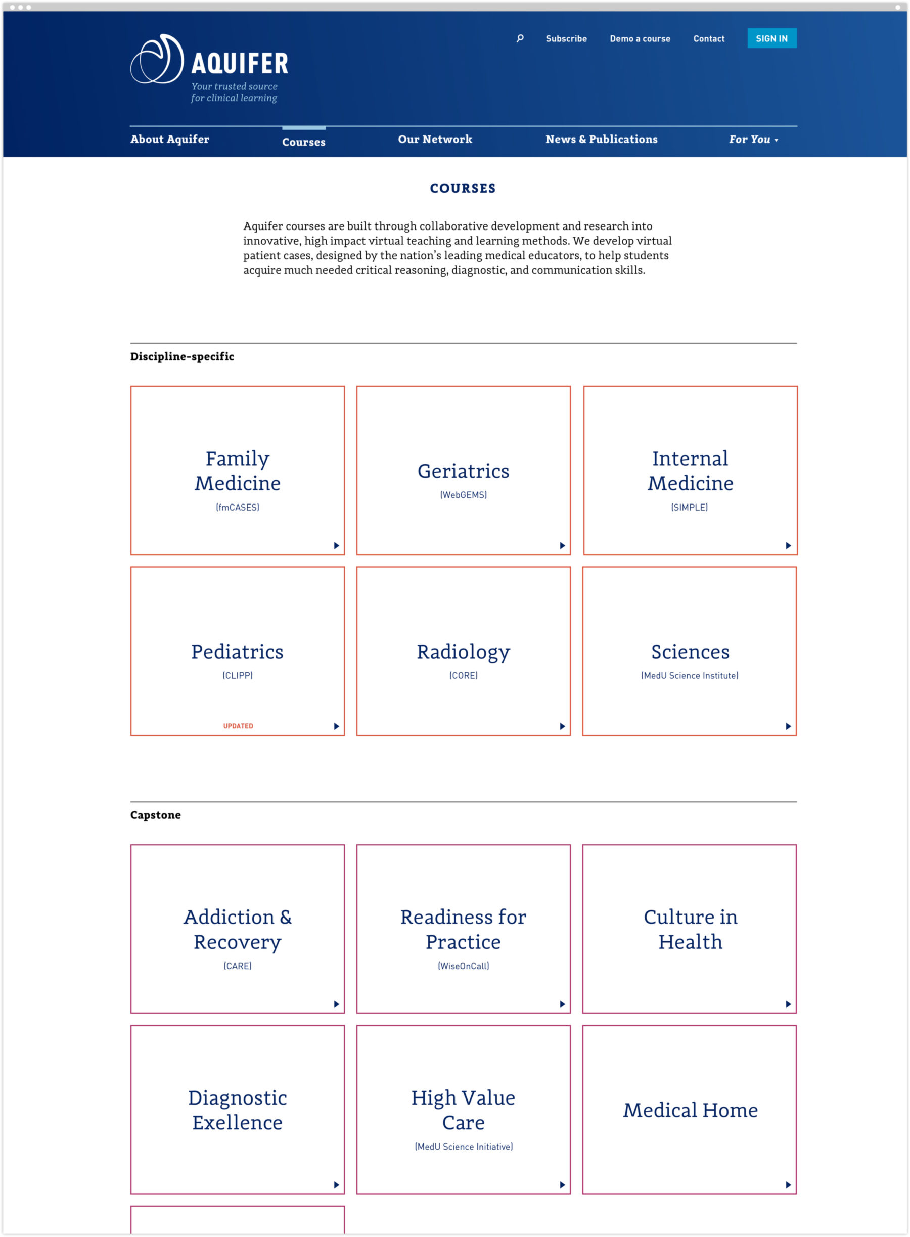
Launched in January 2018, the Aquifer website is the centerpiece of a comprehensive rebranding of the organization formerly known as MedU.
When MedU was founded in 2006, its focus was on providing innovative online learning for third-year medical students during their pediatric clerkship. Each course offering was beloved by medical educators, but with an alphabet soup of names, acronyms, and a disparate set of graphic identifiers, MedU itself was lost in the mix—missing out on an opportunity to build brand equity from the top down, as well as the bottom up. Moreover, the organization was looking to engage a wider set of students within the healthcare education environment.
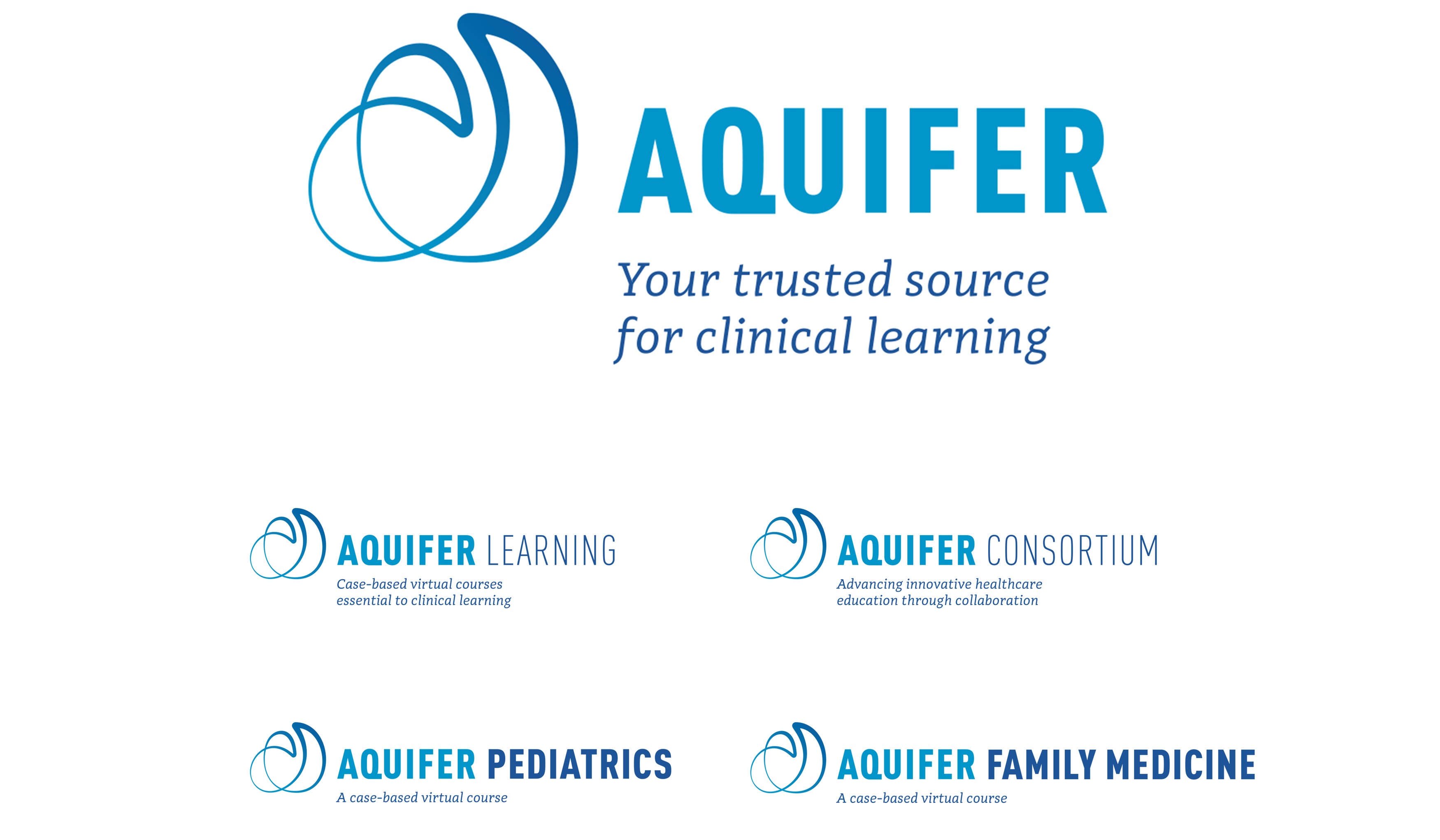
When an international trademark dispute necessitated a name change, we collaborated to do more than come up with a new name. We completely overhauled the organization’s brand strategy in a way that positioned the client for where it was going, not just where it was. This included a new name—Aquifer— that speaks to the critical, essential nature of the clinical learning the organization imparts, as well as simple, self-explanatory names for each of its courses.
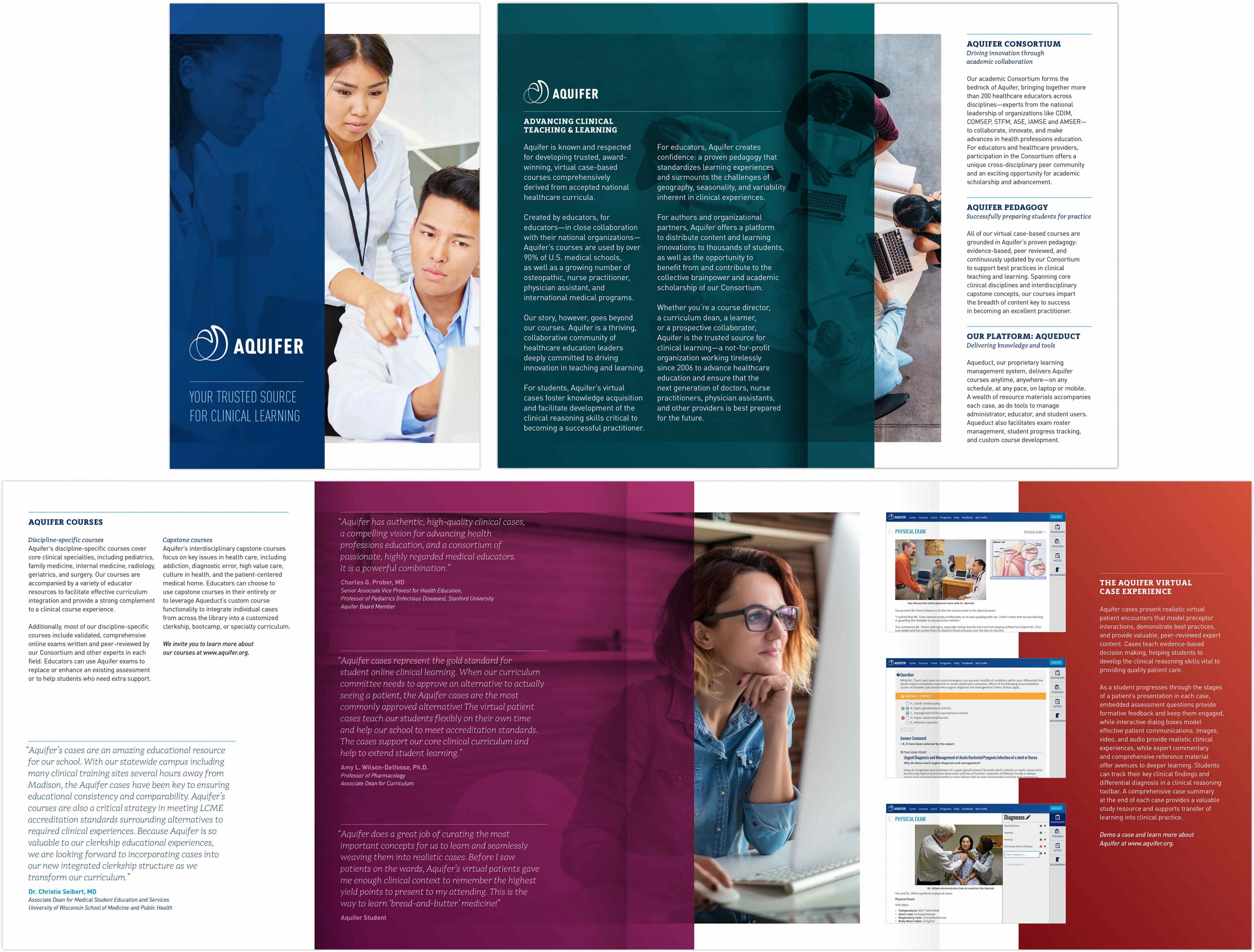
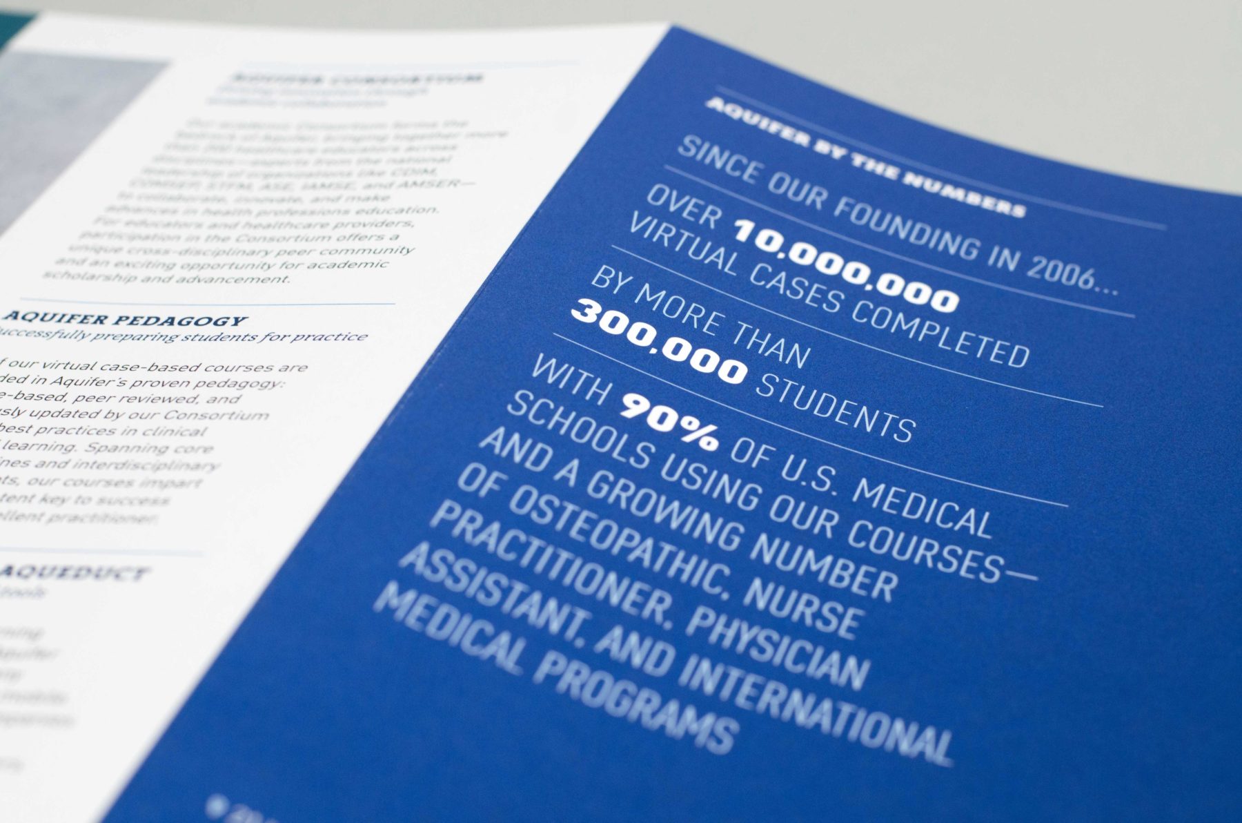
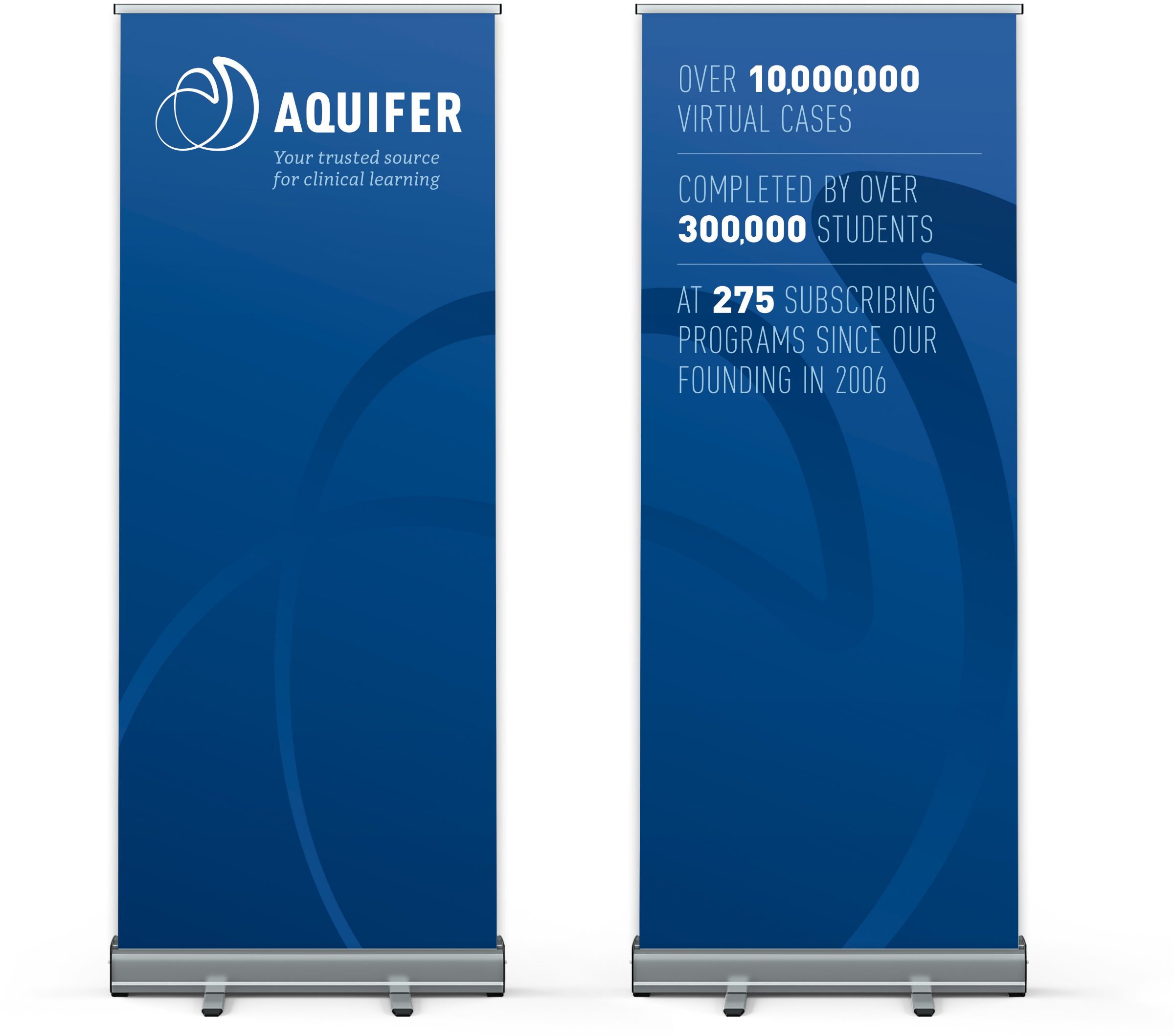
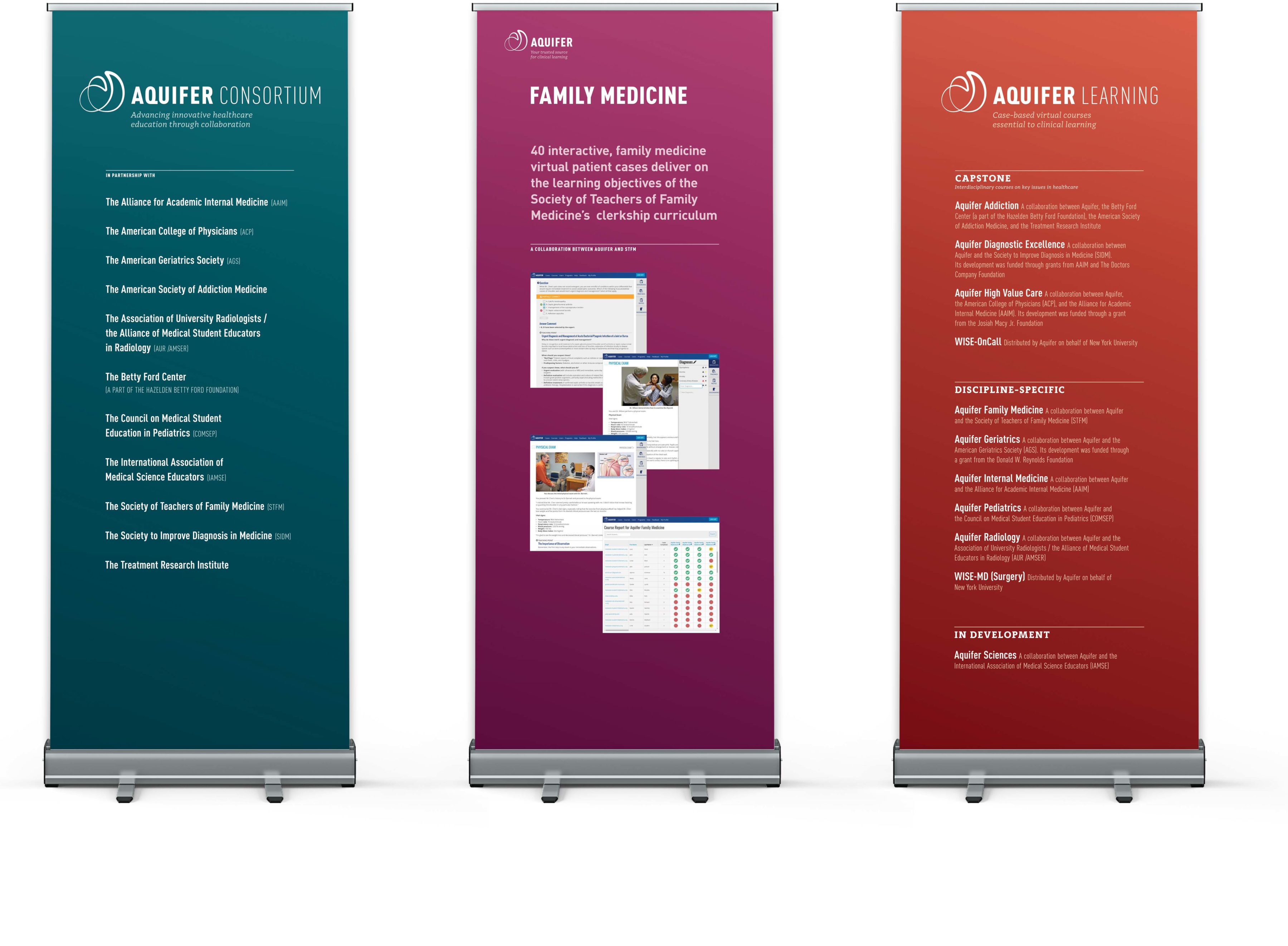
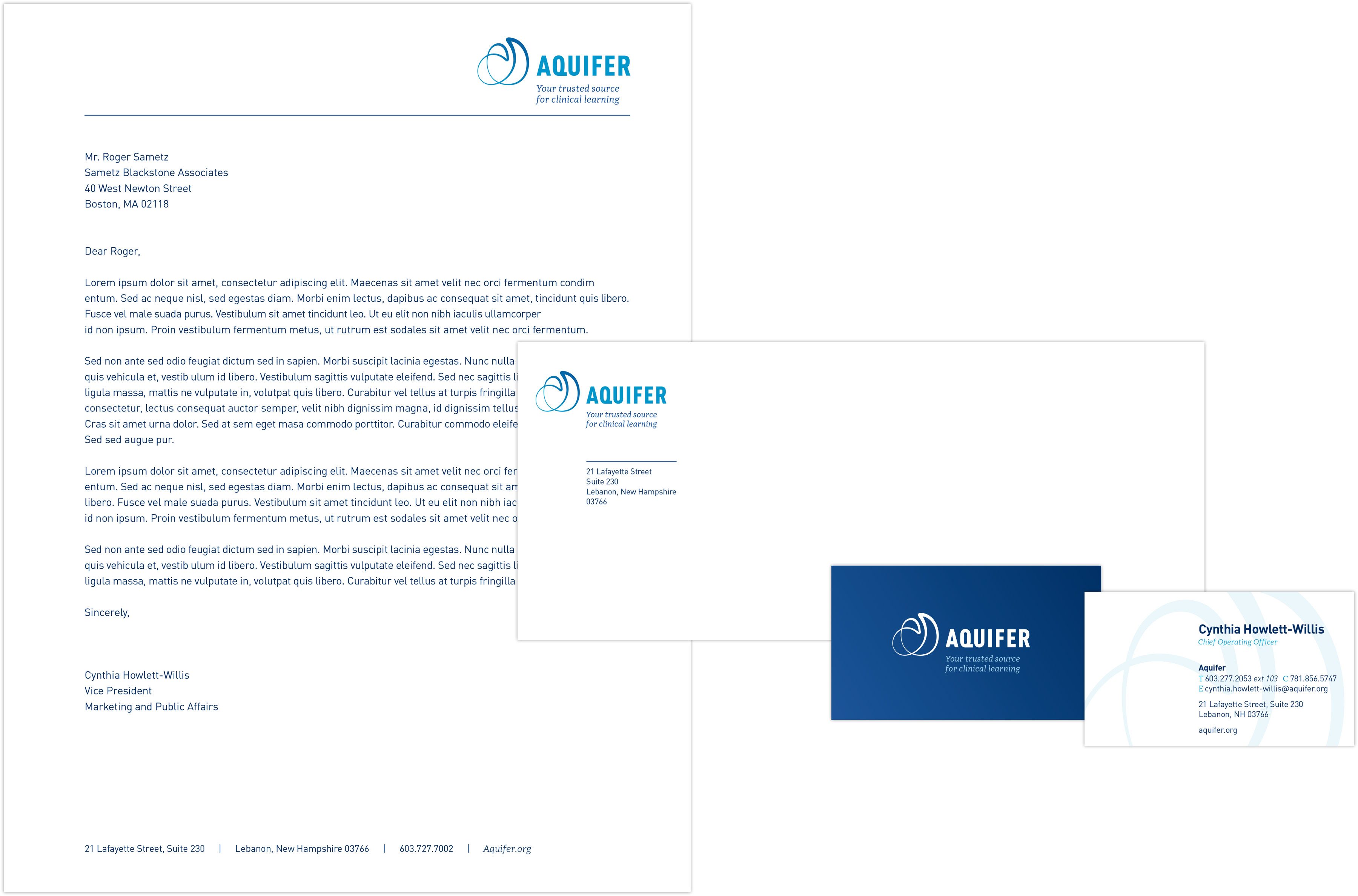
We also developed messaging aimed a variety of key audiences, a visually arresting logo, and a fresh graphic identity—and conducted training workshops for brand ambassadors within their academic consortium. We designed and built not only their new website, but also key print collateral that supported the transition to this new brand system. Aquifer’s brand now reflects the organization as it truly is: a thriving, dynamic leader in healthcare education.
