Seasonal performing arts marketing

Selling tickets and building brand equity

By Roger Sametz


Arts marketers for performing and presenting organizations need to create must-experience, seasonal materials that move current and prospective attendees to get in on the excitement—and purchase tickets. Unfortunately, this challenge is too often met by the creation of completely “new” materials each season. The opportunity to build brand—the recognition, trust, and connection needed to attract audiences to non-blockbuster offerings—is lost… and along with it, the chance to raise contributed income. The good news: generating buzz, enthusiasm, and sales for a new season doesn’t need to be at odds with brand-building. Quite the opposite: you can, and should, do both.
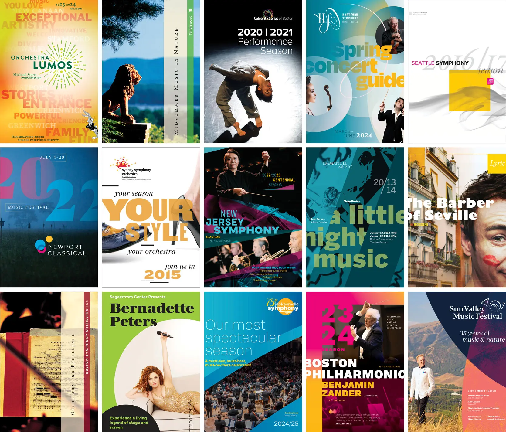


Performing and presenting arts organizations have a range of channels they can employ to foster enthusiasm for an upcoming season, sell subscriptions, and encourage single-ticket sales. There are print brochures, digital ads, social posts, website features, media buying—and for some, even good old newsprint. But irrespective of medium, organizations often think that in order to meet their sales goals, their prime (or sole) directive is to look fresh on kitchen tables (or phones, or billboards) and to focus on the “new” in new season.

What suffers is their brand.

In the headlong rush to be “different” every year, performing and presenting organizations end up, at best, significantly diluting their brand—and at worst, promulgating what can appear to be a new brand every year.

In addition to this new-every-year “strategy” costing more to implement (reinventing the wheel…), every dollar spent generates less awareness and recognition—and stature—than materials that also build brand.


Why reinforcing your brand is important

If they’re not going to exclusively program blockbuster offerings that will fill the house by themselves, performing and presenting arts organizations need to count on their brands to do a fair amount of marketing and sales heavy lifting.

That is, if you’re programming a John Williams evening, a Harry Potter film, Figaro, or Patti LuPone, your brand doesn’t have to work too hard. But if you want to take risks—program lesser-known artists and works, or those that are on-mission but not on the charts—your brand does have work to do. It needs to build (and have built) recognition, trust, and your desired position in your market. Prospective attendees need to look at an unfamiliar event and think, “Well, I don’t know this program / person / group, but I trust them to provide a great night out… what they mean as an organization resonates with me…and I feel connected to them… so I’ll give this program a whirl.”

A strong brand also allows you to sell from the “bottom up” and “top down.” Bottom-up marketing—promoting this offering, then the next one, then the one after… each on its own individual merits—takes a lot of time and money, and very little of each effort helps you sell the next offering. But if you’ve built a strong, consistent verbal and visual brand narrative that sits atop each offering, your brand meaning—that connective throughline—will add value to, and elevate each bottom-up effort. Think of bottom-up efforts as tactical and top-down as strategic; deployed together you’ll save time and money—and put butts in seats.

And while not the focus of this article, increasing the strength of your brand—creating trust, resonance, and belonging—is also critical to successfully raising contributed funds.


A false choice

It’s a common misconception that creating marketing materials that have the year-to-year coherence needed to build and strengthen your brand will be boring… that the choice is between reinforcing brand or being fresh and exciting. But this is a false choice. It’s not a zero-sum game: you can do both. The key is devising and working within a brand system.


System thinking

Building communications within a brand system requires having or developing a kit of parts that can be arranged and rearranged—across media and years. Brand consistency doesn’t require that year-to-year materials look identical; it means they have enough connective elements—brand glue—to reinforce who you are and what you mean. Necessary tools in your toolbox include:

  • Agreed-upon guiding brand attributes
  • Brand storylines and a high-level message / brand promise
  • A holistic approach to visual expression


Guiding brand attributes

Brand attributes are those qualities (often adjectives) associated with an organization. They often accrue organically over time (for better or worse), but they can also be managed intentionally. We think of them in three dimensions:

  • those that are owned: positive qualities you want to reinforce;
  • aspirational attributes: what you’d like to be associated with—these may already be true, but not known externally, or they may take some work on the ground to achieve; and
  • attributes to be managed away: outdated notions or misperceptions.

Nailing these is important, and the most critical attributes are the aspirational ones (which are often the converse of the set to be managed away). If you’re actually an innovative, inclusive, energetic, and welcoming organization—but are thought to be boring, white, sleepy, and elitist—then your messaging and visual expression have to address this gap head-on. Your set of agreed-upon guiding attributes will inform your verbal and visual brand narrative—and the creative decisions you make when creating seasonal marketing materials.


Orchestra Lumos brand attributes

Orchestra Lumos—née Stamford Symphony—had a bold vision to expand their offerings and impact beyond their historic home city. Agreeing on guiding brand attributes was a critical first step in re-naming, re-branding, and selling tickets more widely. Board, leadership, and staff were deeply invested in their attributes—and believed them to be key to connecting with both new and traditional audiences, and to achieving their ambitious plans.


Brand storylines and a high-level message / brand promise

Storylines, as opposed to stories, are those key concepts an organization wants to put in constituents’ heads. In the aggregate, they communicate who you are, what you do, how you do it, why you do it, for whom—and why anyone should care, participate, and contribute. They are key to building your brand narrative. They can roll up into a high-level message and brand promise (with brand attributes providing the adjectives) or be used in different combinations to take best advantage of a particular opportunity. We strongly believe there is always room in your print and digital marketing materials for your high-level message: this strategic text will add meaning and value to your more tactical offering-specific copy.


Orchestra Lumos storylines

  • Your destination for the highest level of musical excellence
  • The most professional, modern, and inclusive orchestra in Fairfield County
  • Meeting all members of the community where they are: across genres, formats, venues
  • Led by celebrated Music Director Michael Stern, with a galvanizing vision
  • Nimble, innovative, and reflective of Fairfield County’s rich diversity
  • A force for good, serving our entire community
  • A fun night out—and a meaningful, stimulating experience
  • A source of civic pride: helping make the county a dynamic place to live, work, raise families, and enjoy a stellar quality of life
  • Family-friendly, enriching entertainment
  • Shining brightly, radiating energy, sharing new possibilities


Orchestra Lumos high-level message

“Orchestra Lumos shines brilliantly across Fairfield County, sharing the passion and energy of the region’s most talented musicians to create exhilarating musical experiences of the highest quality-for audiences from all walks of life. Led by one of America’s foremost conductors, Music Director Michael Stern, the orchestra illuminates the power and beauty of music-across genres, formats, and venues.

“Blazing with the intensity and artistry you’d expect only in New York City, Orchestra Lumos welcomes, celebrates and engages our richly varied communities. Whether you’re a classical aficionado excited to hear an internationally renowned guest artist, a first-time concertgoer seeking a fun night out, or a family looking for an entertaining afternoon, you’ll be thrilled, entranced, and recharged.”

 

The first two years of marketing materials launched and then reinforced Orchestra Lumos’ new name and positioning (they also sold tickets). Covers project desired attributes and bring storylines forward. Color and typographic shifts within defined palettes build equity and signal a new season. Inside, the high-level message positions the orchestra and invites both “classical aficionados” and “first-time concertgoers” to engage.(Bugs also helps out.)

We had the usual challenges of needing to retain loyal audiences and attract new ones—but we also had the challenges of launching a new name, brand, and of expanding our footprint across all of Fairfield County. Our marketing materials moved us forward on all counts—bringing our positioning and attributes forward, signally year-to-year freshness and energy, helping to establish our new brand—and, of course, selling tickets."

Russell Jones

President and CEO, Orchestra Lumos

Building blocks of visual expression

It’s not rare that we hear, “We have our look and brand all sorted: here’s our logo and color.” And while your primary identifier, or logo (wordmark, symbol, or the combination), is certainly an important avatar of your organization—and ideally, a platform from which you can begin to tell your story—logos are not enough to either hold a series of marketing materials together, nor are they able to provide the needed freshness year-to-year.

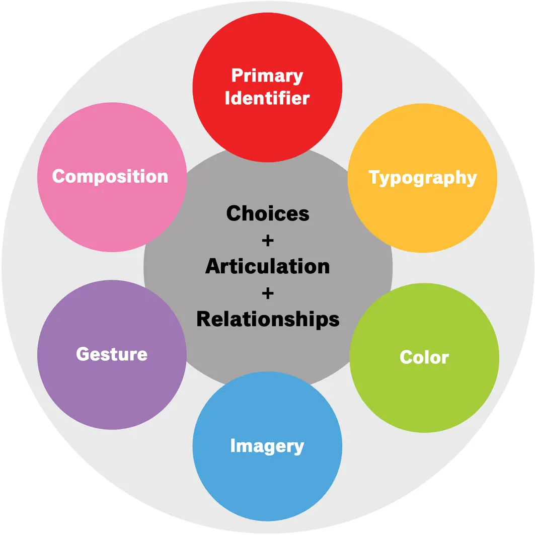
What’s needed is a system of visual expression—curated approaches to type, color, imagery, gesture, and composition—that can be modulated year-to-year and which recognizably project who you are, your meaning, and value.

Your visual system will be informed by your mission, vision, values, brand promise, positioning, agreed-upon attributes, and operational requirements. It’s comprised of two major groups of components:

  • those you can own: your primary identifier (wordmark / symbol) and any imagery you own; and
  • those that are essentially open source: type, color, gestures, and compositional approaches.

What will make the system yours are:

  • your proprietary identifier(s) (wordmark and / or symbol);
  • the choices you make within open-source options (which type, which colors);
  • the articulation of those choices (how the type is used, how images are used); and
  • the interaction of all of the above: how the choices, and the articulation of those choices, come together to project a memorable, proprietary, and durable image for you.


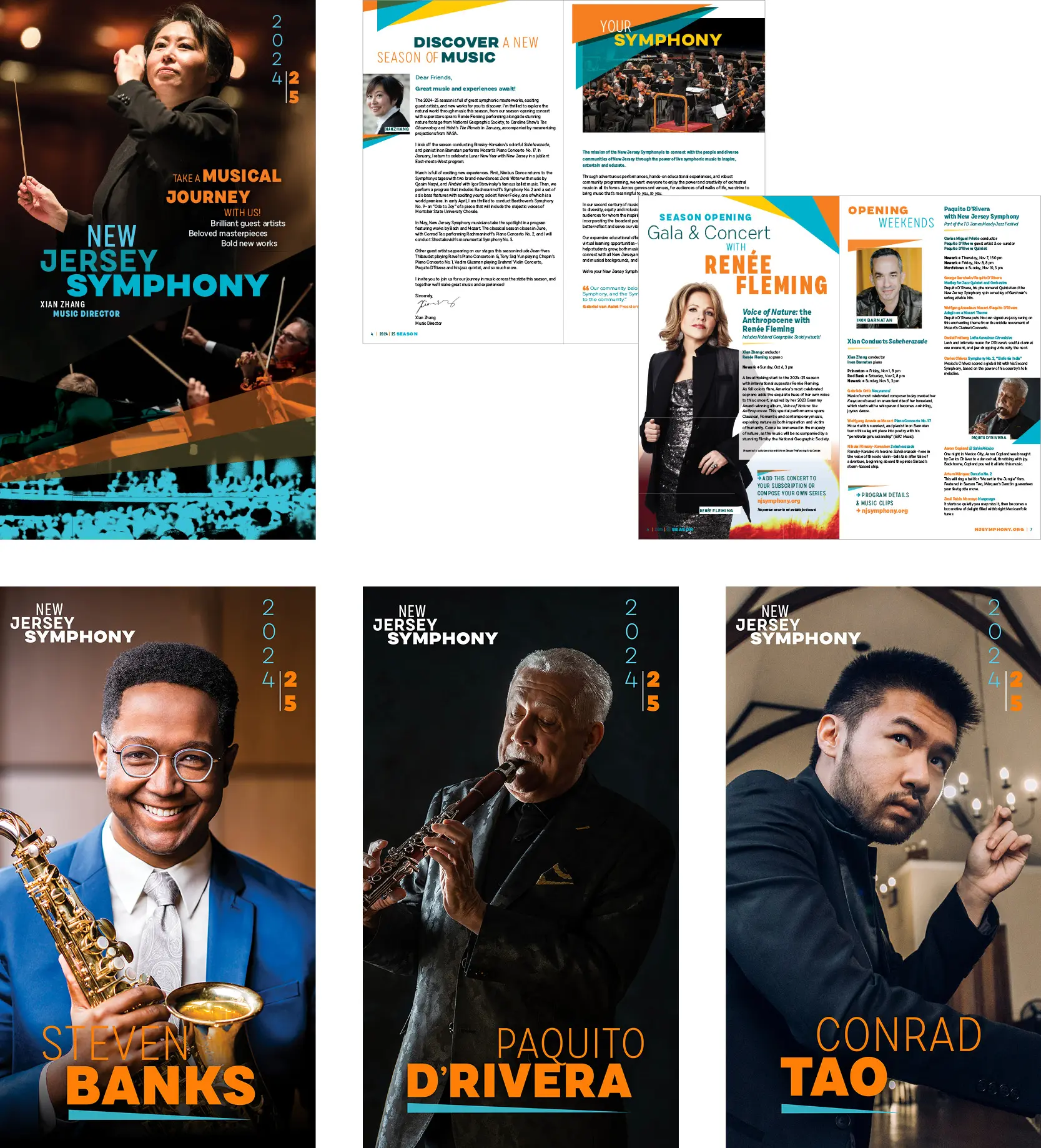
New Jersey Symphony’s kit of parts


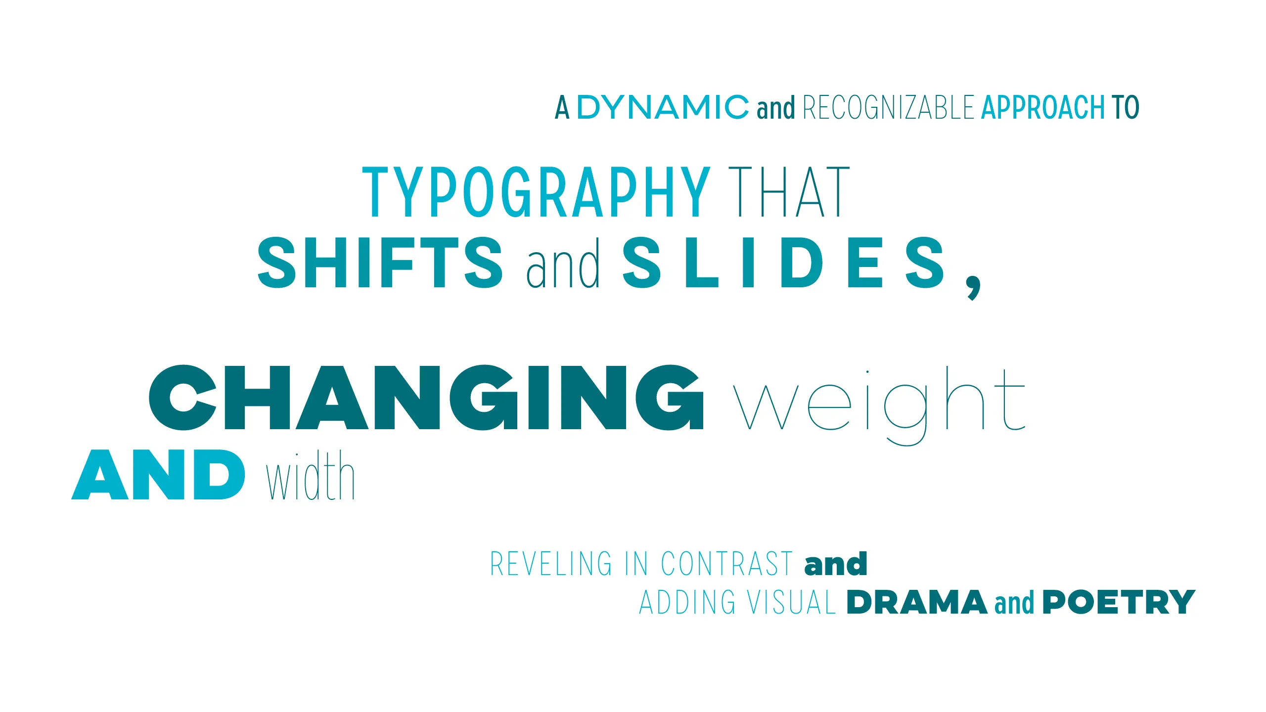
New Jersey Symphony’s wordmark progresses in terms of color and weight and signals that this is not your grandmother’s orchestra.

A distinctive approach to typography maps to the dynamic range and energy of the orchestra and its programming. And there’s built-in flexibility: type can be dialed up to be very energetic or rendered more quietly—while also reinforcing the brand. 


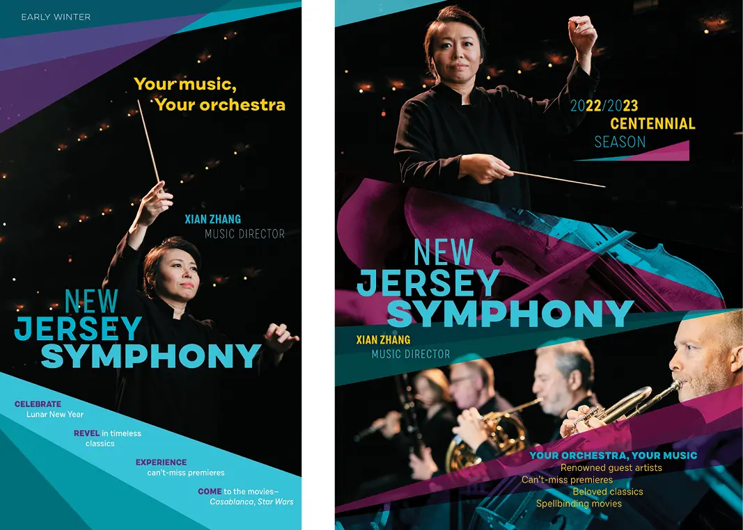
New Jersey Symphony has the singular challenge of being sandwiched between the New York Philharmonic and The Philadelphia Orchestra. To stake out its position, the organization’s primary brand color needed not to be confused with either. A progression of distinctive teals is augmented by pairs of bright and deep hues.

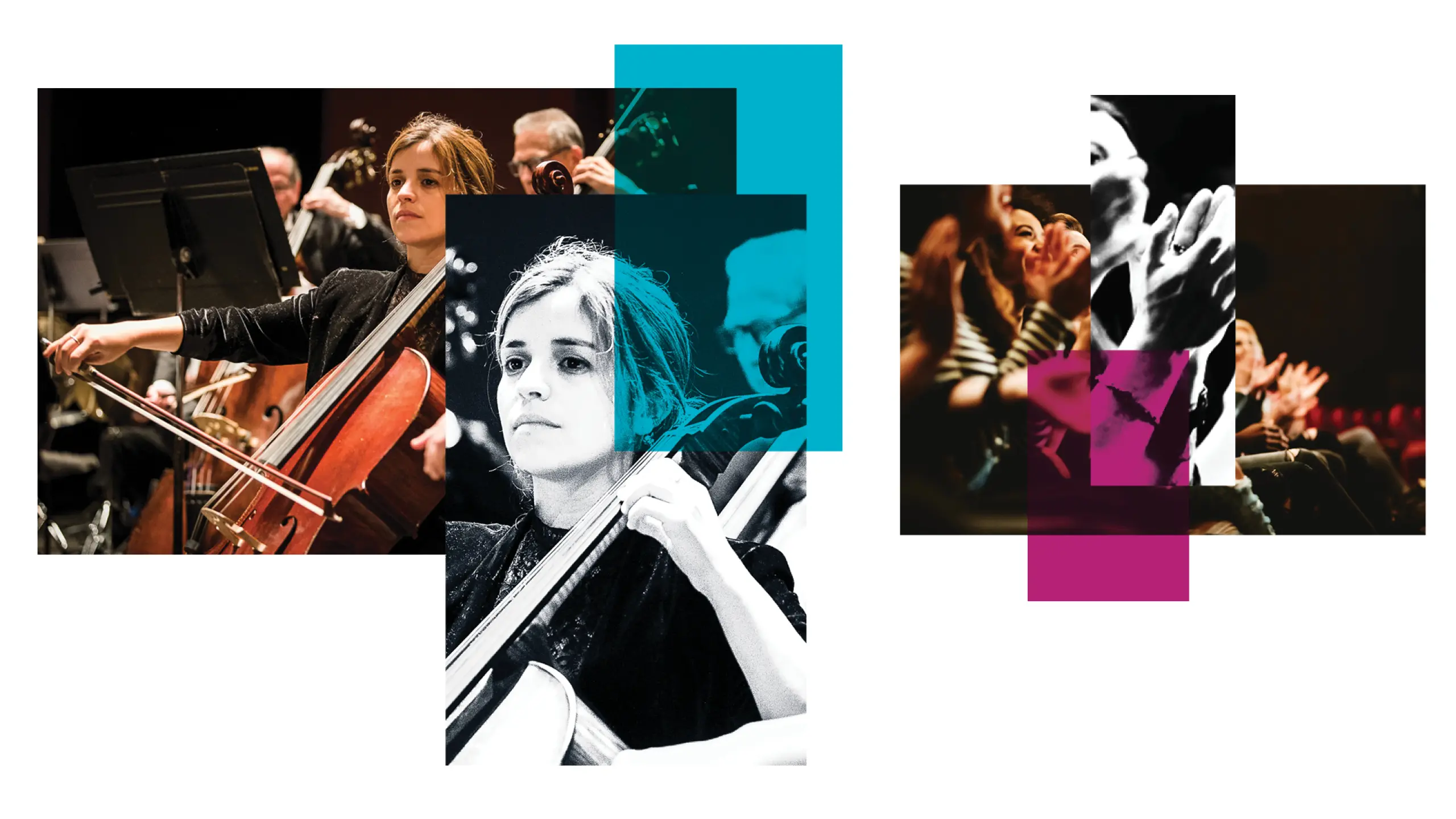
Imagery of orchestras in concert can often be “brown”—a result of warm lighting and warm wood. And while warmth can be desirable, New Jersey Symphony needed to present itself as the innovative, energetic, nimble organization that it is. Different approaches to rendering literal imagery set the organization apart.


Angles further differentiate New Jersey Symphony—and telegraph its desired positioning in the cultural landscape.


These visual brand elements all came together in materials that both launched the new brand—and generated significant earned income.


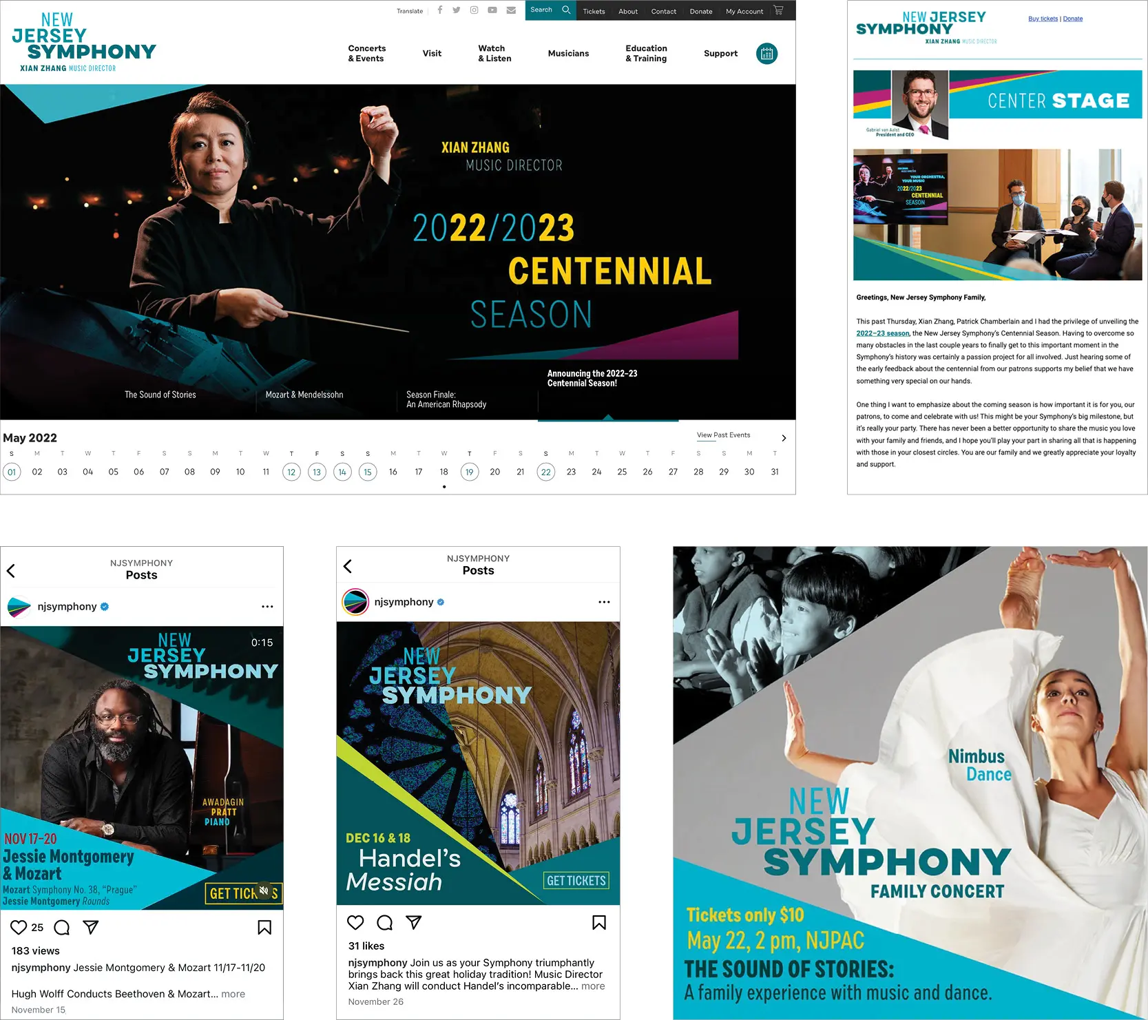
The visual brand was Implemented across all marketing touchpoints: digital ads, social media, and a tuned-up (but not blown up) website.


By bringing forward a secondary color in their palette—orange paired with their signature blue—the second season’s print and digital ads are both fresh and brand-building. All were designed in-house, using their brand guidelines.

Situated between two very prominent orchestras, we needed to show and tell audiences and donors what sets us apart—and encourage them to engage with “their orchestra.” Our new brand—verbal and visual—captures who we are, now and going forward: a leader in the orchestra world known for our innovation, risk-taking, inclusivity, and warmth. Brand guidelines and training enable us to create effective marketing year-to-year with the confidence that we’re always strengthening our brand."

Geoffrey Anderson

Vice President of Marketing & External Affairs, New Jersey Symphony

A note especially for presenters

One challenge that many presenting organizations face is that they rely heavily on photography supplied by the agents / managers of the acts they present. This hodgepodge of imagery can push seasonal marketing materials to look more like scrap books than a curated season. Putting these unrelated images into a strong visual brand context can overcome this challenge and build trust in the presenter. (Of course, this is also relevant to performing organizations who need to promote guest artists, all of whom also come with their own imagery.)


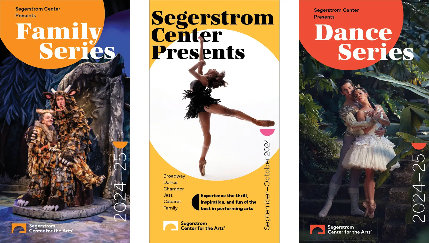
A strong branded context—and approach to using supplied imagery—enable these subscription brochures to bring forward featured acts and intriguing imagery while also building a coherent brand-building series of marketing pieces.


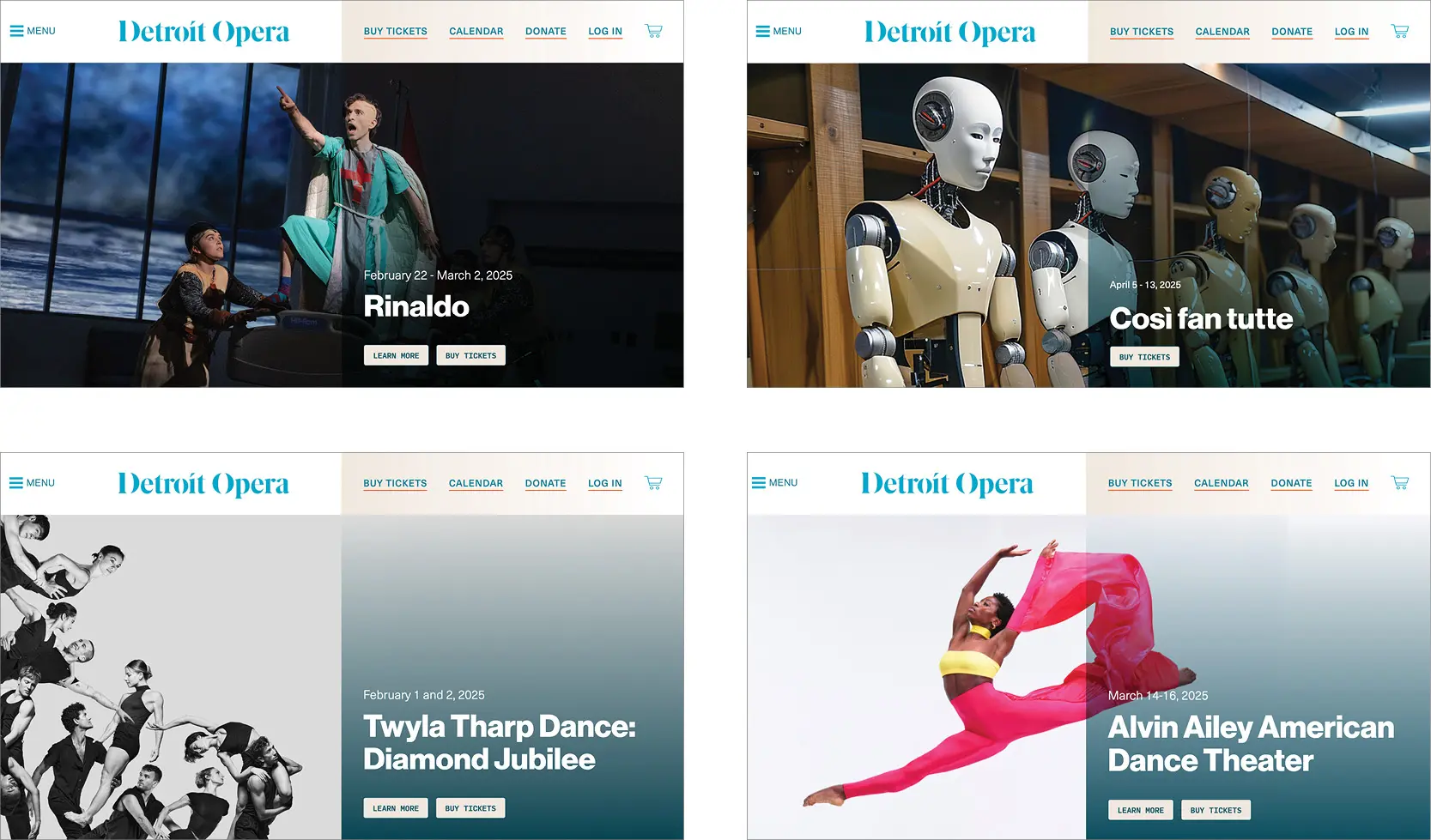
A clearly defined homepage structure and consistent visual brand gestures unify the presentation of both the offerings that Detroit Opera creates and produces and the acts it presents.


Connecting theory to practice: four mini cases

The following examples all project the brand attributes, storylines, messaging—and defined approaches to type, imagery, color, and gesture—that enable these very different organizations to craft marketing materials, year-to-year, that encourage engagement and participation and increase brand meaning and equity.


Boston Symphony Orchestra’s Tanglewood

The summer home of the BSO, Tanglewood is a magical destination where music and nature each enhance the other: where the highest quality programming is presented in an inspirational setting—and all are welcome.

We pioneered a brand-centric approach to seasonal arts marketing during our 20-year tenure as brand counsel for the BSO and Tanglewood. Year over year, recognizable elements—graceful curves, saturated natural colors, and a typographic palette shared with the BSO—interact with dramatic changes in composition and photography that brings nature forward. Each season the visual system’s curves, colors, and typography vary to highlight different aspects of the Tanglewood experience, moving from dramatic sweeping landscapes to closeups of flora and fauna—and from energizing daylight to romantic evening glow.


Text reinforced brand attributes: Tanglewood immerses visitors in an exhilarating experience of both music and nature.


Segerstrom Center for the Arts

This preeminent presenter in Southern California was under-presenting themselves and their offerings: marketing communications were all bottom-up—this act, then the next one—without any connective brand narrative or visual glue. Segerstrom Center itself was almost invisible.

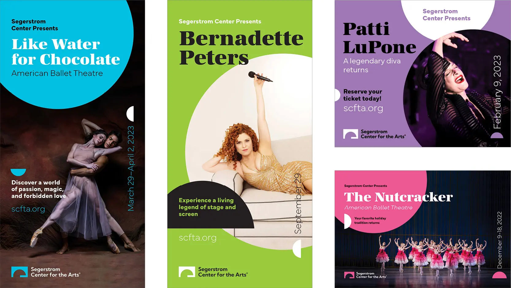
The new system, now into its third year, elevates Segerstrom Center, connects offerings across genres, and provides the flexibility for in-house staff to take advantage of all opportunities.

A distinctive display face, a bold palette, and circular elements that connect to both the logo and to the Center’s primary concert hall can be arranged—and rearranged—to present and market different series…


…and individual offerings:


In-house staff are keeping the brand system exuberant and healthy across channels—while selling out shows and raising contributed income.


Boston Philharmonic

The Boston Philharmonic, founded by Benjamin Zander in 1979, features student, professional, and amateur musicians. It’s not your average musical ensemble: it follows a vision of “passionate music making without boundaries.” Audiences describes the Boston Philharmonic as “powerful,” “inspiring,” “unique,” and—perhaps our favorite descriptor—”un-stuffy.” The organization’s Youth Orchestra “shapes future leaders through music.”

Marketing materials year-to-year bring forward the ensemble’s charismatic leader—and reinforce “passionate music making without boundaries”  through a decidedly hot palette, gradations, and type that pushes and engages the edges.


It’s important to note that Boston Philharmonic is not a large organization with a large marketing budget. System thinking doesn’t add a cost premium; rather, creating materials that work within a system saves money. Year-to-year materials cost less to create—and because each season builds upon the previous, every dollar spent generates more recognition.


Lyric Opera of Chicago

The second largest opera company in the country, leadership had a vision to both advance what opera could be in the 21st century—and to change outdated perceptions of opera.

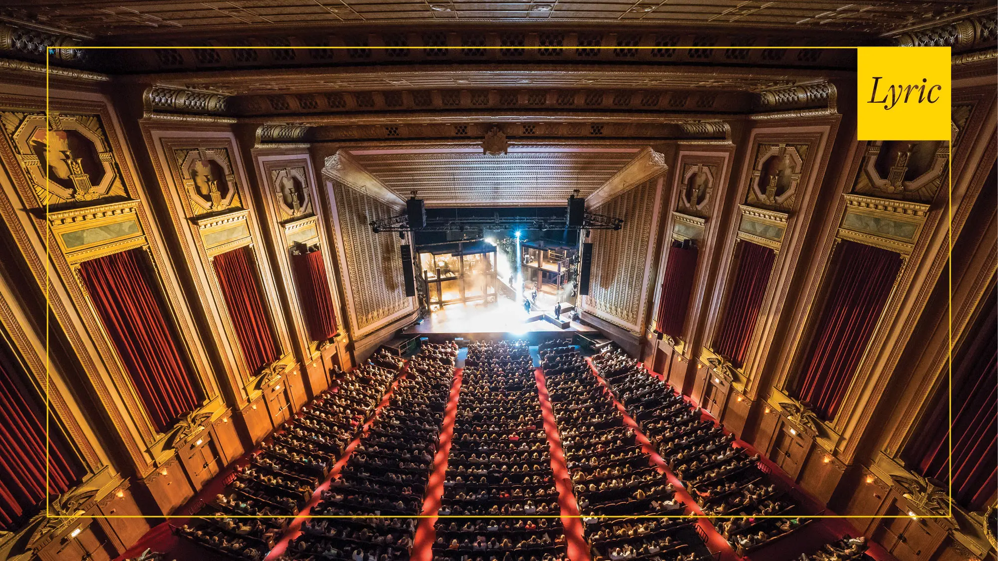
In tandem with leadership, staff, board, audiences, and artists, we evolved a new vision statement, supporting tenets, attributes, storylines, and a messaging framework. Importantly, the new system of visual expression we devised focused on the experience that Lyric delivers: gone were the singer-packed proscenium shots. Instead, both imagery and typography projected the emotional impact of each opera. A simple brand frame that integrates company’s logo and ties each of their efforts together. The system is now in its fifth year.


Lyric’s high-level message

“Lyric Opera of Chicago amazes, replenishes, inspires, and engages audiences with must-see, must-hear live experiences. Through the timeless power of voice, acting that brings characters to life in triumph and tragedy, the splendor of a great orchestra and chorus, theater, dance, design—and through truly magical stagecraft—Lyric immerses audiences in worlds both familiar and unexpected, leaving everyone thinking and feeling differently when the curtain comes down.”


Marketing materials across five years

Subscription covers across years project Lyric’s offering’s emotional underpinnings, begin to tell stories, and communicate the experience of being in the company’s amazing Art Deco Opera House. All are held together by shared composition and typography—and Lyric’s strong brand frame. The last four seasons have been designed in-house from brand guidelines.


Within each subscription piece are spreads that reinforce the company’s core messaging—reflecting our belief that there is always room for your high-level message.


Articulated type, evocative imagery, a strong grid that organizes show information—all contained by Lyric’s brand frame—connect both subscription and single-ticket materials across years, and build recognition, stature, and earned and contributed revenue. The top and bottom sets of examples are five years apart.


Engaging with audiences and prospective attendees across all touchpoints

The implementation of Lyric Opera’s brand system extends across all current and prospective audience touchpoints. Lyric’s primary color—Montepulciano—combined with Lyric’s brand frame and evocative type and imagery, makes each of their emails immediately recognizable in an inbox.


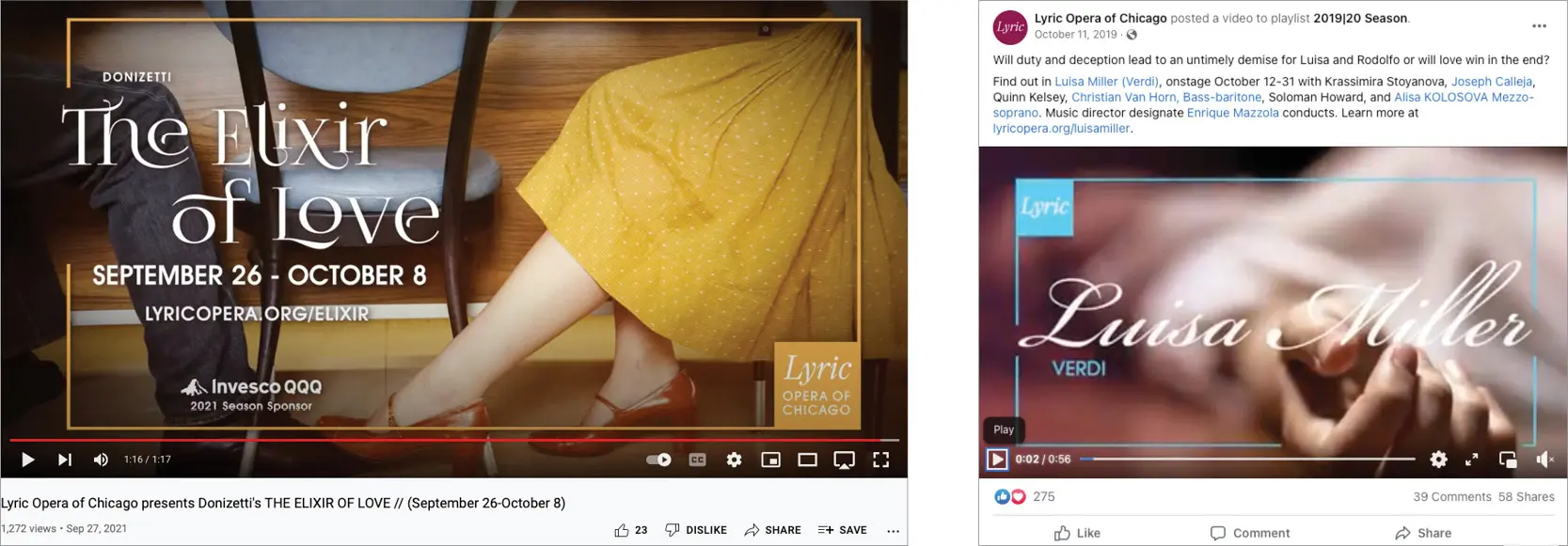
Short videos, many embedded in social media, provide a sample of Lyric’s offerings, encourage prospects to take next steps, and drive people to Lyric’s website.


A set of static web ads for each production, in a wide range of sizes with information appropriate to each size, enable Lyric’s marketers to be quick and nimble—with the confidence that these ads will always reinforce other efforts.


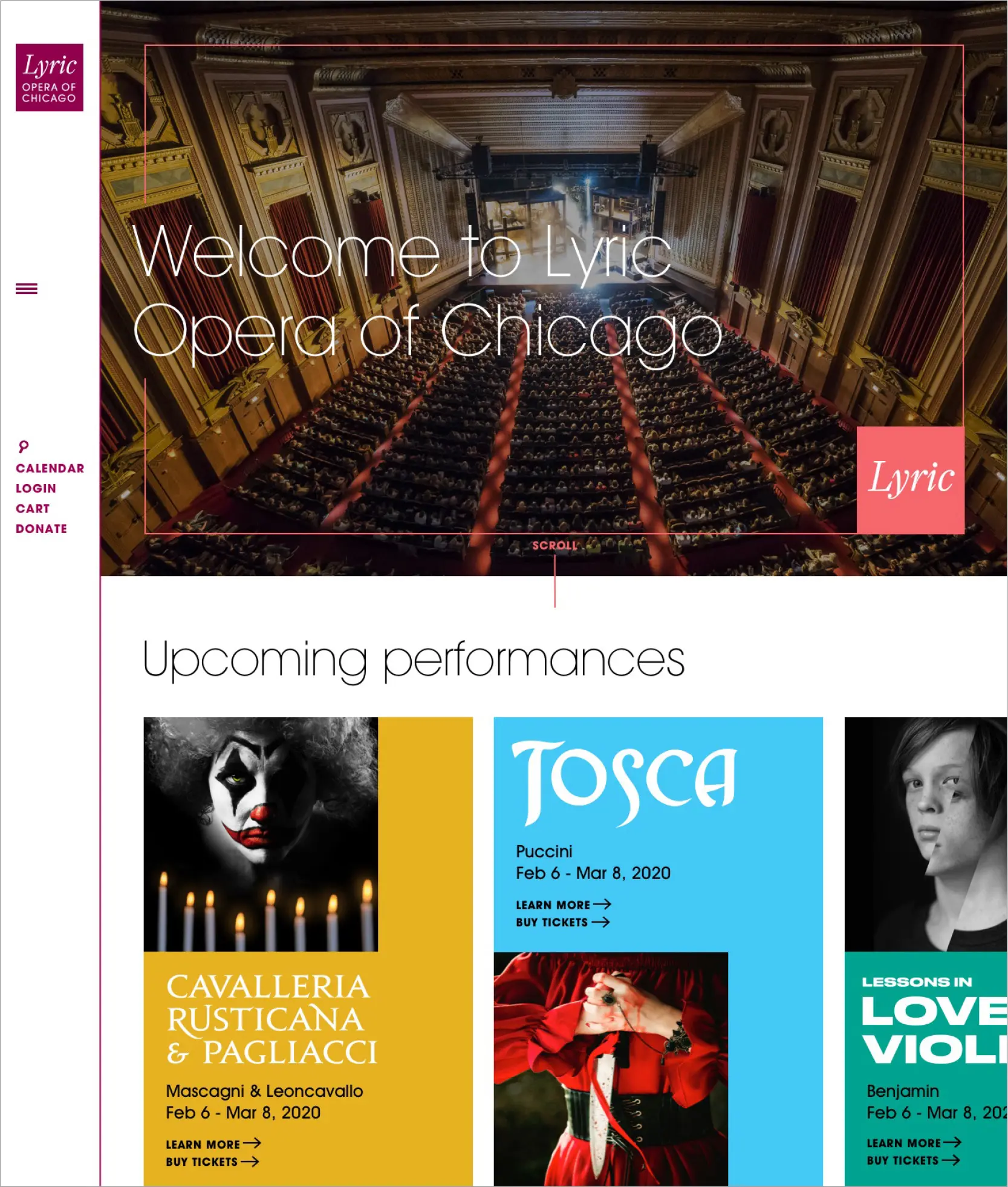
“Cards” on the website pair show-specific imagery and typography—and invite a visitor to scroll horizontally to explore upcoming performances.


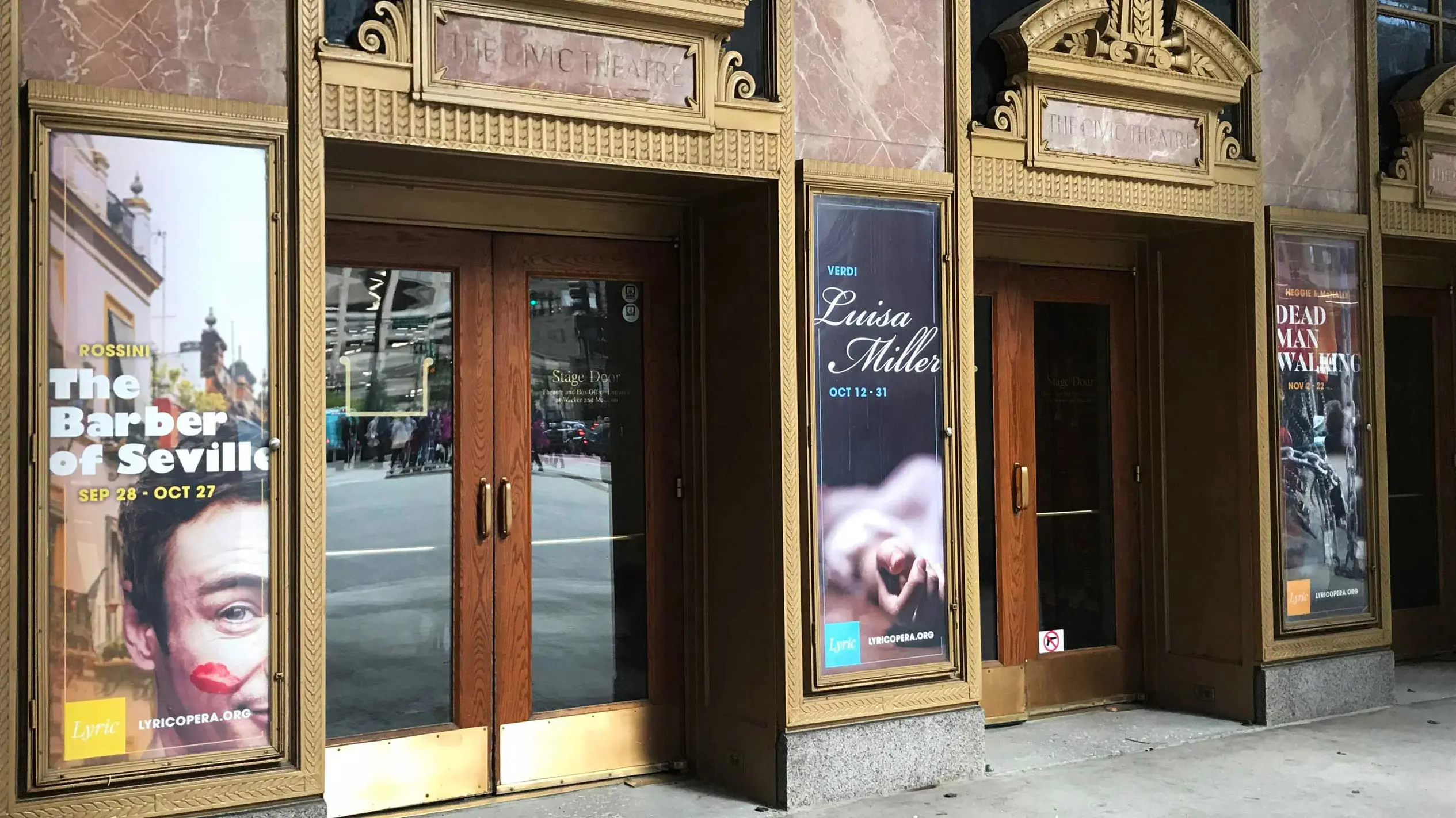
Three-sheet posters enable passersby to get a glimpse of what is instore inside Lyric’s Opera House.

Sametz truly evolved a brand system for Lyric: agreed-upon brand attributes drive decisions; key storylines inform messaging across departments; and our visual system lives our vision to lead opera in the 21st century and also ensures both consistency and flexibility. Marketing materials will look fresh and build brand equity, year after year. Our evocative approach to imagery separates us from other cultural institutions and underscores our commitment to visual inventiveness on the stage.”

Lisa Middleton

Vice President, Marketing and Communications, Segerstrom Center for the Arts • Formerly: Vice President, Marketing and Communications, Lyric Opera of Chicago

Playing from the same score

Arts marketers for performing and presenting organizations (along with their leadership and boards) face a range of challenges. While attendance post-pandemic has significantly rebounded, encouraging people to experience live art together is still on everyone’s to-do list. Add to this the ongoing changes in how people want to “consume” entertainment, the ever-widening set of choices available, demographic shifts in organizations’ markets, the trickle-down effect of diminishing arts education in schools—and the over-arching mandate to attract younger and more diverse audiences—and marketers have their work cut out for them.

To surmount these persistent challenges, marketers (reasonably) want to create must-experience, seasonal materials that move current and prospective attendees to get in on the excitement—and purchase tickets.

Unfortunately, these challenges are too often met by the creation of completely “new” materials each season: materials that have very little connection to what people saw last year—or will see the next.

The opportunity to build brand—the recognition, trust, and track record needed to attract audiences to non-blockbuster offerings; to keep people connected year after year; to engender a sense of belonging—is lost… and along with it, the chance to raise additional contributed income.

The good news: generating buzz, excitement, and sales for a new season doesn’t need to be at odds with brand-building. Quite the opposite: you can, and should, do both.

The essential ingredients to your success are system thinking followed by thoughtful implementation:

  • develop a set of agreed-upon attributes to inform messaging, design, and marketing decisions;
  • create high-level messaging to add strategic top-down meaning to bottom-up offering-specific copy; it helps people understand who you are, what you’re about, and why they should care and engage;
  • design within a visual framework; create or refine approaches to color, type, imagery, composition, and gesture so that you have a durable set of design directions that can be “tilted” and evolved for each new season (materials do need to look fresh!), while also providing easily recognizable brand glue; and
  • have the confidence and commitment to stay the course: no strategy works unless you give it a chance.

You may need a significant brand evolution to accomplish the above. Or, you may already have established elements in your existing brand (verbal and visual, beyond your logo) that may need an infusion of system thinking—to evaluate, distill, and redeploy these elements more effectively.

And for those concerned about the bottom line (probably all of you): creating effective seasonal marketing materials—year-over-year—that do their jobs well and build your brand is not budget-dependent. You don’t have to be a large organization with a commensurately large budget. It’s all about putting the strategic, system-thinking horse on the right side of the tactical cart…  where it belongs.