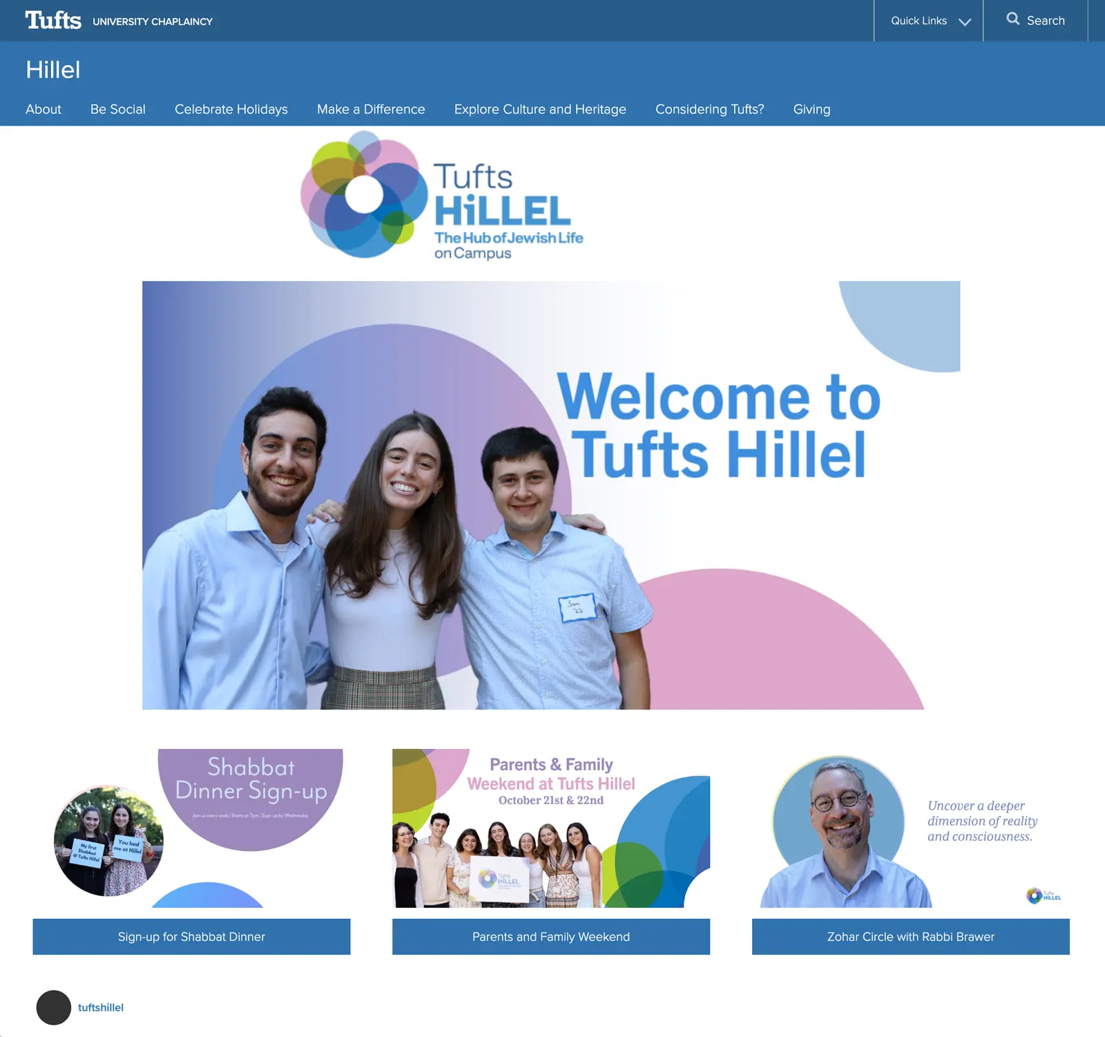
Tufts University Hillel
Tufts University Hillel
Evolving the brand to increase understanding, participation, and support
As the largest and most established Jewish organization at Tufts University, Hillel plays an essential role on campus. But in recent years, Hillel has faced significant challenges: they have not always been understood for who they are, what they stand for, how they’re open to everyone, or all they offer.
Hillel needed to better tell their story—authentically and compellingly. They needed students, parents, faculty, donors, and the campus community to see them for the warm, welcoming community they are—and take advantage of the transformative opportunities they provide forTufts students.
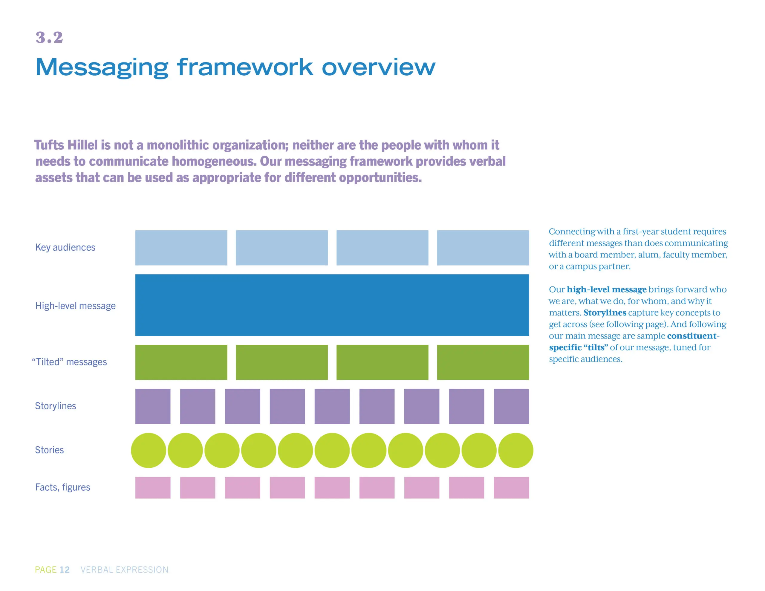
To more clearly communicate why people should take part in Hillel’s many programs, partner with them, and contribute—we first engaged in cross-campus, multi-stakeholder research. We then collaborated to develop a robust messaging framework that telegraphs the values and programs that make Tufts Hllel a vibrant, thriving, meaningful, and accepting organization.
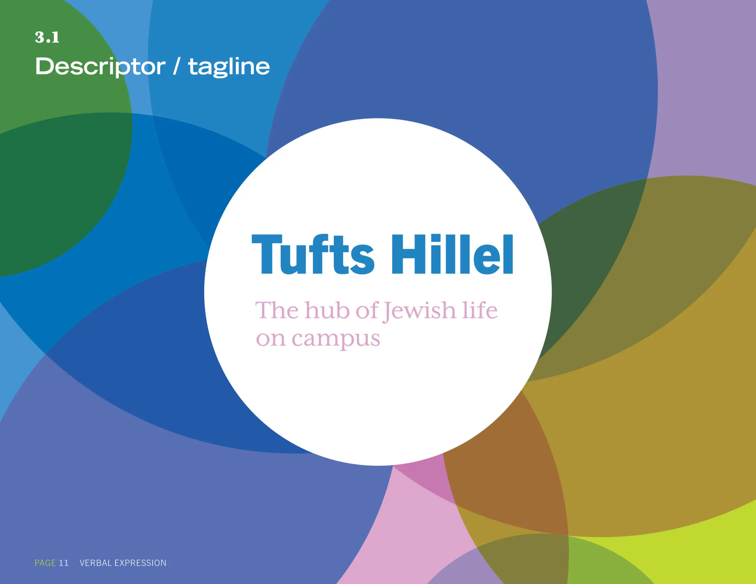
A new tagline conveys how the organization is a hub where Jewish students can evolve their identities, connect with their beliefs and heritage, and develop lifelong relationships. We streamlined programs into key areas to help students find their personal connection to Hillel, and articulated how Hillel contributes to a rich, lively campus environment where students are motivated to make the world a better place.
We developed a primary identifier that graphically projects the “hub” value proposition—and crafted an inviting, youthful, contemporary visual system that connects communications across programs and channels and ups the organization’s polish while still being user-friendly. The system was designed to be easily taught—so that non-designer students can create communications that reinforce the evolved brand.
Objectives
- Get control of the organization’s narrative within a noisy campus environment
- Attract and retain students—and encourage participation
- Engage prospective and current parents and alumni
- Inspire donors through compelling storytelling
- Build awareness of diverse programs—and also ensure the breadth of Hillel is known
- Communicate Hillel’s vibrant social justice initiatives
- Convey Hillel’s “open tent”—welcoming to different religious practices, backgrounds, points of view
- Get across its student-led, staff-supported model
- Be seen as an essential member of the Tufts community, and a valued partner for other campus groups
- Clarify Hillel’s belief in dialogue and debate—and its non-doctrinaire support of Israel
Collaboration
- Engaged in a cross-campus, multi-stakeholder research phase
- Evolved guiding brand attributes and positioning
- Developed a Strategic + creative brief with directions for messaging, communications strategy, and improvements to the Tufts Hillel website
- Devised a tagline and primary graphic identifier that illustrate Hillel’s vital role as a “hub” for all Jewish students on campus
- Crafted storylines and a messaging framework
- Designed an inviting, lively visual system to make all Hillel communications instantly recognizable—and user-friendly for non-designer students to execute
- Streamlined Hillel’s areas of focus to be more easily communicated and understood
- Led staff and student workshops to build fluency in the new brand
Scope
- Qualitative research
- Internal and competitive communication audits
- Primary graphic identifier
- Attributes / storylines
- Messaging framework
- Strategic + creative brief
- Visual system
- Brand book documentation
- Messaging workshops and training
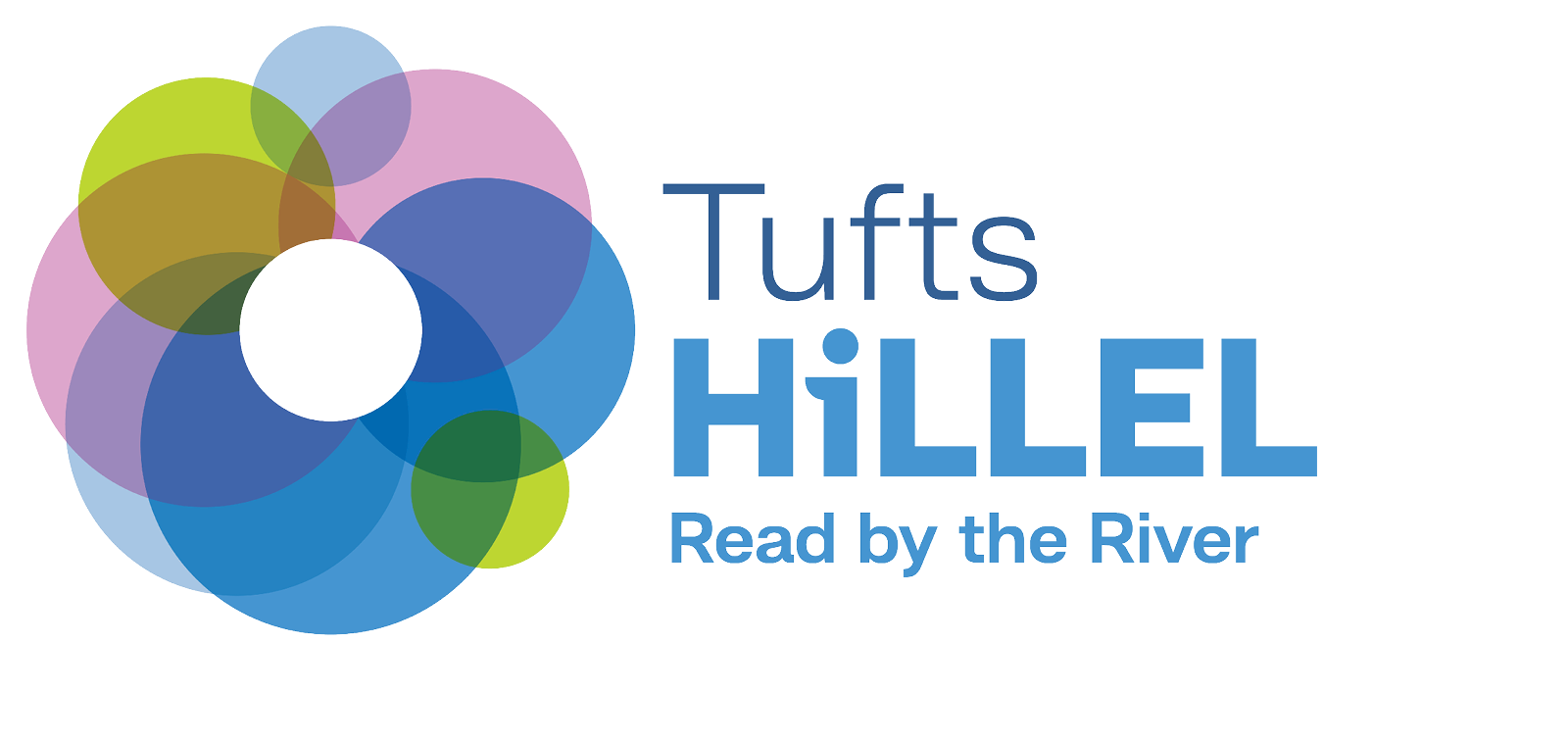
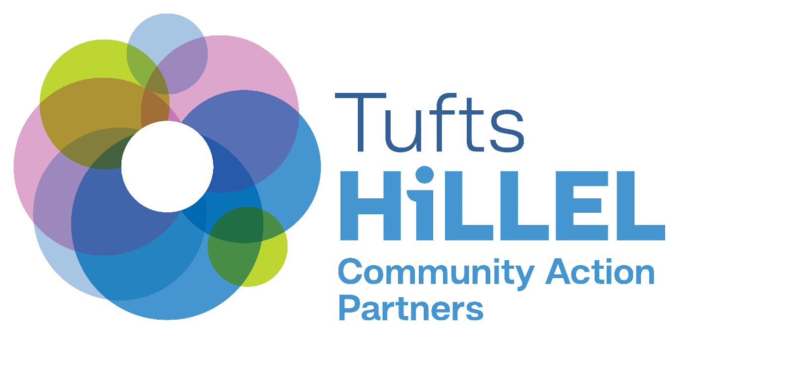
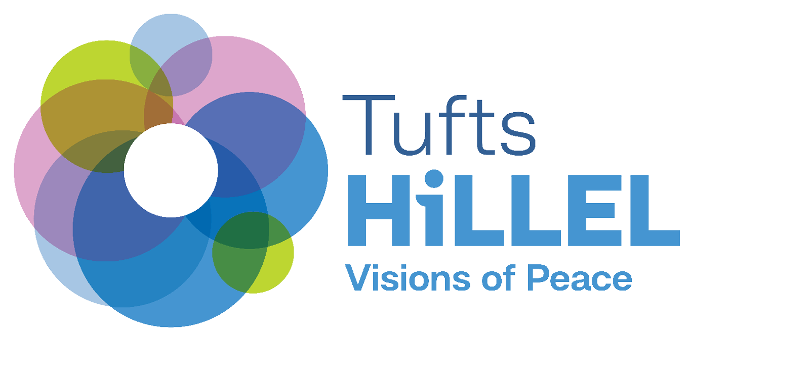
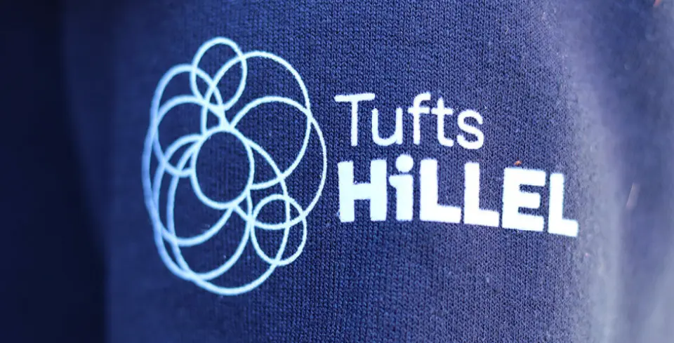
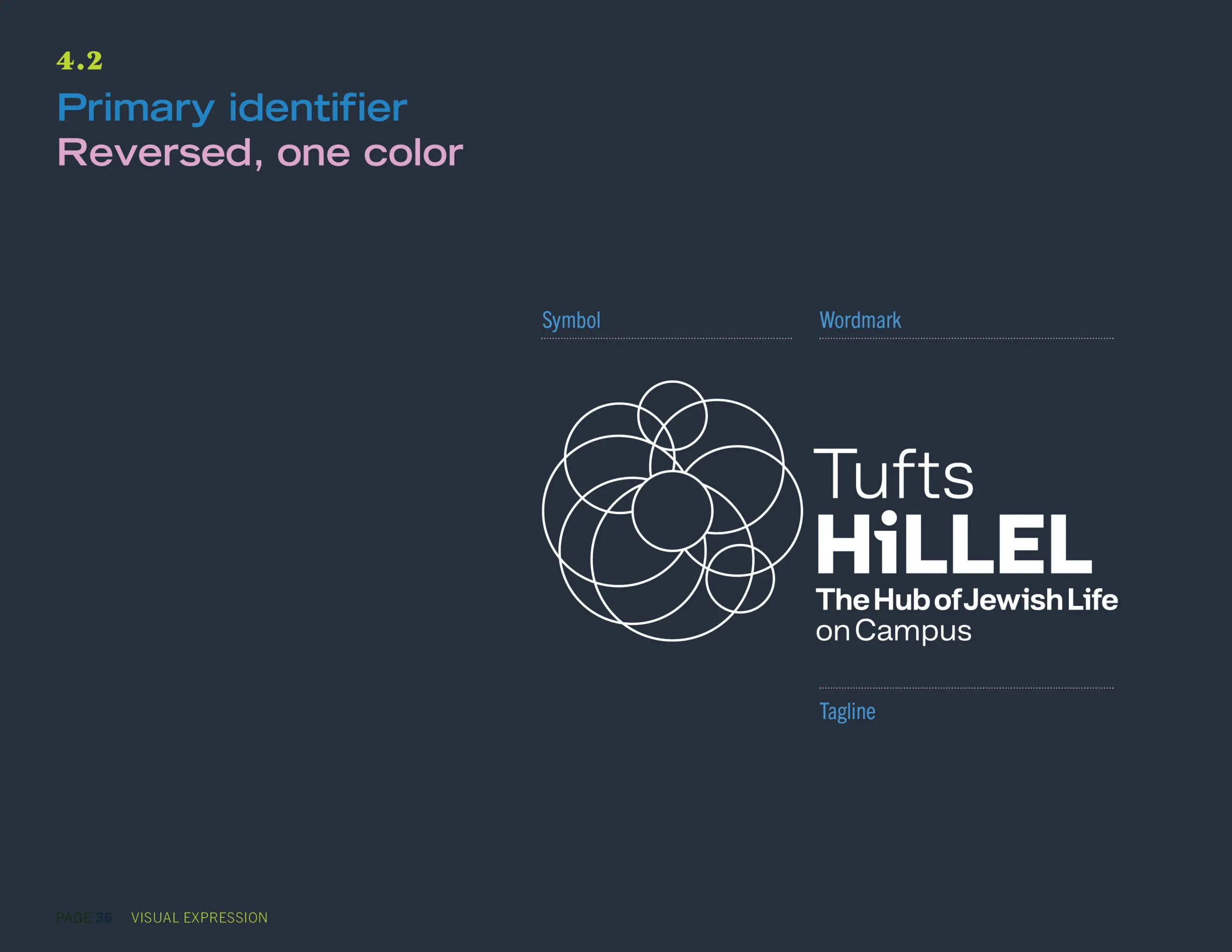
Primary identifier and tagline
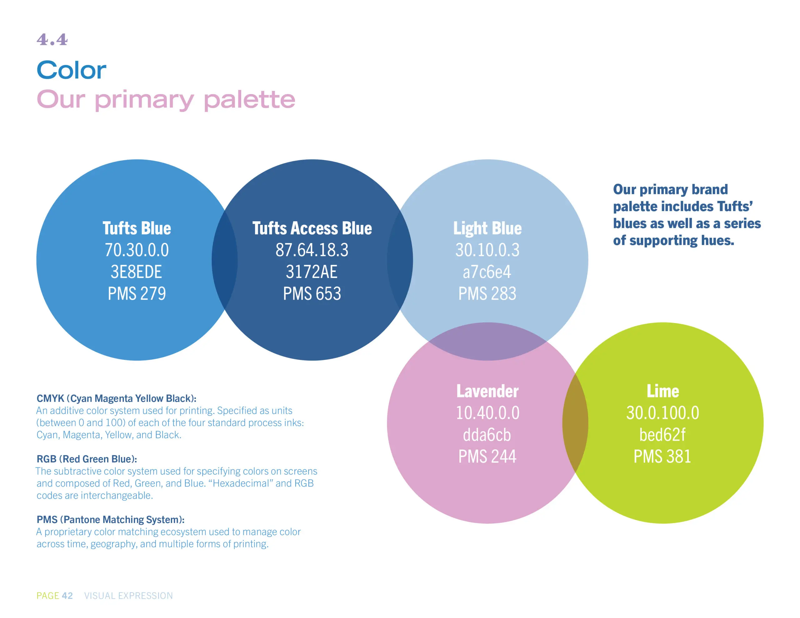
Tufts Hillel’s new graphic identifier lives the idea that the organization is the hub of Jewish life on campus. The panoply of overlapping circles points to the depth and breadth of Hillel’s programs—and to the range of people and perspectives that Tufts Hillel welcomes.

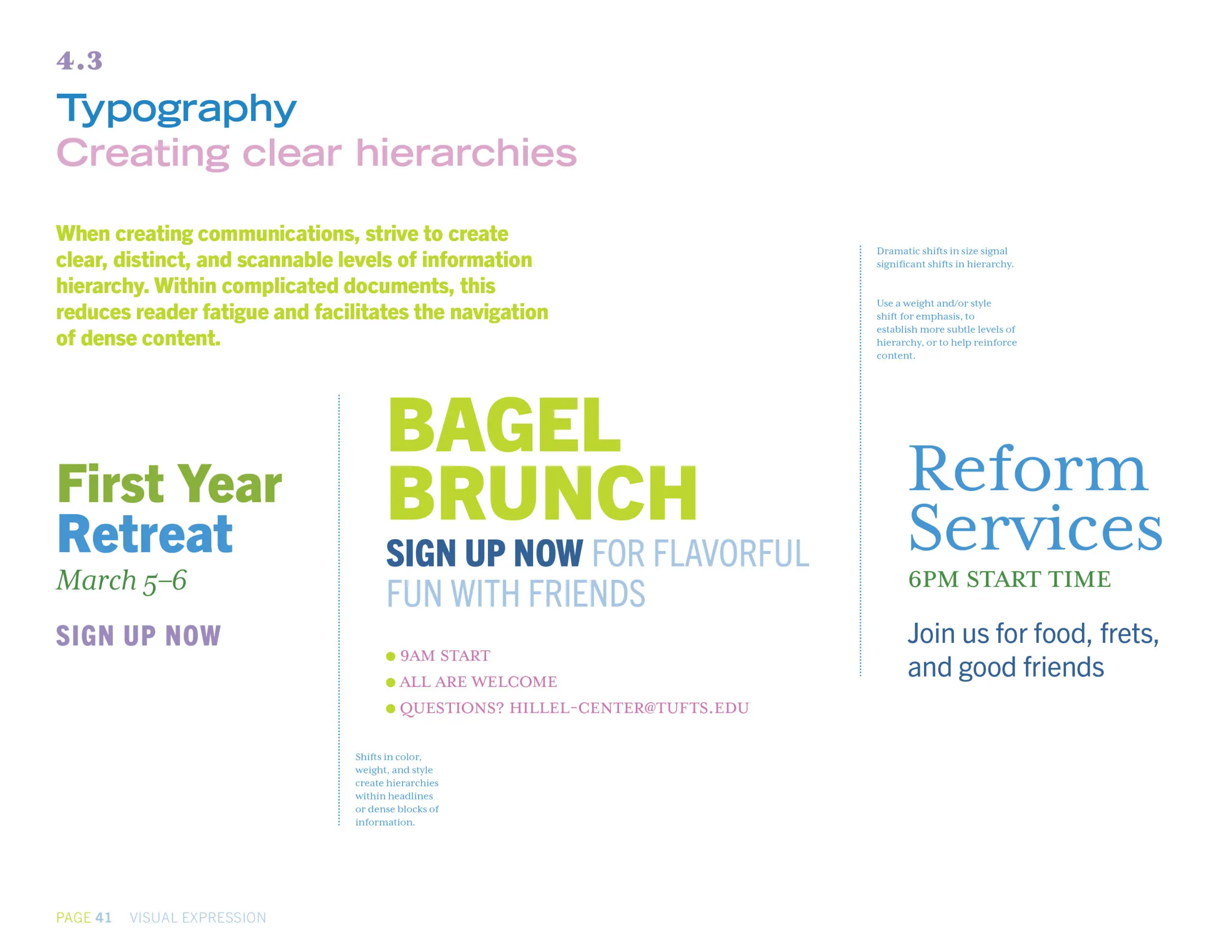
Hillel's symbol and typography were designed to be easily modified to express different programs—while ensuring that all programs are “brought to you” by Tufts Hillel.
High-level message
The new top-line message concisely brings together key storylines. An “elevator” message, it’s constructed in “floors”—each of which adds successive detail. Here, floors 1 and 2.
First floor
Join a vibrant, flourishing Jewish community. At Tufts Hillel, we provide a warm, welcoming environment where you’ll engage your curiosity, energy, and intellect—and perhaps have the most significant experiences of your college years. Dive deep into your identity, explore religious practice, develop lifelong friendships—and help make the world a better place.
Second floor
The center of Jewish life on campus, Tufts Hillel is always here for you: not only for thoughtful (and fun!) celebrations of Shabbat and holidays, but also as your guide to discover and express your Jewish self in ways that are meaningful, comfortable, and exciting for you. Students come with different identities, practices, and perspectives—from all over the globe—to ask challenging questions, meet soon-to-be best friends, and grow together in a safe, accepting space.
Tufts Hillel has been an important part of student life on campus for generations. But it became increasingly clear we needed to refresh our messaging and visual presentation and take control of our narrative. Sametz Blackstone, after an inclusive research phase, helped us to define our vision and promise—and develop messaging that our entire community could use to communicate the organization's value to prospective students, parents, donors, and the wider Tufts community. Our a new system of visual expression effectively presents, and connects, our varied offerings.”
Rabbi Naftali Brawer, PhD
Neubauer Executive Director, Tufts Hillel
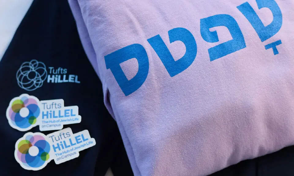
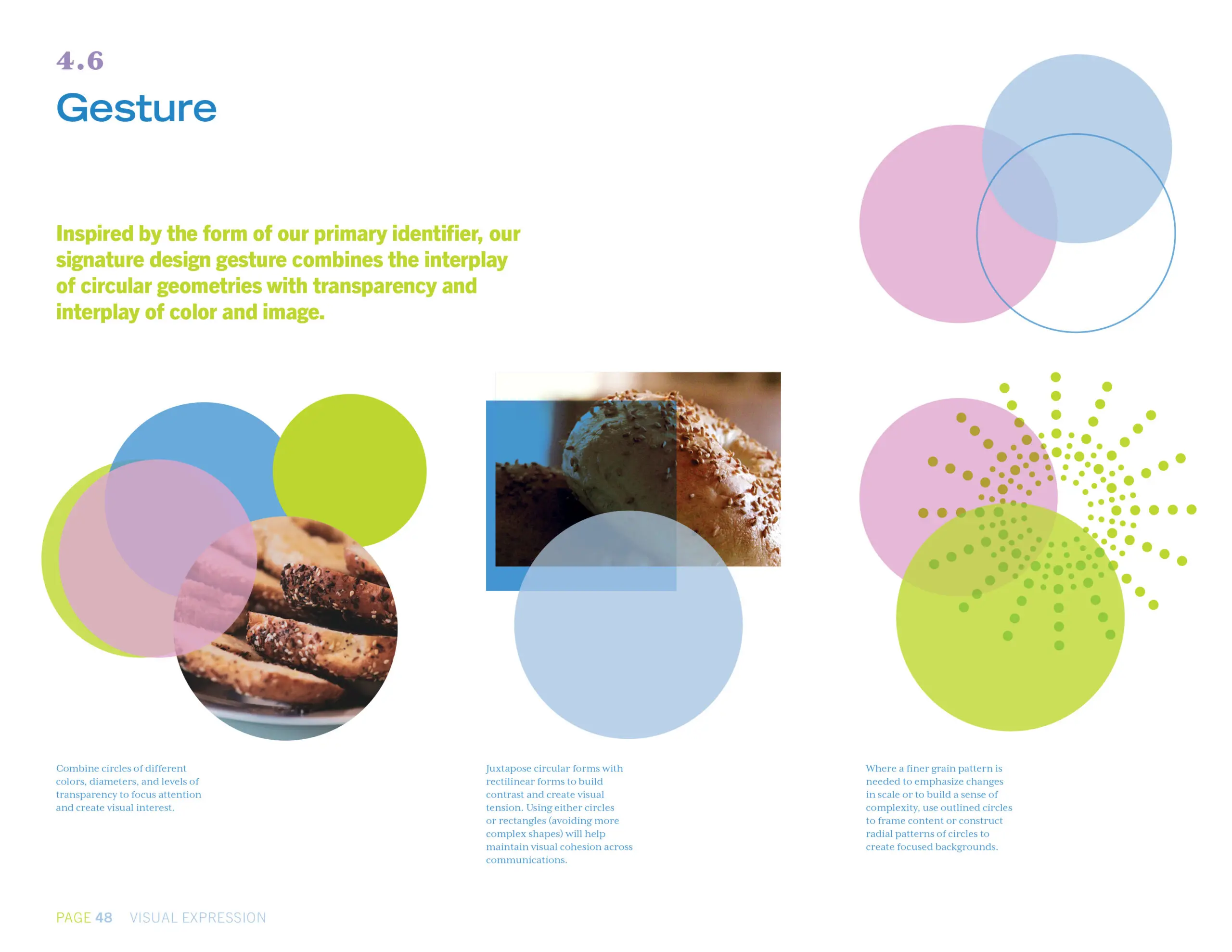
A vibrant, user-friendly visual system
A system of illustrations and icons provides connection across programs in an informal, friendly way.

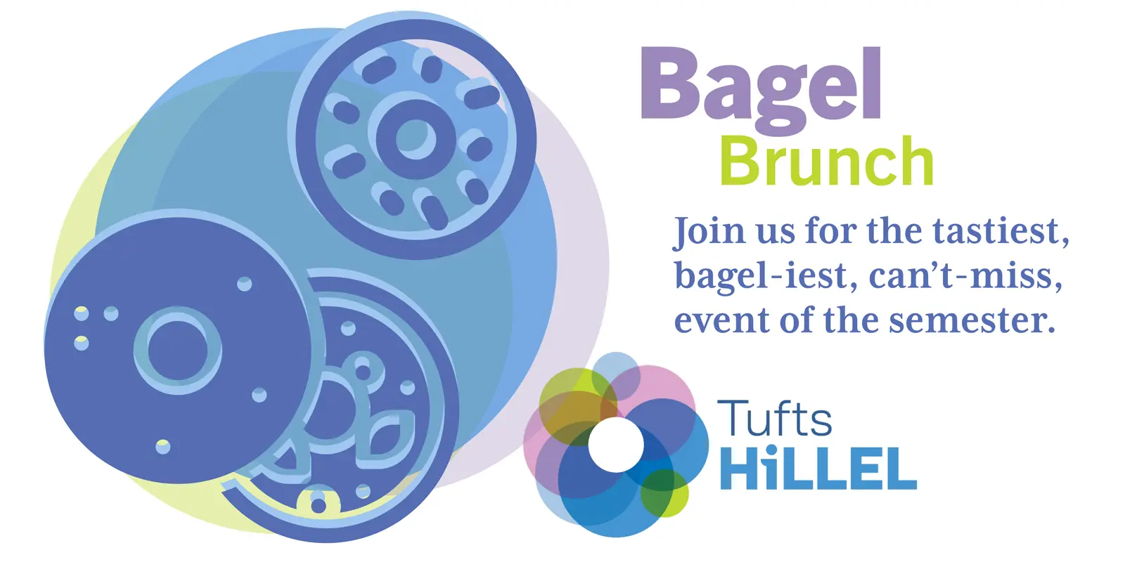


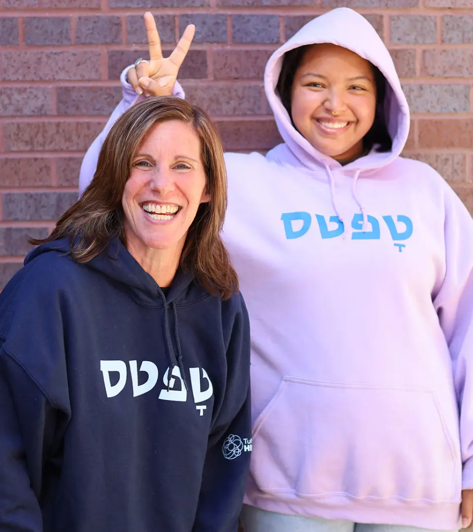
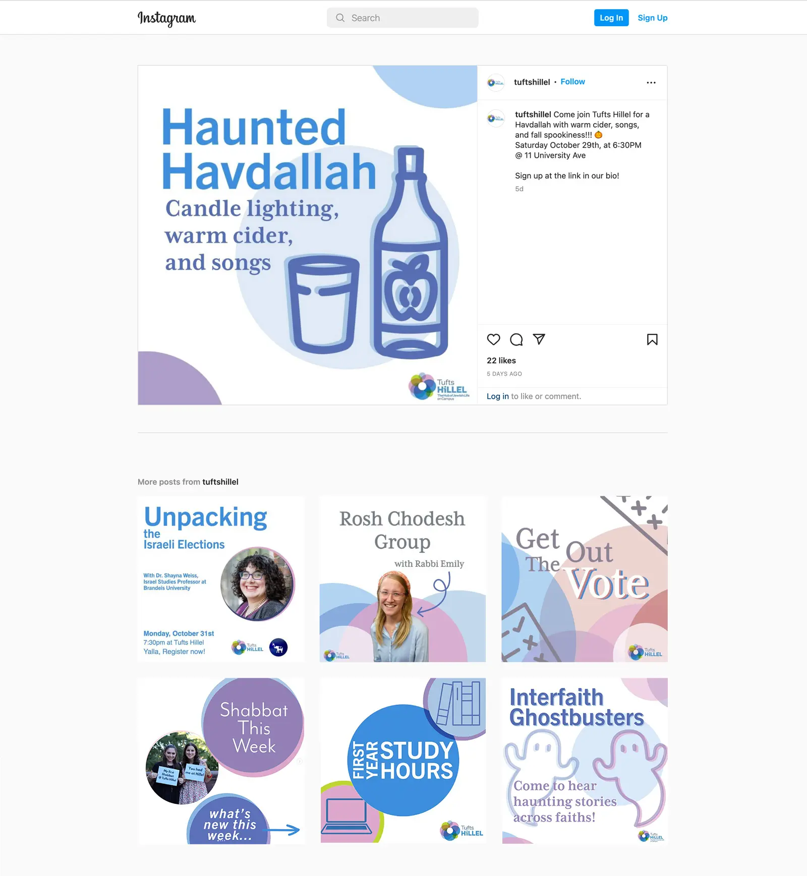
Student-focused, student-crafted communications
Tufts Hillel’s updated website and social media incorporate signature gestures and the organization’s distinctive color palette. Sweatshirts and stickers help build awareness and engage students as ambassadors.
Style guide
A concise style guide documents Tuft’s Hillel’s messaging, voice, identifier, typography, compositional gestures—and presents models of the brand in action—so that the organization has the assets to keep the brand healthy and vibrant.
The Sametz team rounded out our engagement with a series of workshops—helping staff, students, and board to become more comfortable, fluent ambassadors for our organization. It's been a great partnership—one that's engaged our community in a shared enterprise. The early results are impressive, and the work will serve us well for years."
Rabbi Naftali Brawer