Lyric Opera of Chicago
Lyric Opera of Chicago
Redefining what it means to be a great opera company in the 21st century
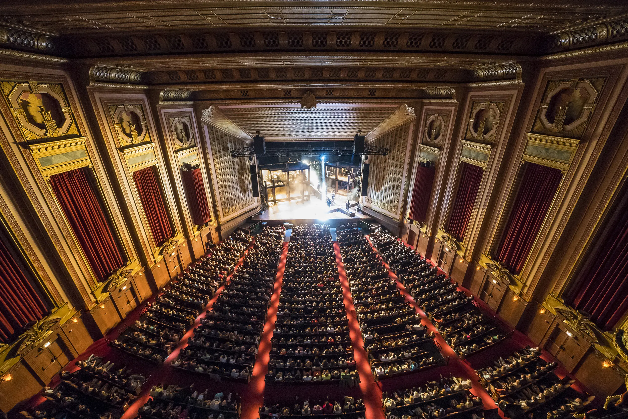
For seven decades, Lyric has brought together the timeless power of voice and acting, the splendor of a great orchestra and chorus—coupled with theater, dance, design, and magical stagecraft—to transport audiences to worlds both familiar and unexpected.
But a rapidly changing cultural landscape, demographic shifts within Chicago, changes in how entertainment is valued and consumed—and the continued perception of opera as elitist, expensive, inaccessible, and “not for me”—posed significant challenges for Lyric.
The company needed to focus on making its offerings more relevant and “must-see” for a wider group of people, while simultaneously rethinking fundraising to garner increased support from both traditional and donors new to opera.
We were brought in to work with leadership, marketing, and development to help broaden audiences, increase giving, reinvigorate Lyric’s standing in Chicago—and evolve a meaningful, authentic, and compelling brand. We collaborated to craft a new vision and brand for the organization, one that would increase the relevance of Lyric’s offerings, draw on the diversity of the city, manage away misperceptions, and expand and communicate what opera could mean in this century.
Objectives
- Increase earned revenue by helping retain existing audiences and develop new ones—especially younger attendees
- Strategically respond to shifting audience behaviors and preferences
- Combat perceptions of opera as elitist, irrelevant, costly, inaccessible, “not for me”
- Compete effectively with other entertainment options—and the desire to stay home
- Increase contributed income by retaining and motivating existing donors—and cultivating new ones
- Recast giving from “transactional” to “investment” and “philanthropy”
- Craft an overall brand narrative
- Bring clarity to Lyric’s wide range of endeavors
- Reinforce the company as preeminent in Chicago’s cultural landscape
- Generate excitement for the art form
Collaboration
- Developed a clear, compelling vision for the company
- Devised and implemented a new brand architecture to integrate Lyric’s diverse offerings into a cohesive portfolio
- Evolved guiding brand attributes
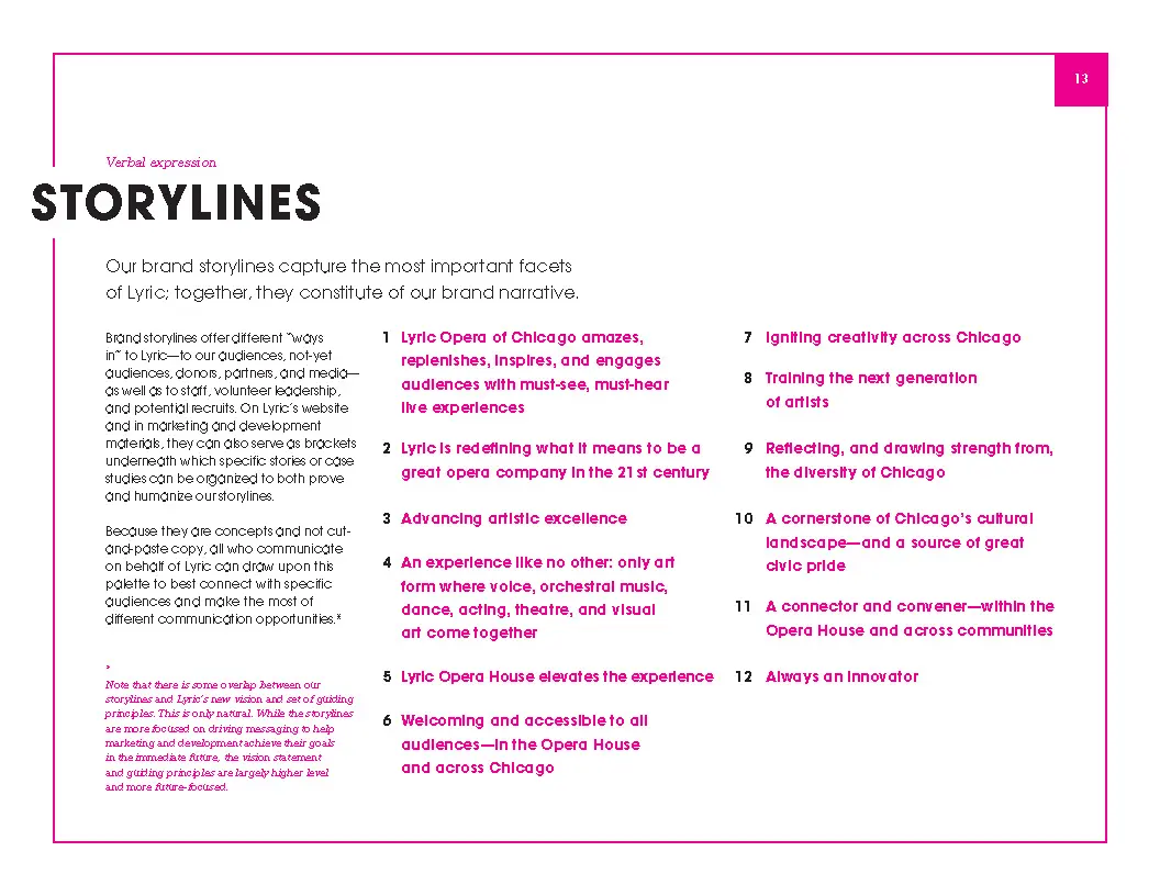
- Developed key storylines and messaging
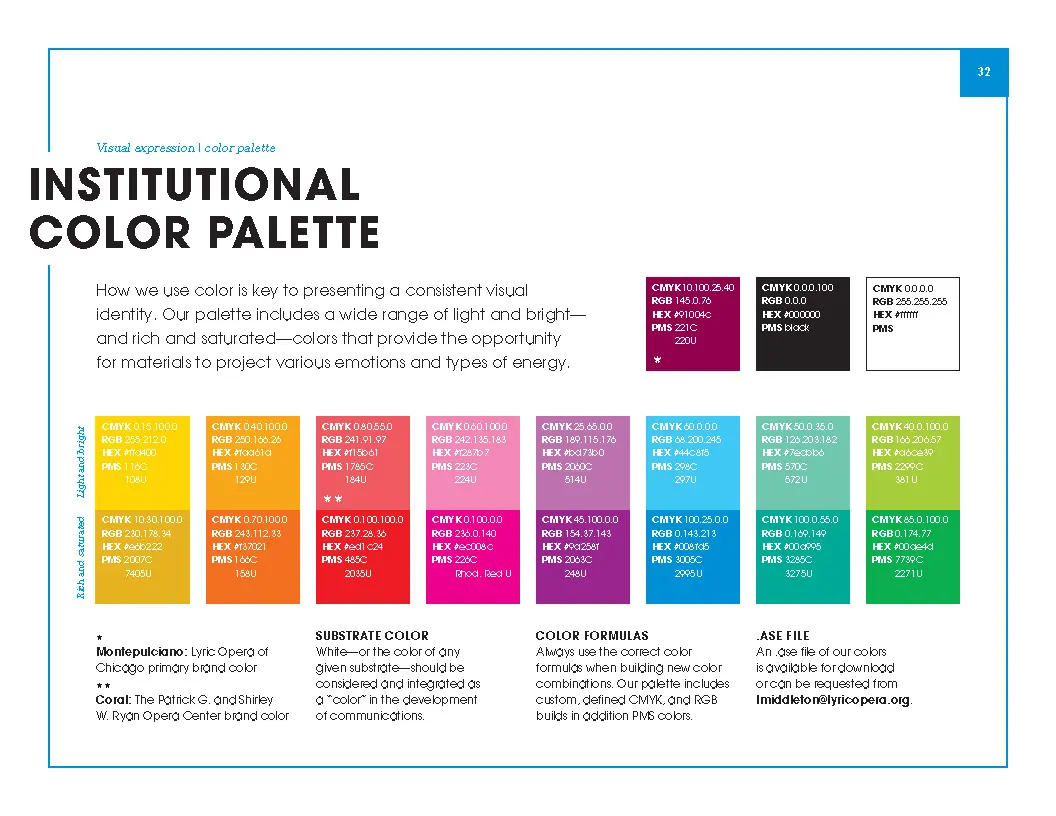
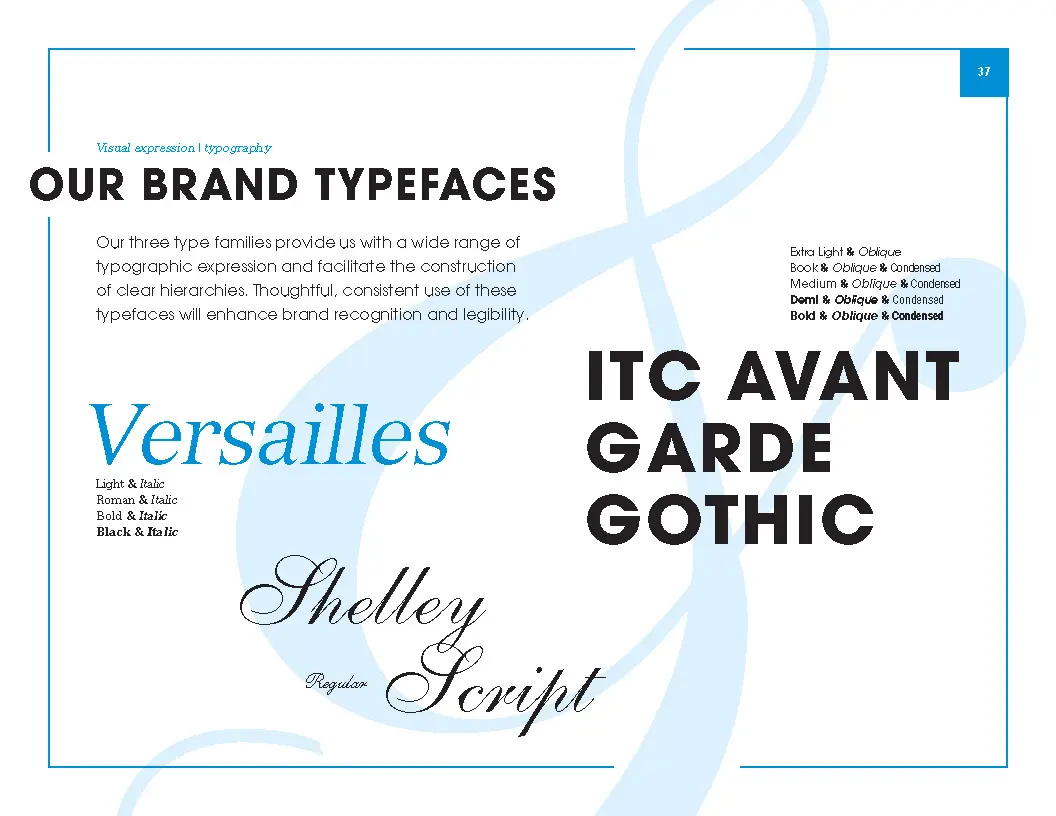
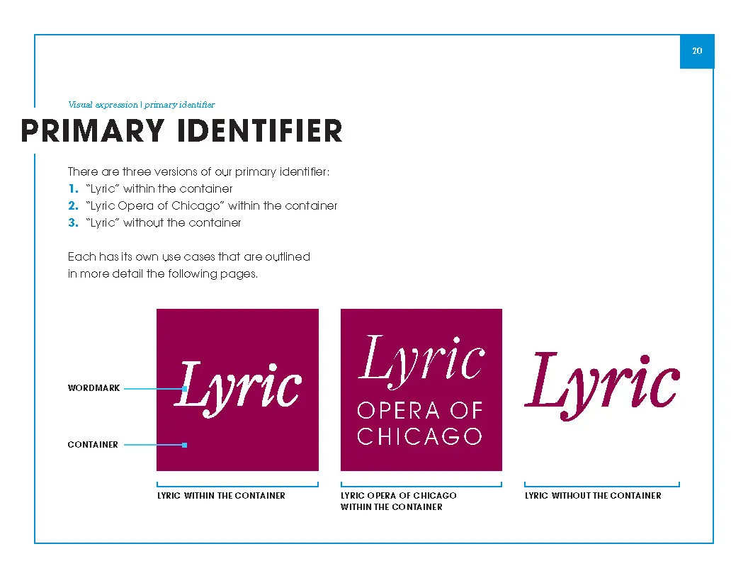
- Designed a new system for visual expression, informed by brand strategy and attributes
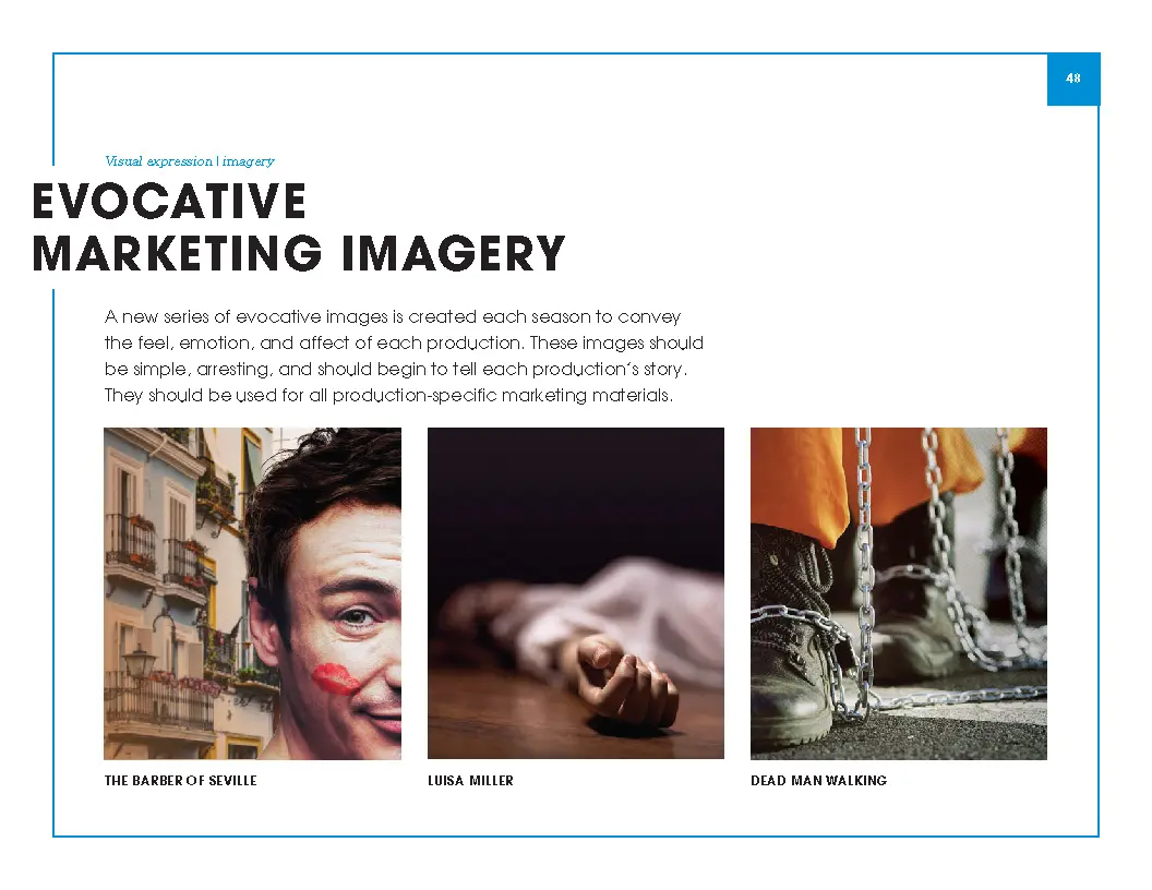
- Devised an evocative approach to imagery
- Produced a comprehensive suite of print / digital / environmental communications to support marketing, performance, and development
- Planned, designed, and launched a comprehensive new website
- Documented Lyric’s new brand system to enable all who communicate on Lyric’s behalf to be effective, creative, and on brand
Scope
- Extensive, inclusive qualitative research
- Internal and competitive communication audits
- Brand strategy /architecture
- Attributes / storylines /messaging
- Vision statement / guiding principles
- Visual system
- Print / environmental marketing communications
- New suite of development communications
- Website planning, user experience, design, testing, launch
- System documentation and training
A new vision—and the guiding principles that inform it
We collaborated to craft a new vision for the organization—undergirded by a strong set of guiding principles—that together are helping increase the relevance of Lyric’s offerings, draw on and integrate the diversity of Chicago, manage away misperceptions, and expand and communicate what opera can mean now—and into the future.
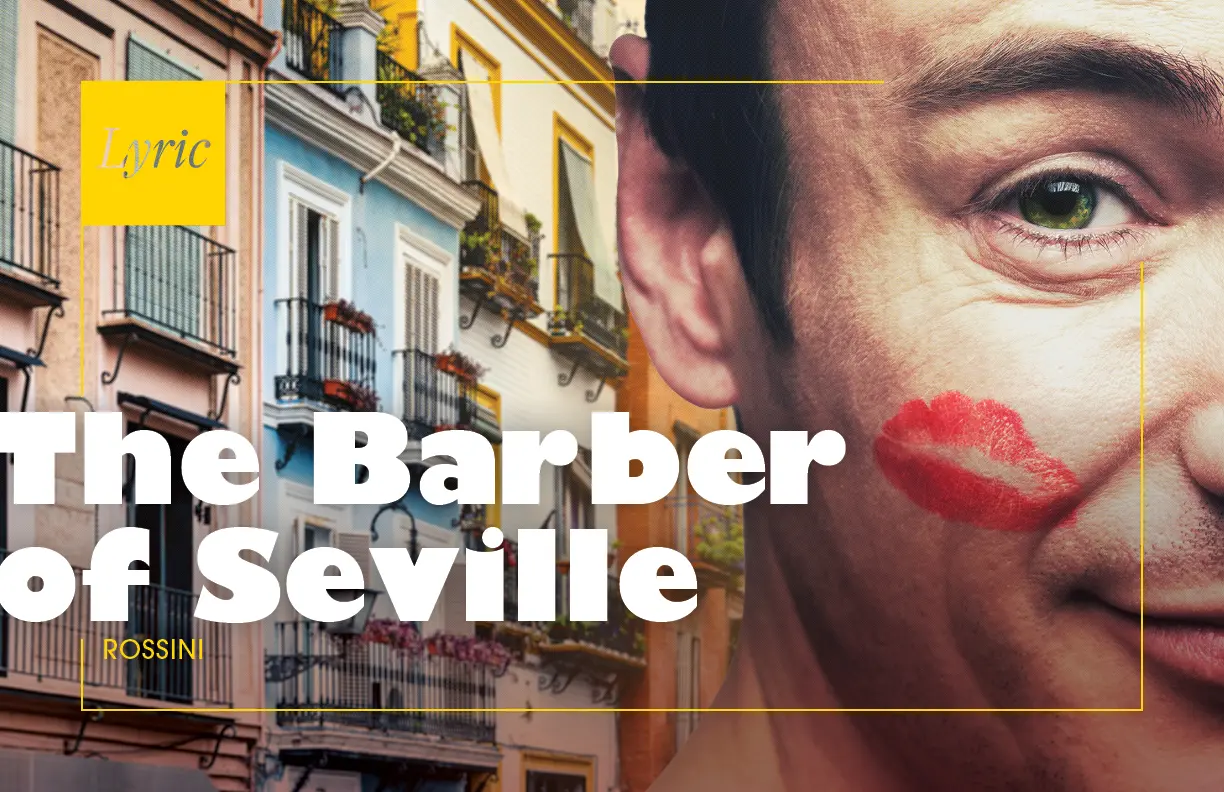
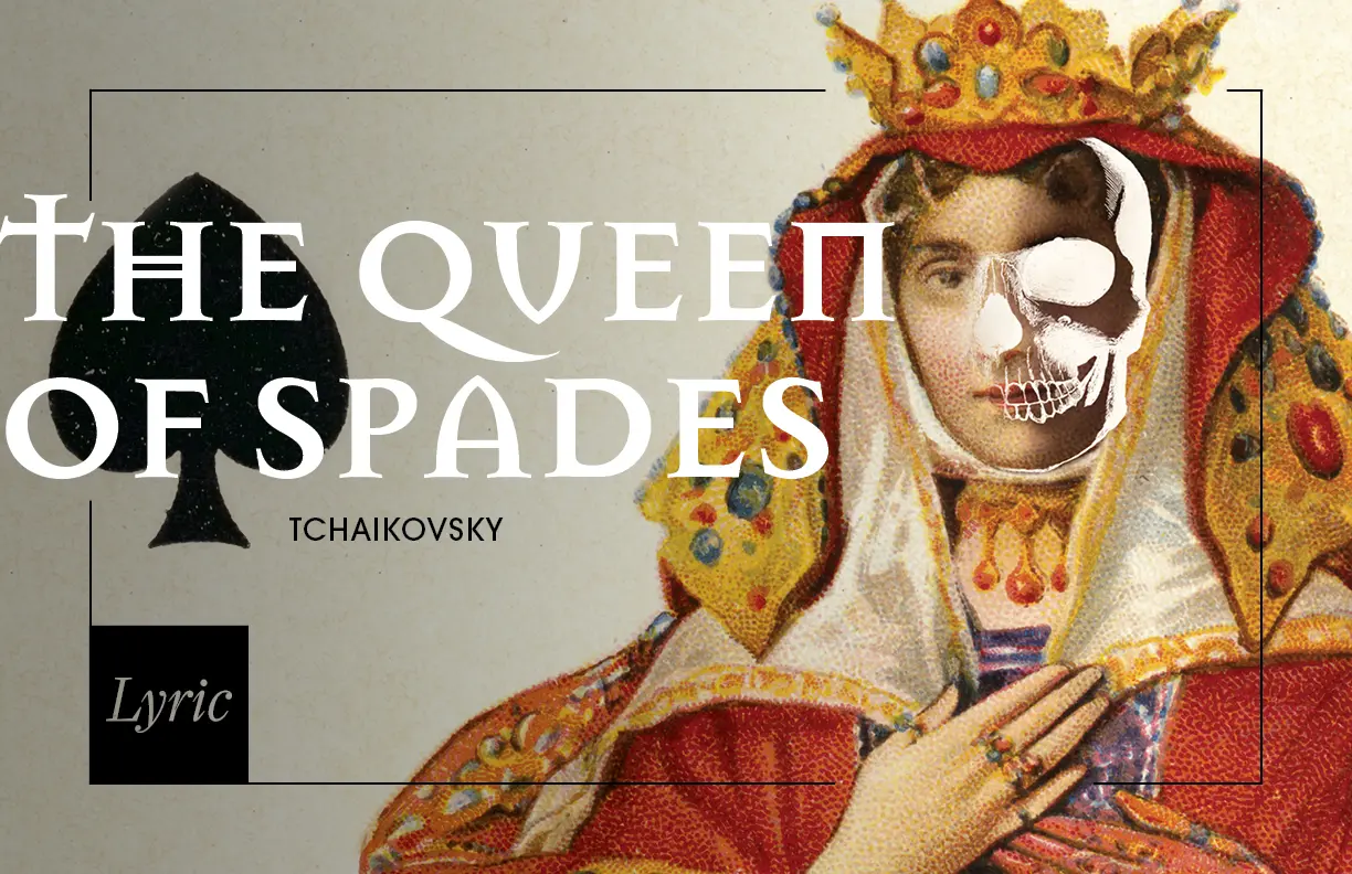
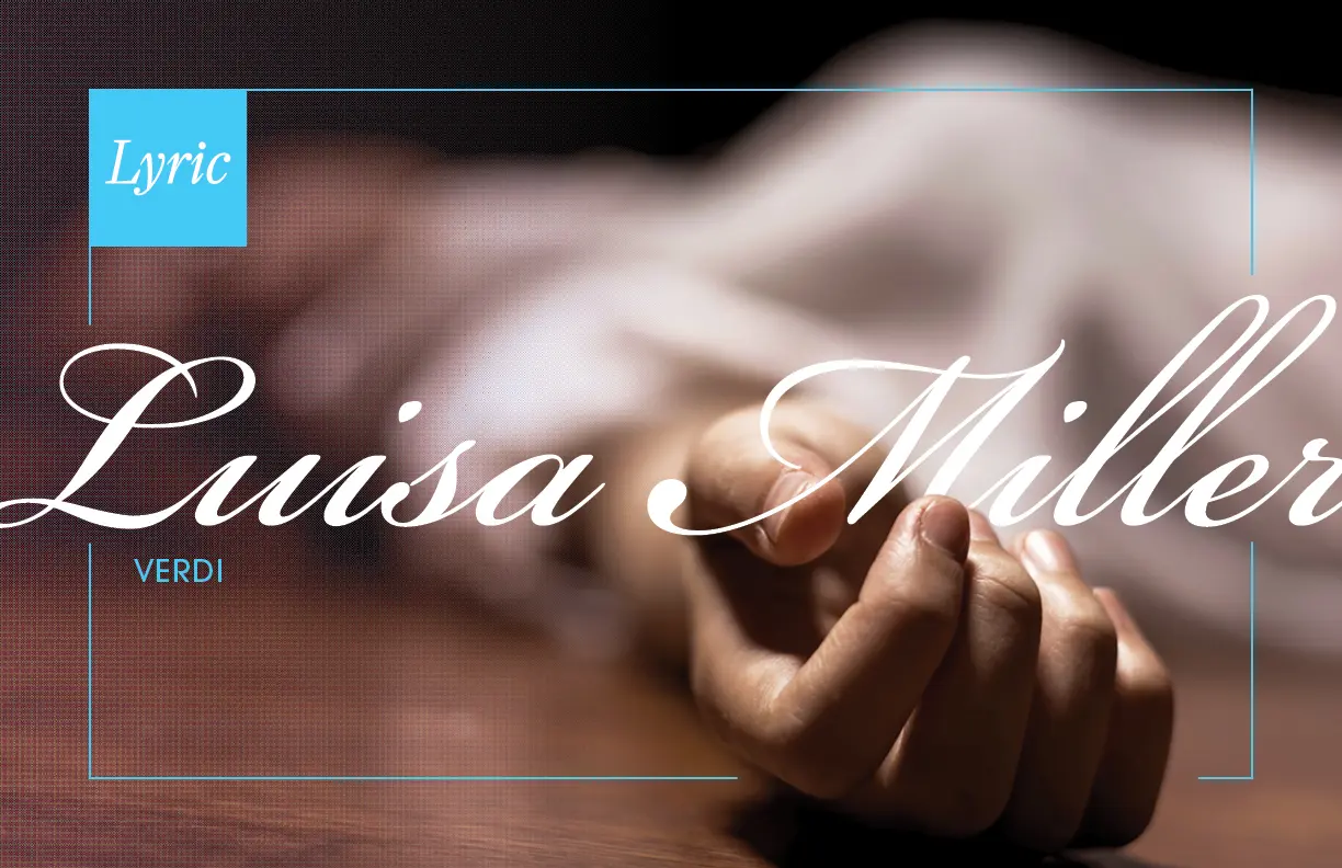
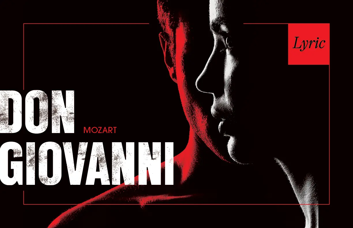
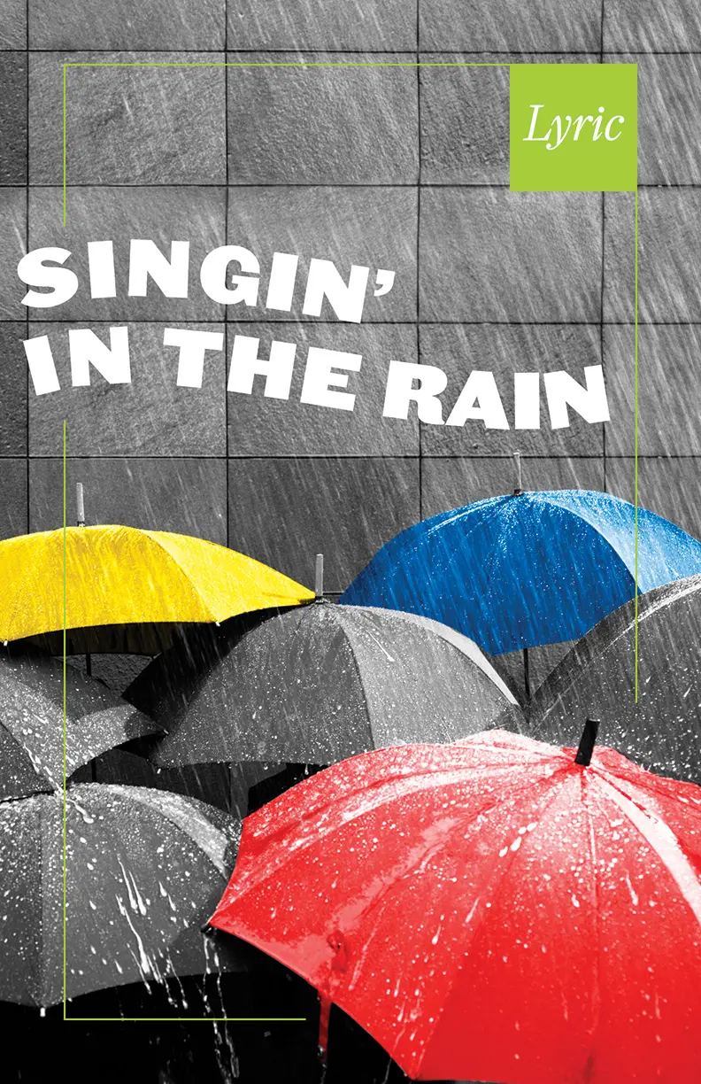
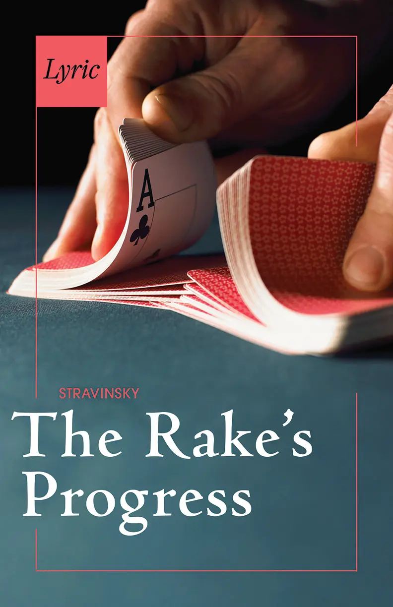
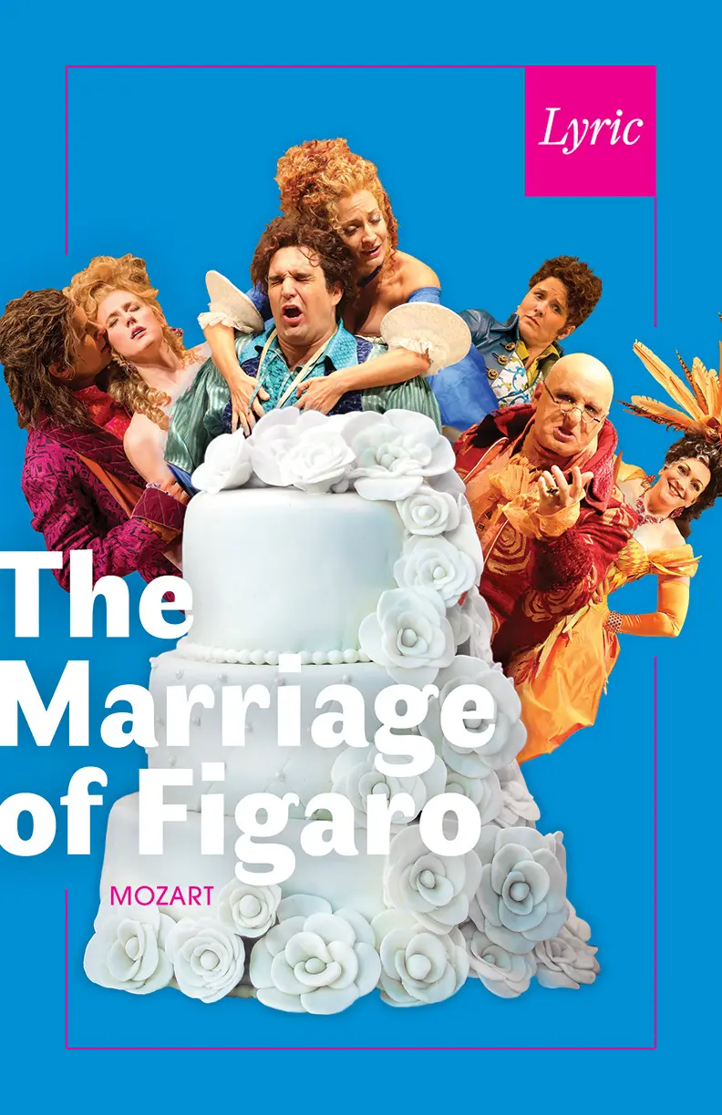
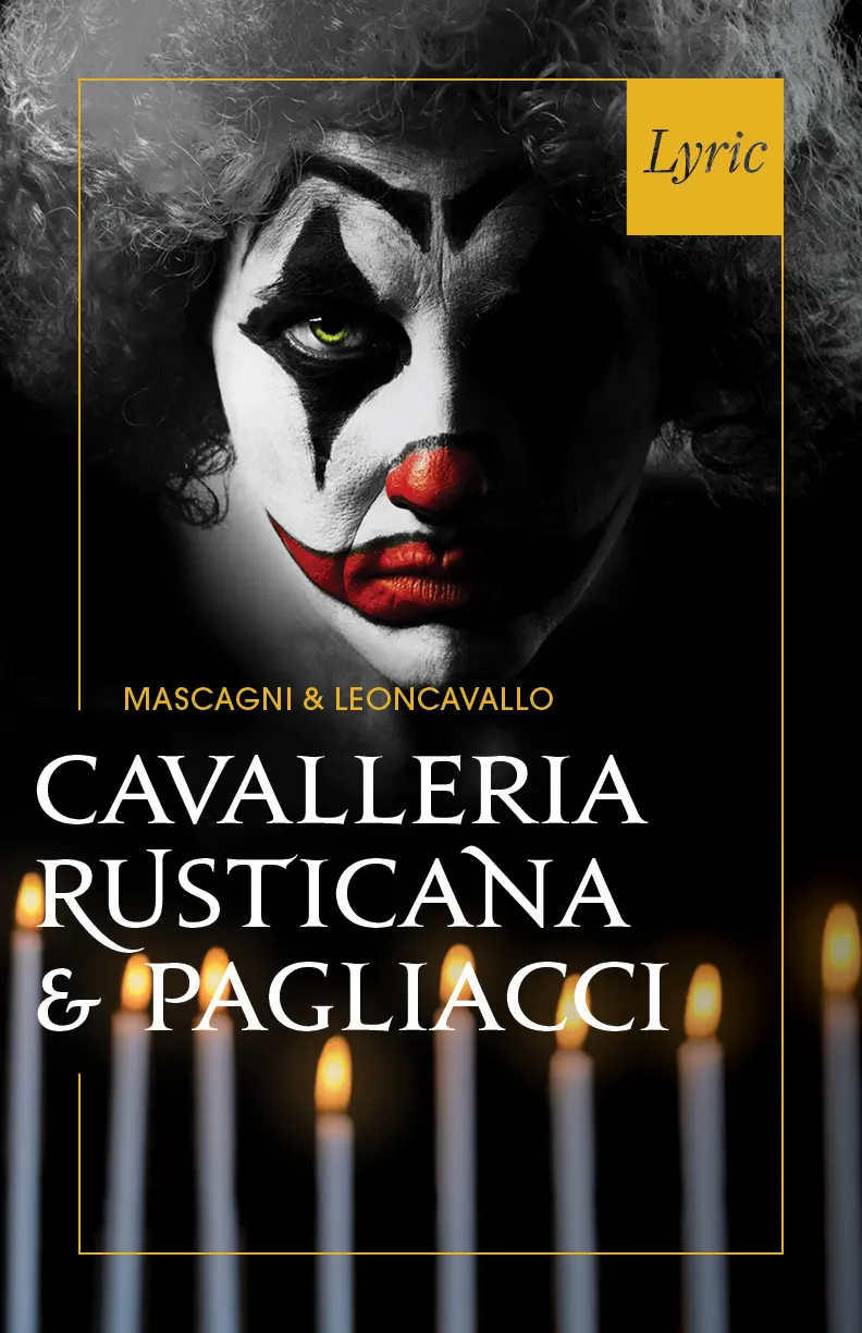
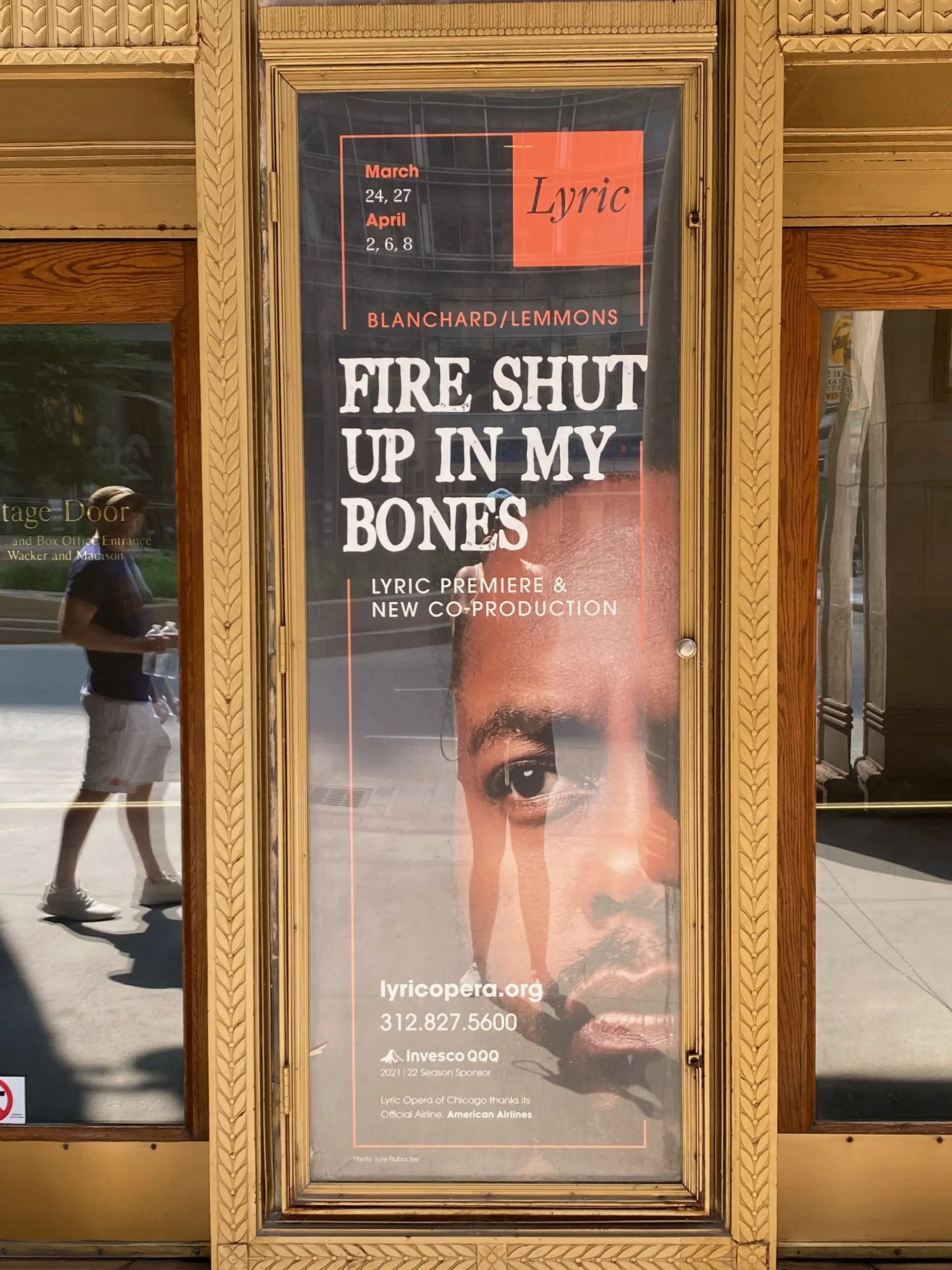
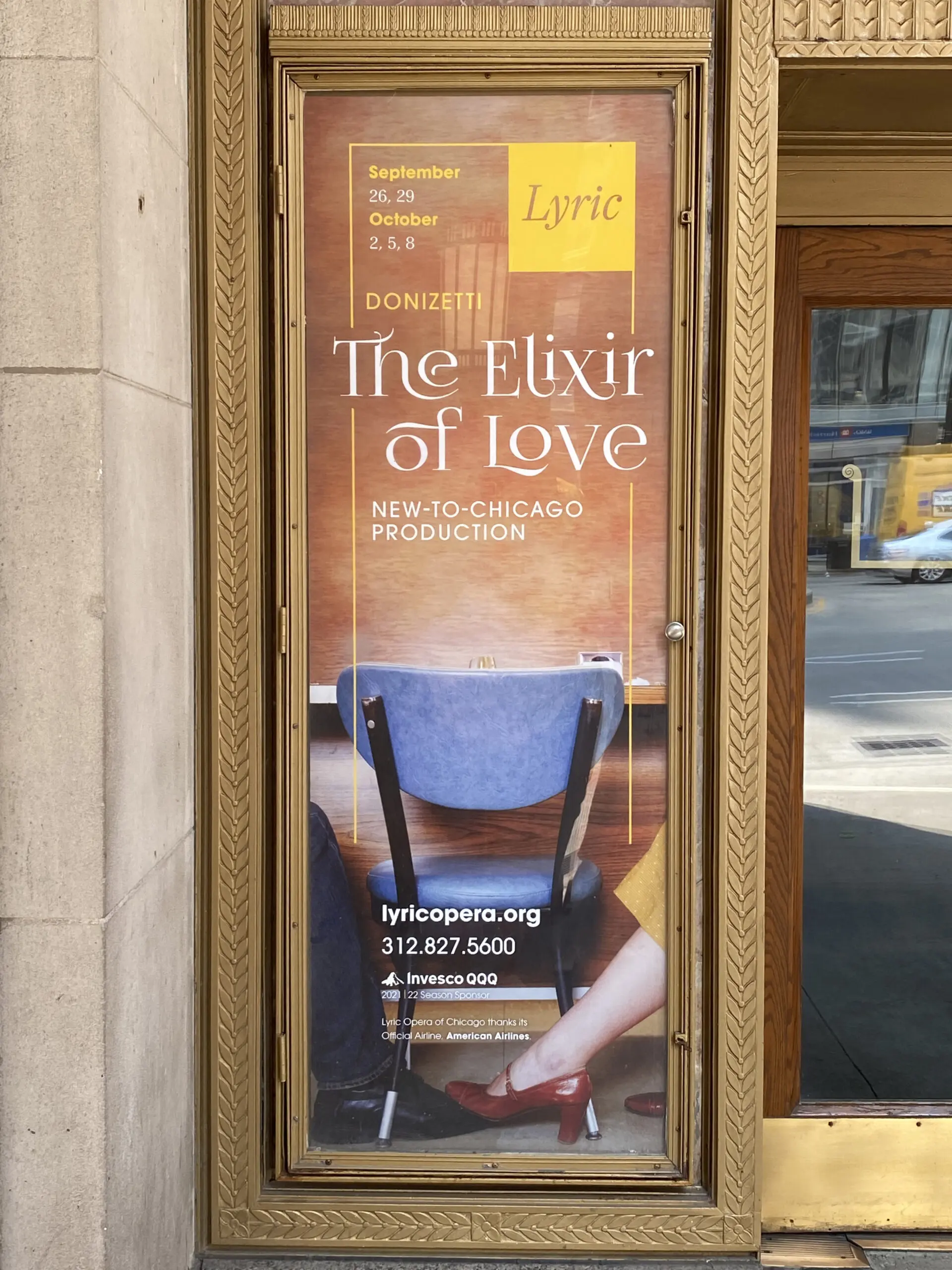
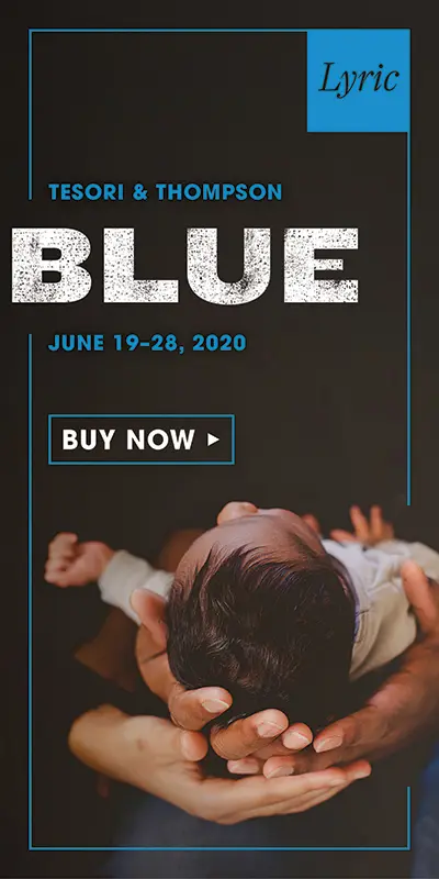
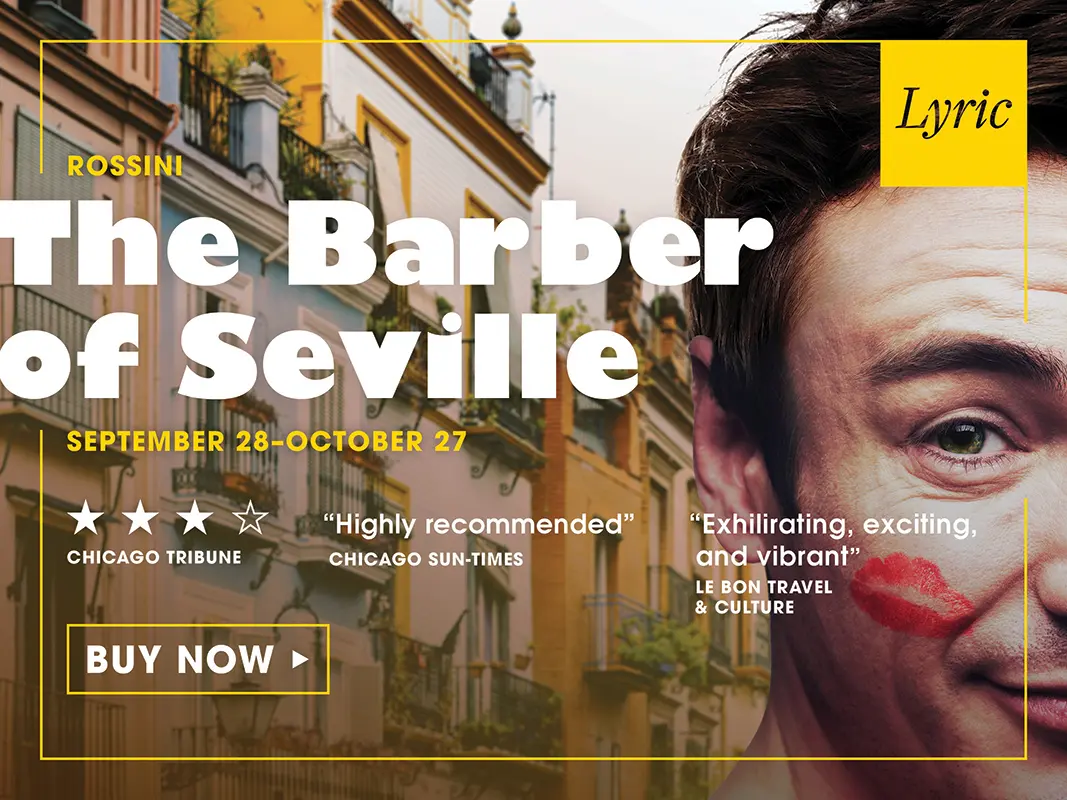
Emotive + evocative imagery to engage all audiences
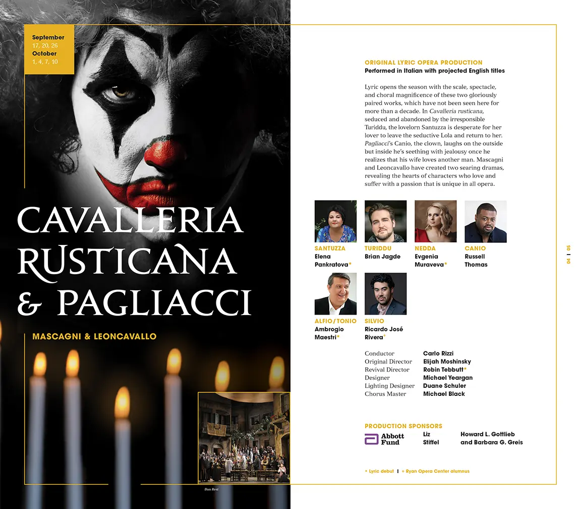
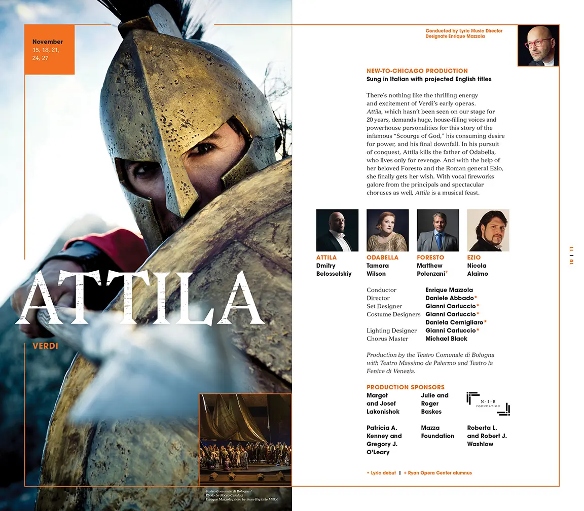
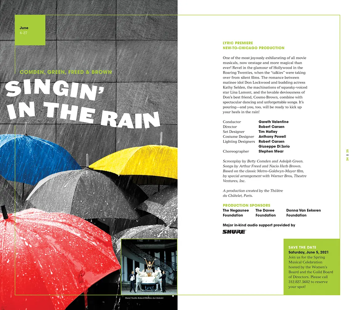
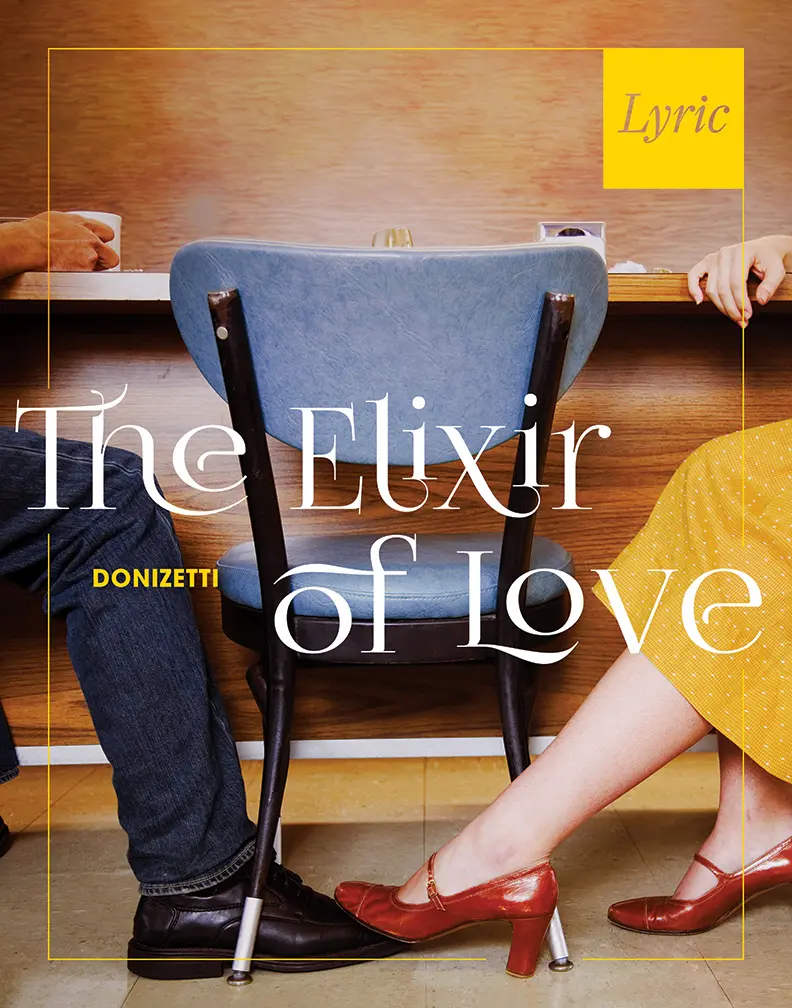
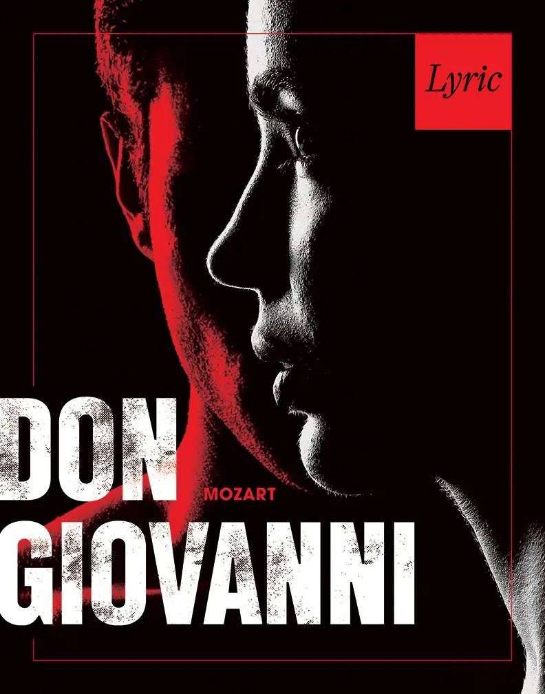
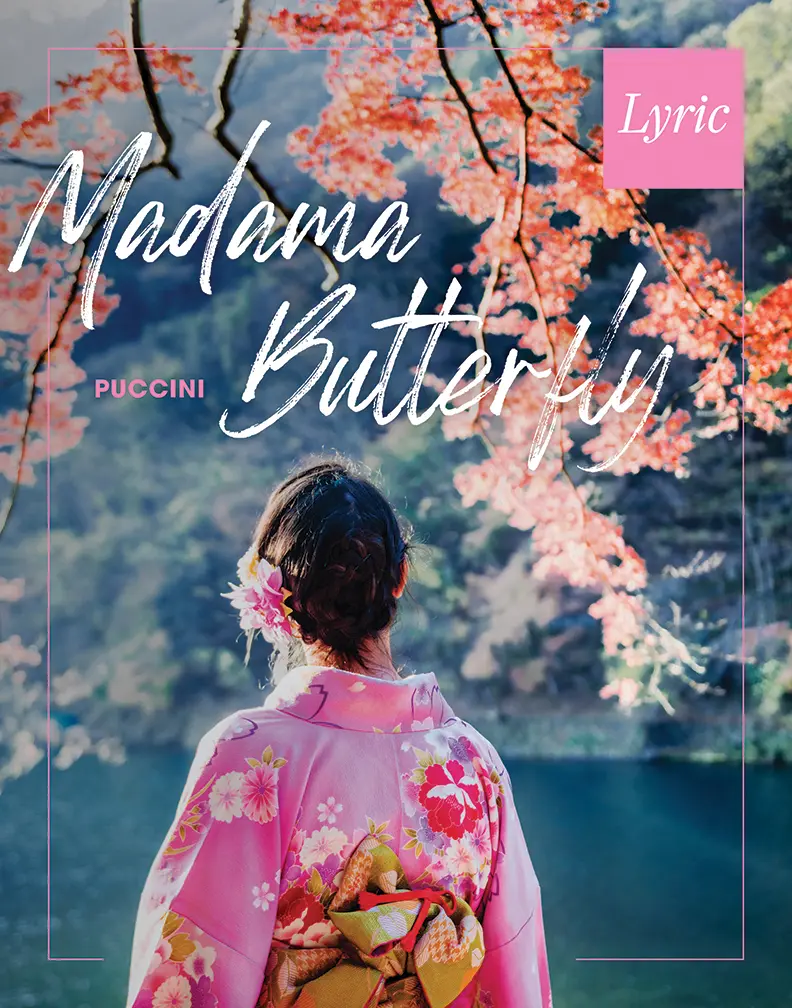
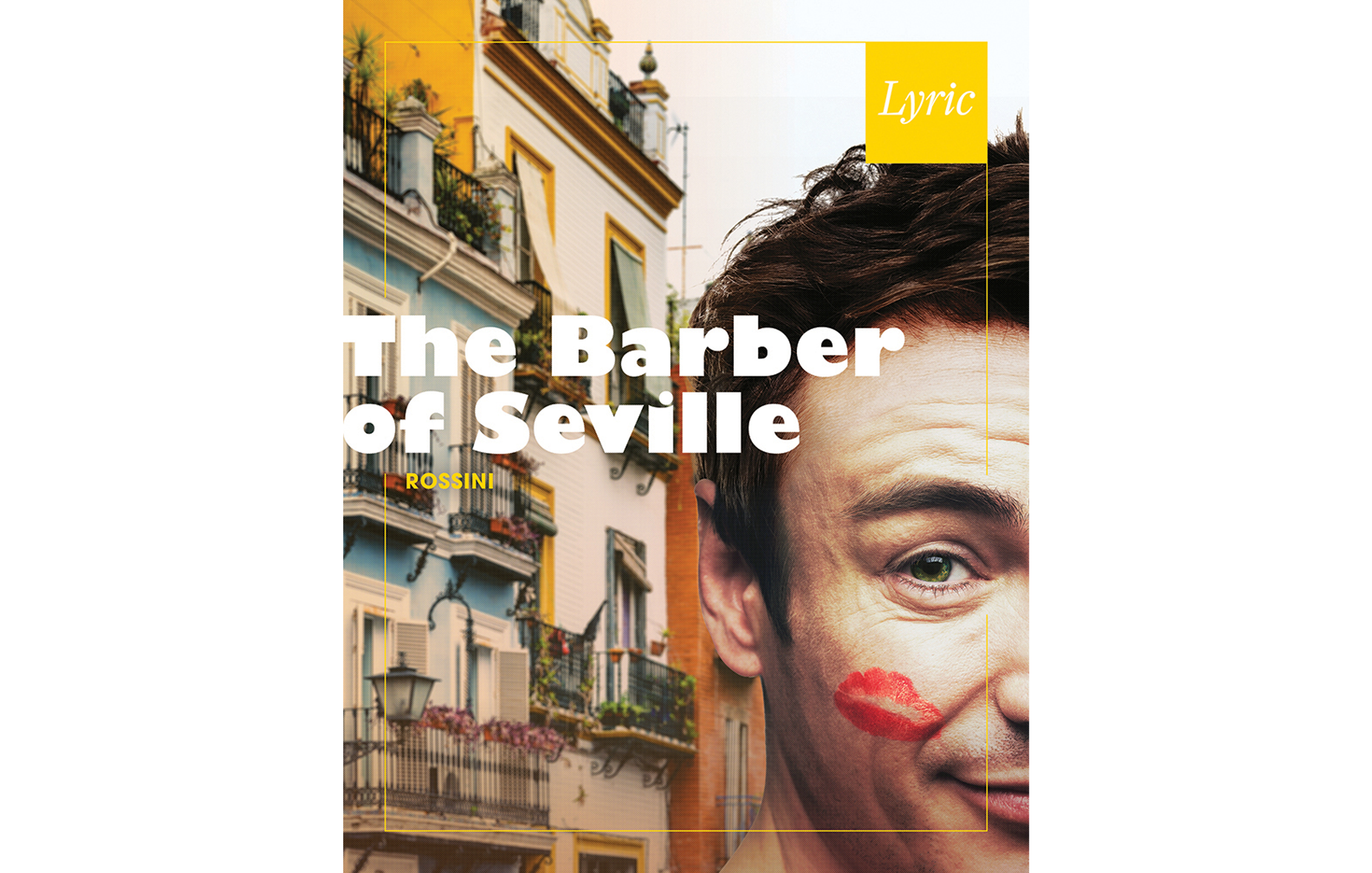
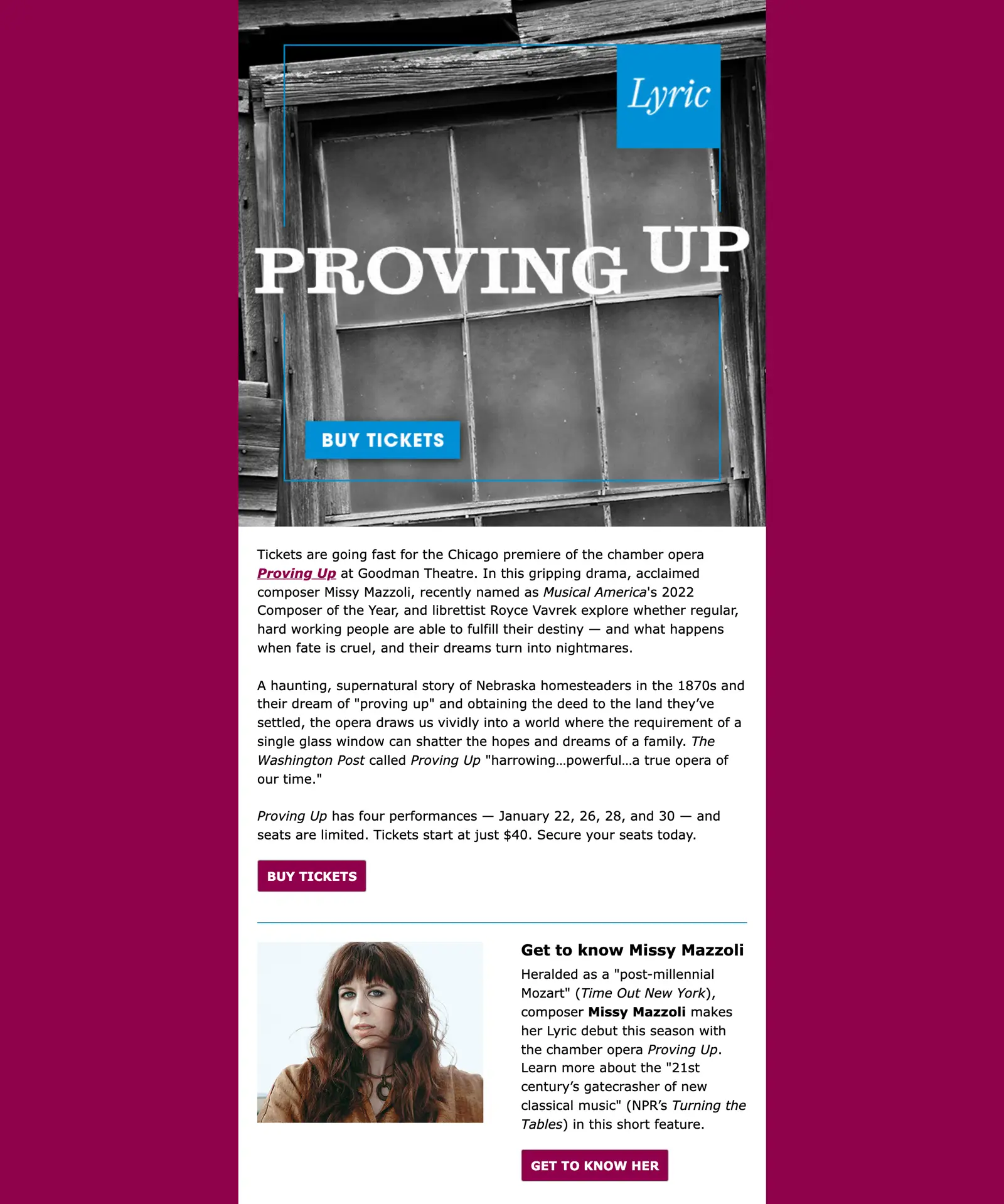
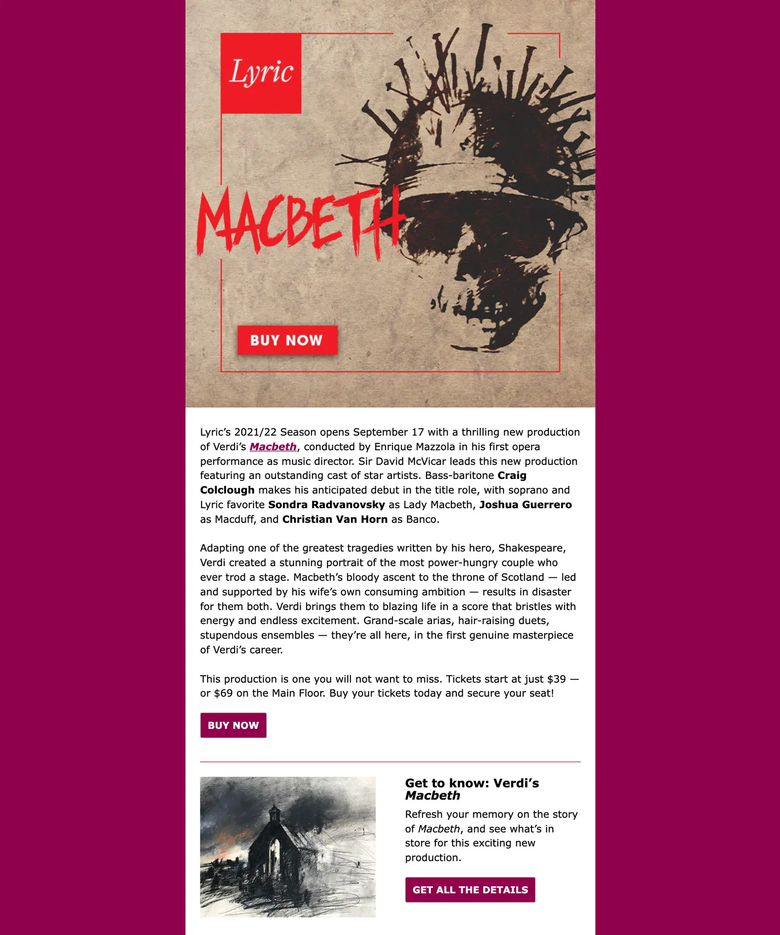
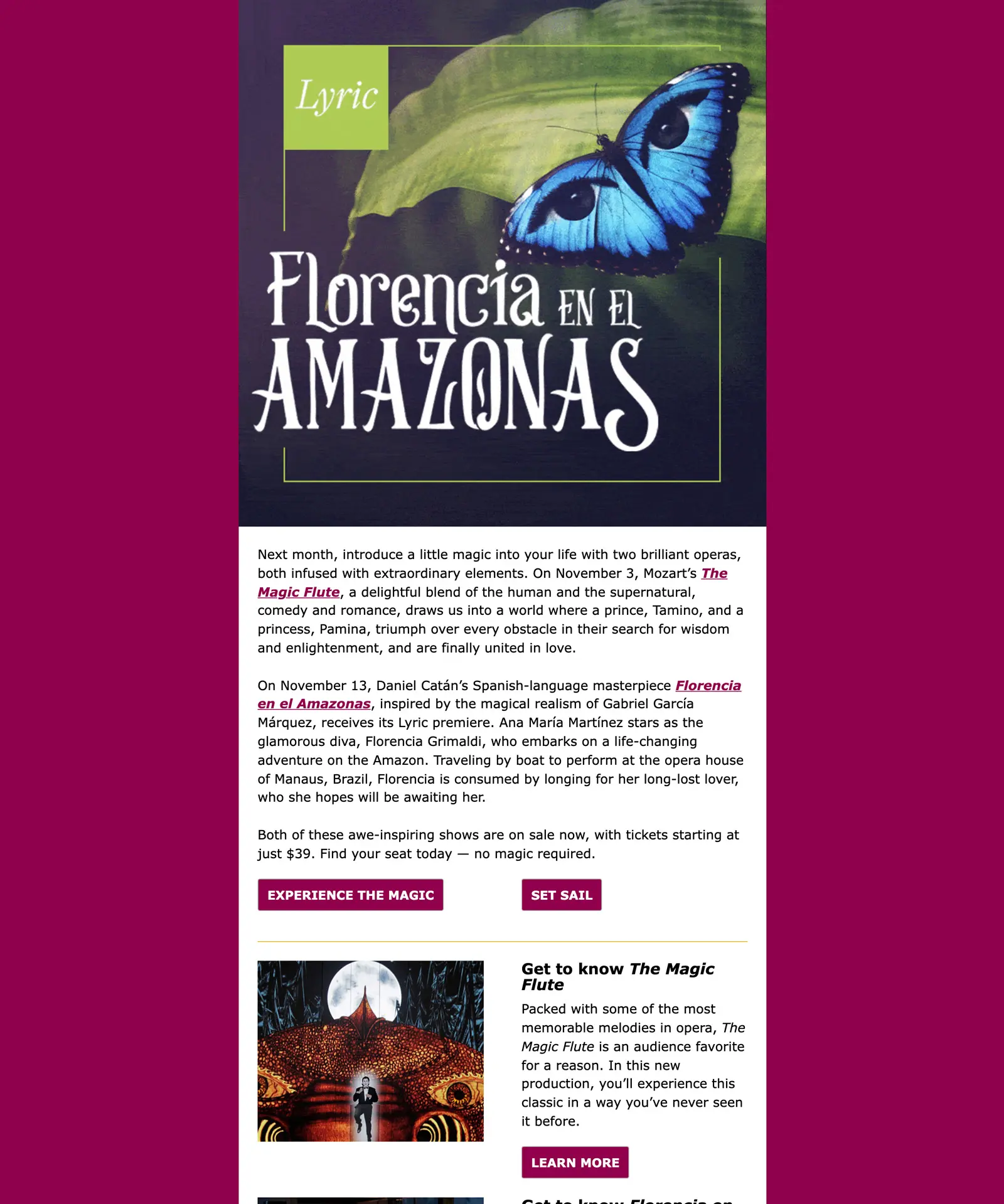
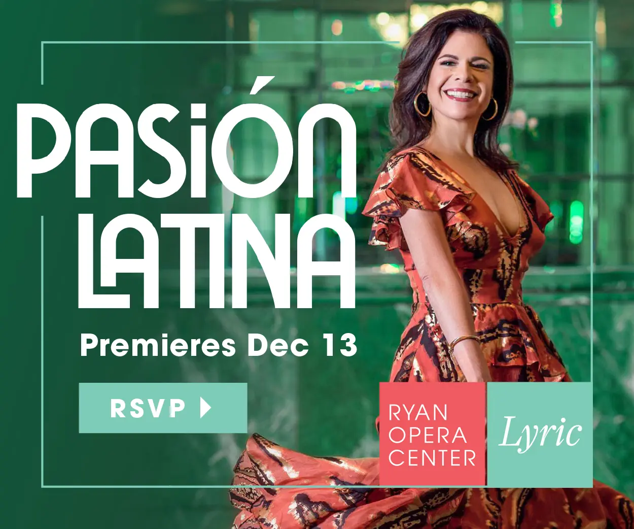
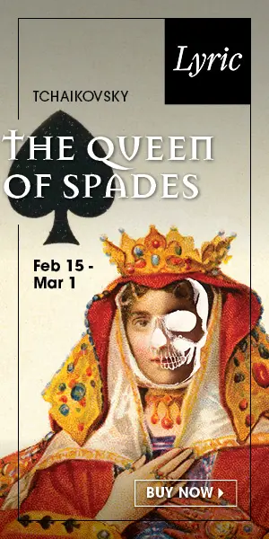
Across the country, opera companies have historically relied on wide, proscenium images of productions to promote offerings. While they show scale, they fail to engage the viewer. A new evocative approach to imagery gives both loyal and prospective audiences an intriguing, emotional way into productions—and sidesteps the ongoing problem of presenting images for shows that have not yet been staged, or images borrowed from other companies. Show-specific typography reinforces each show’s essence. These elements are then tied together by a strong Lyric framing device.
Our engagement with Sametz Blackstone was not a ‘rebranding’ so much as it was a ‘branding’ project. In Lyric’s 65 years, we’d never strategically thought about our brand, having been very tactically focused. In an organization as complex as ours, it was important that we achieve buy-in across the company. The Sametz team, through their inclusive process, engaged everyone from artistic staff to union stagehands, from board leadership to orchestra members, from civic leaders to prospective donors— enabling them to learn and then articulate who Lyric is, for whom, and why that matters.”
Lisa Middleton
Vice President, Marketing and Communications, Lyric Opera of Chicago (former)
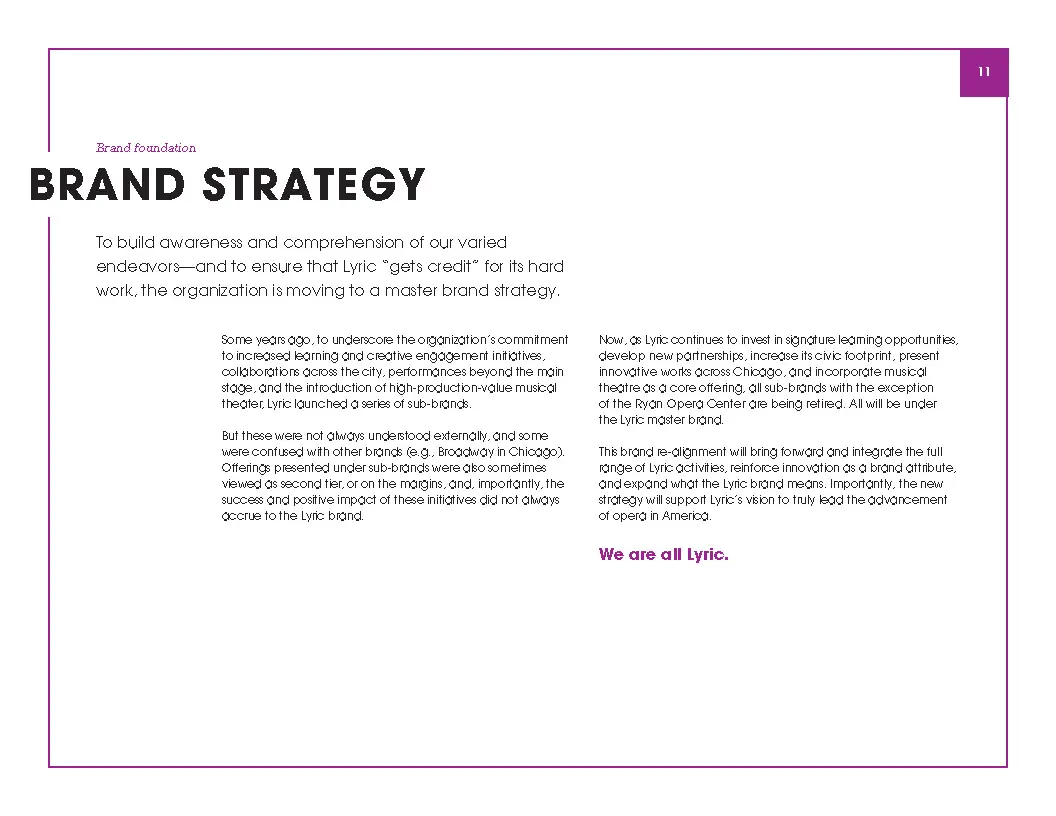
An evolved brand strategy and architecture
Based on wide-ranging qualitative interviews, internal and external communication audits, and a strategic assessment of Lyric’s many offerings and how they were promoted, we developed a set of guiding brand attributes, key storylines and messages, and a brand architecture that replaced disparate names and logos with a system that ensured that the value of the company’s different efforts—innovative chamber operas, recitals, musical theater, and creative engagement with Chicago public schools and the city’s diverse communities—accrued to Lyric and the Lyric brand.
Historically, the company had promoted offerings, one at a time, marketing each from the “bottom up.” Lyric’s new brand strategy combines offering-specific marketing with a “top-down” verbal and visual brand narrative that gives context and adds value to all their offerings.
Lyric’s “brand frame” further unifies the company’s offerings.
Show-specific, emotional imagery—and typography—provide both loyal and prospective audiences with compelling “ways in” to productions. High-level, institutional messaging communicates key brand storylines and is interleaved with show spreads.

Making the most of every communication
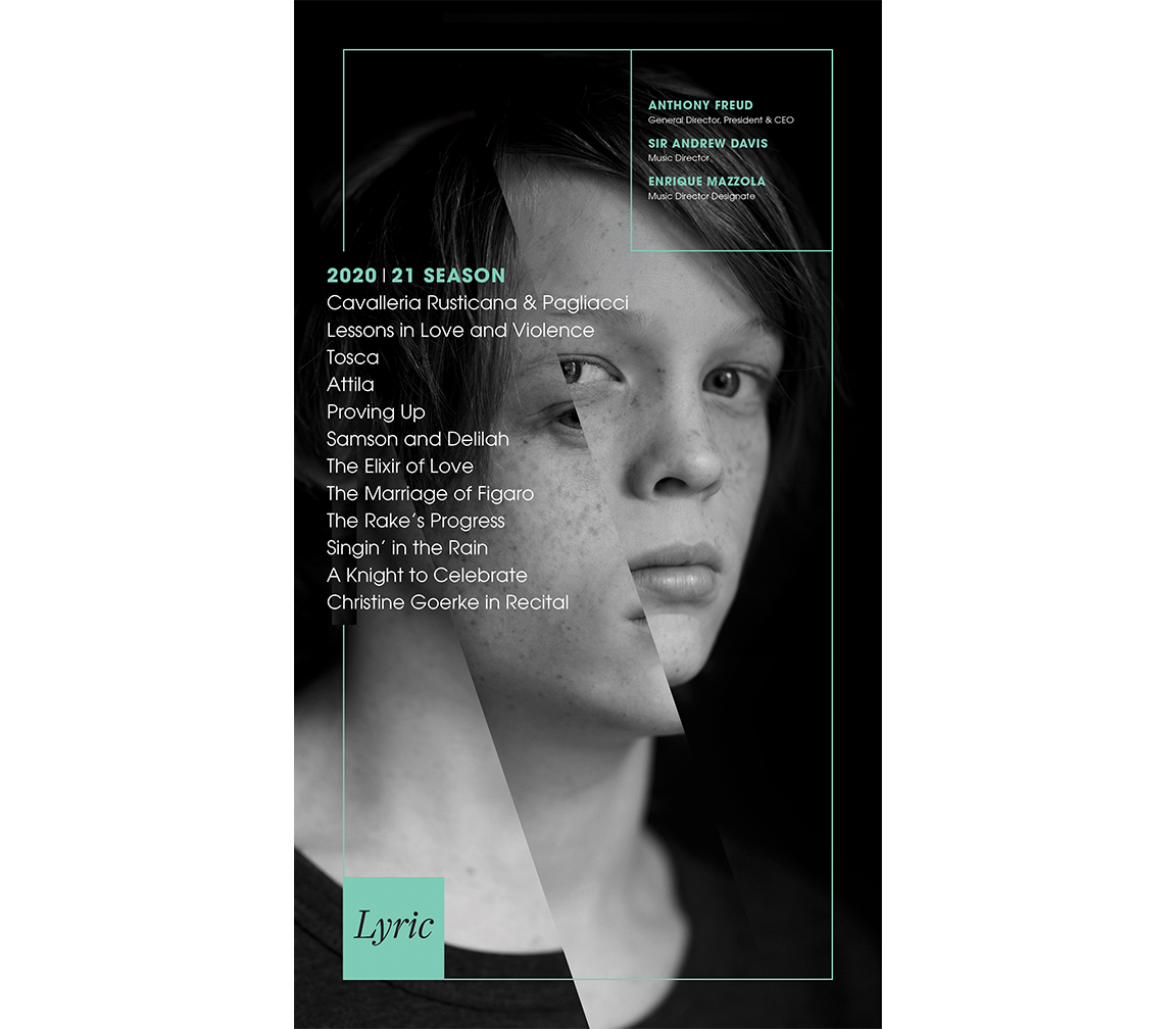
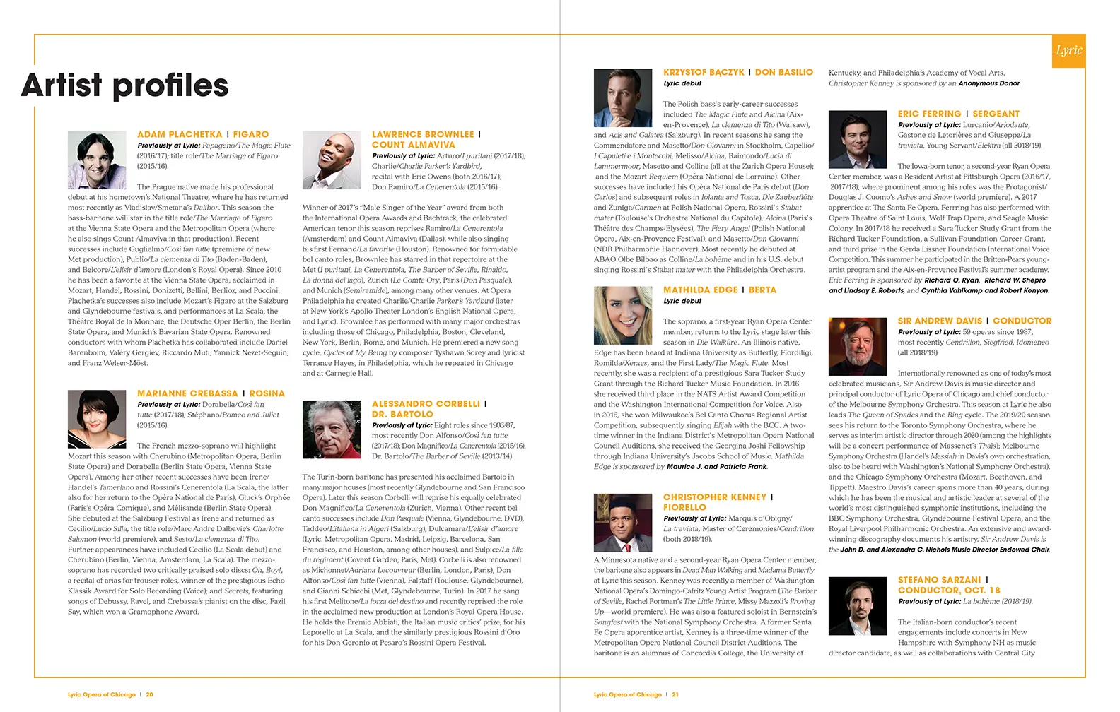
A new architecture for program books informs audiences about more than just that night’s offering. Spreads incorporate high-level brand messaging, bring forward Lyric’s work across Chicago, and both cultivate and thank donors.
Program book covers
Program book spreads


The visual system ensures consistency and flexibility: marketing materials will look fresh and build brand equity, year after year. And our evocative approach to imagery separates us from other cultural institutions and underscores our commitment to visual inventiveness on the stage.”
Lisa Middleton
Moving fundraising from transactions—to investment
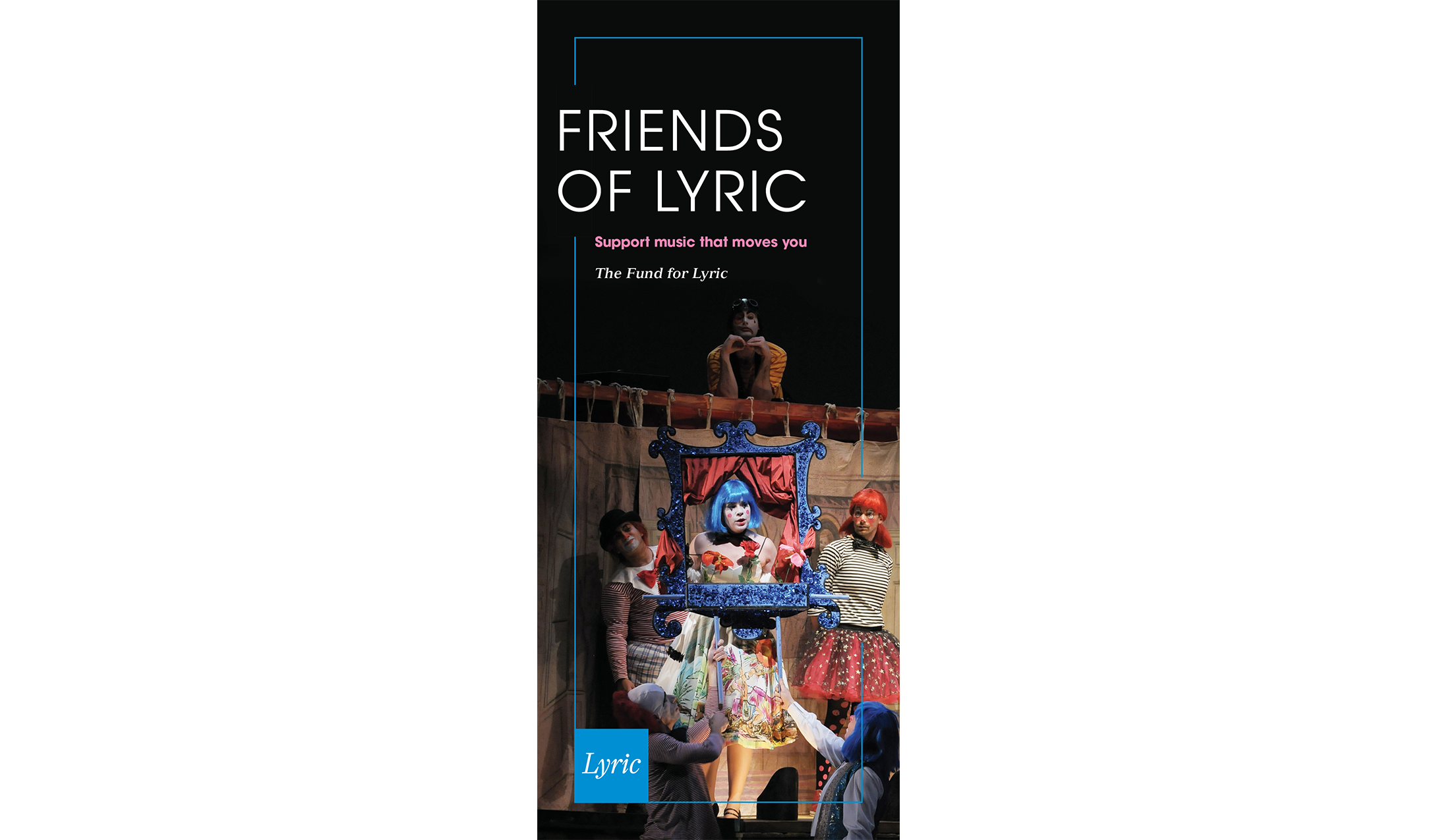
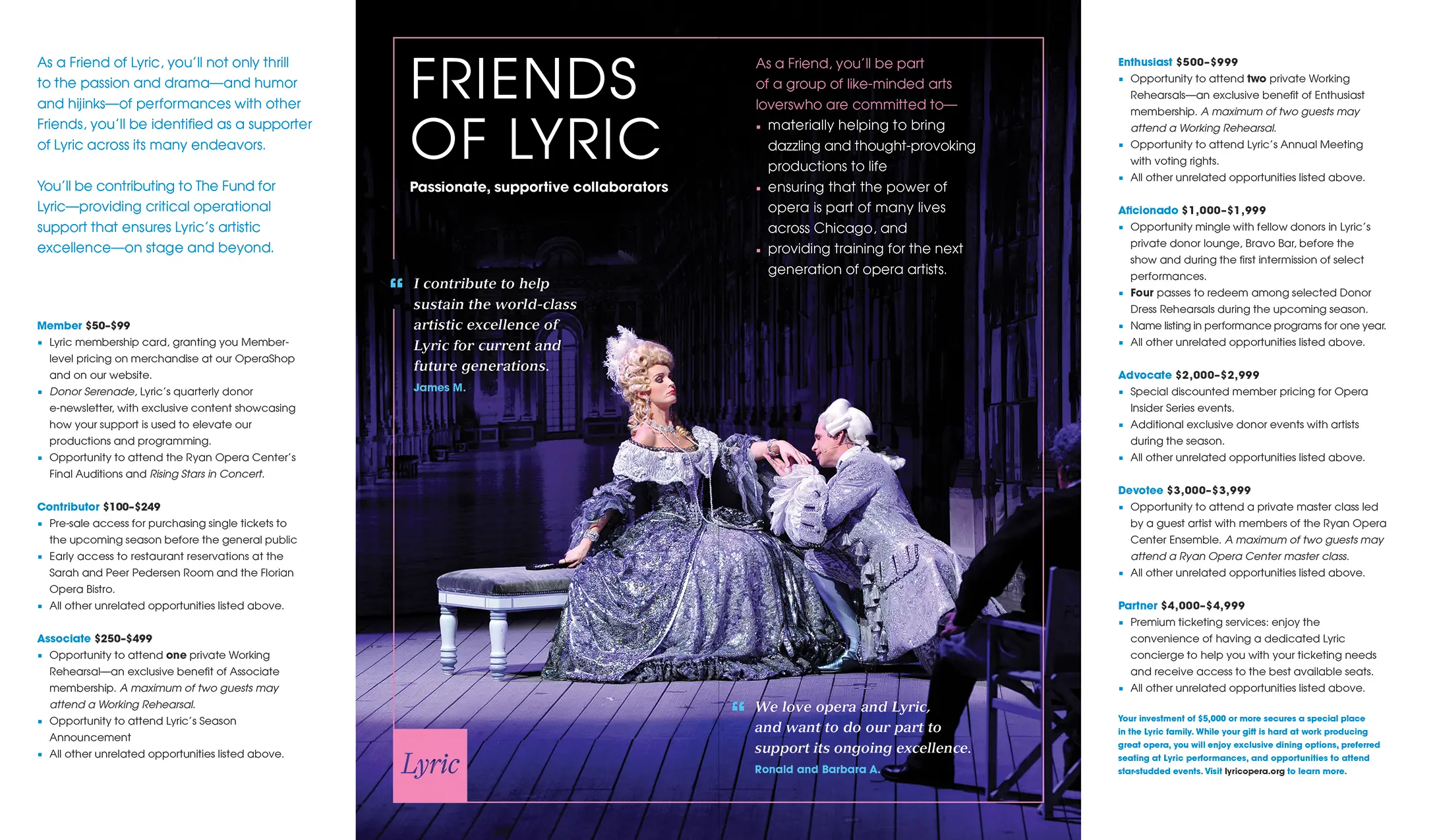
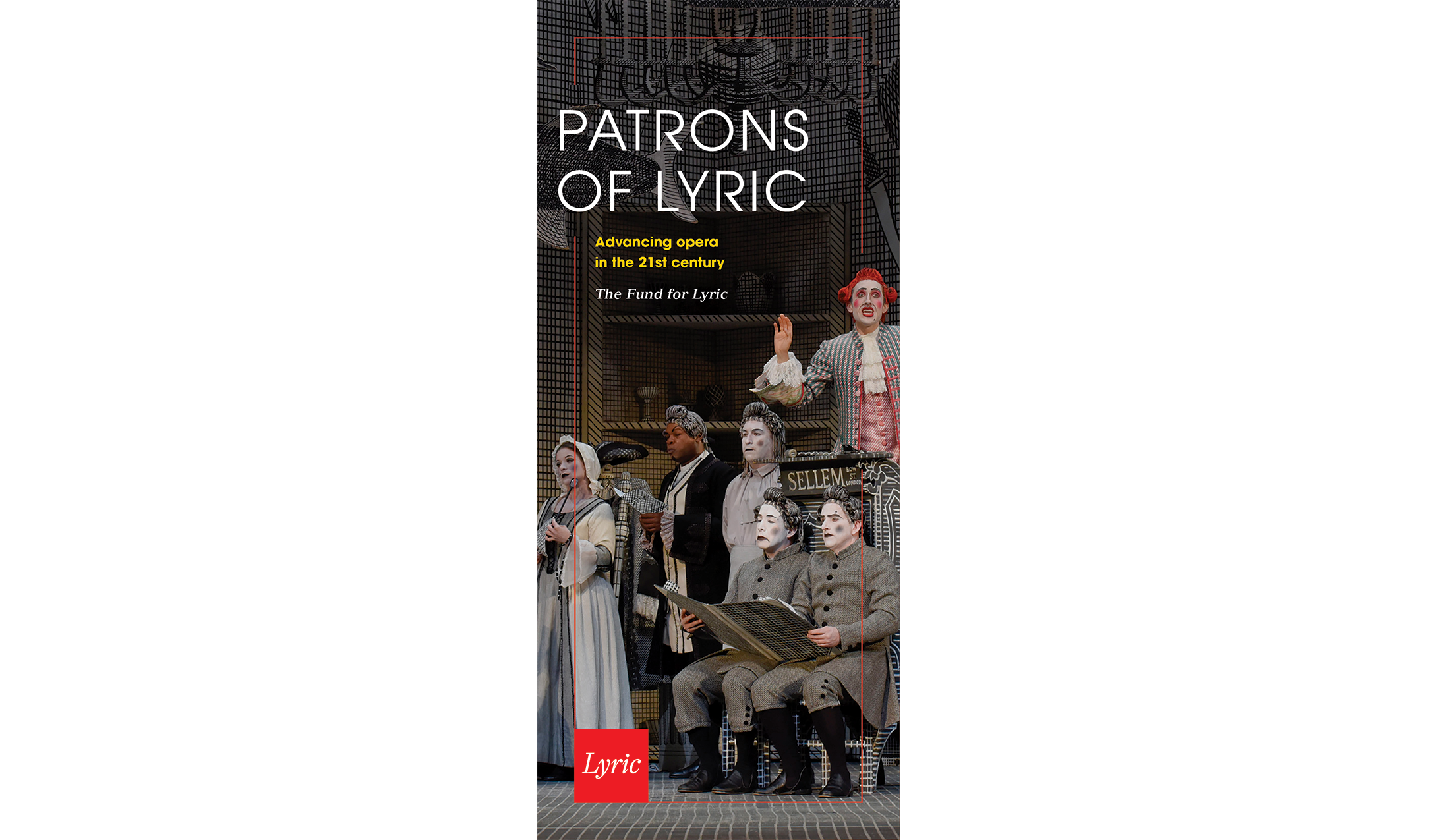
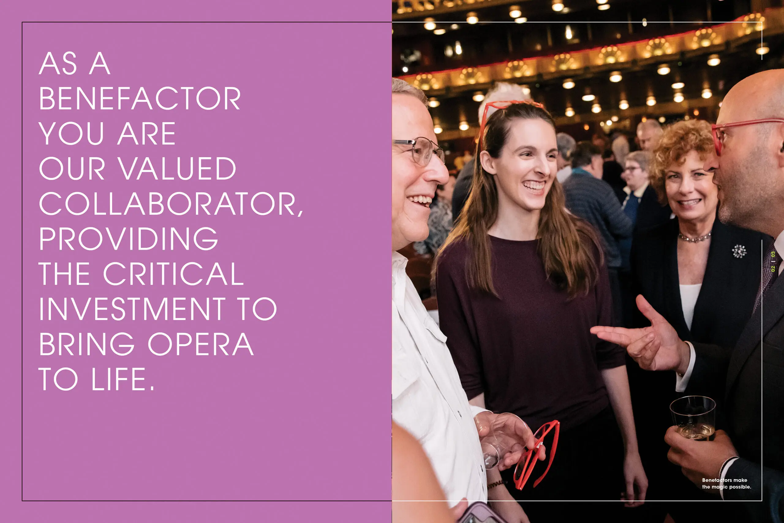
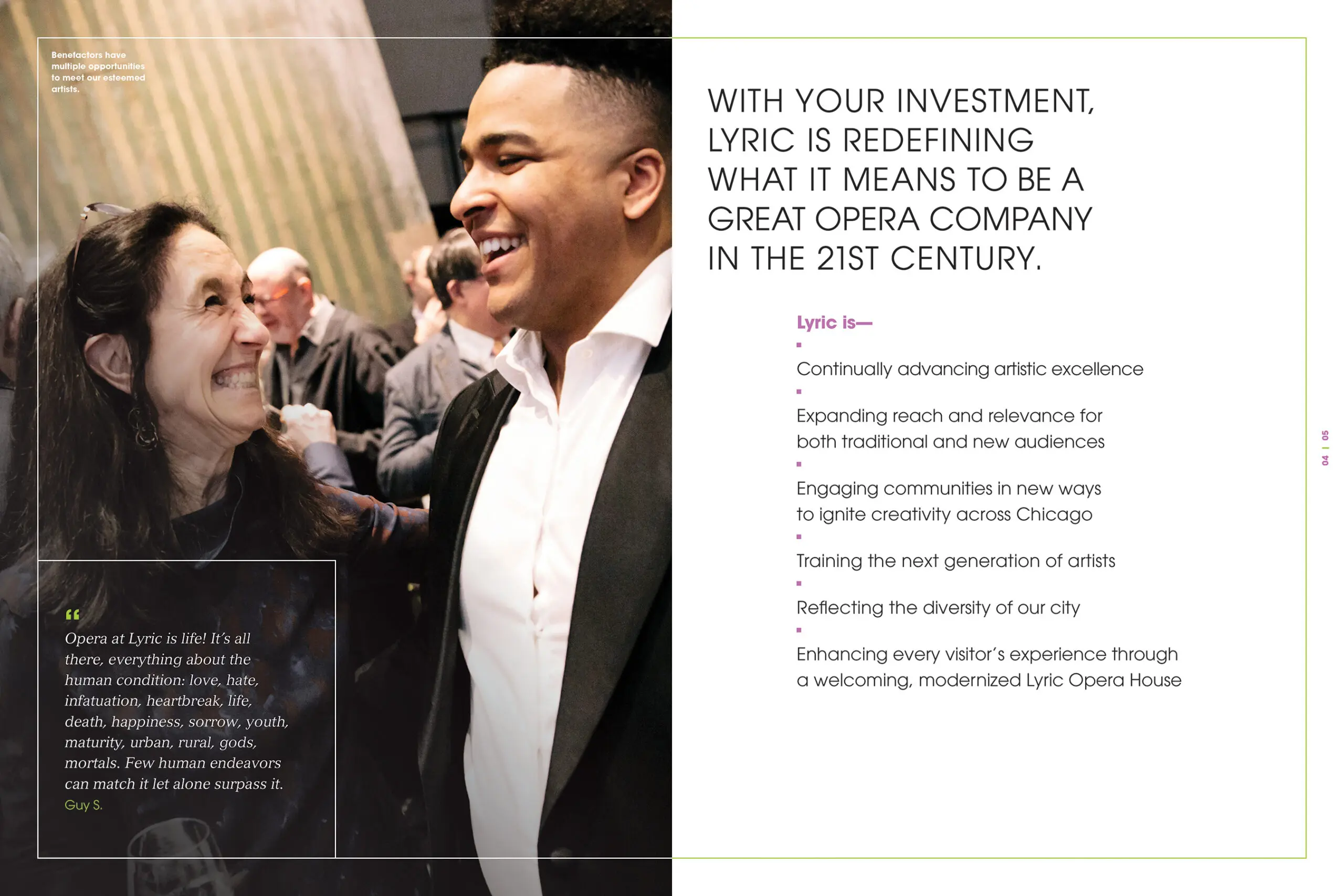
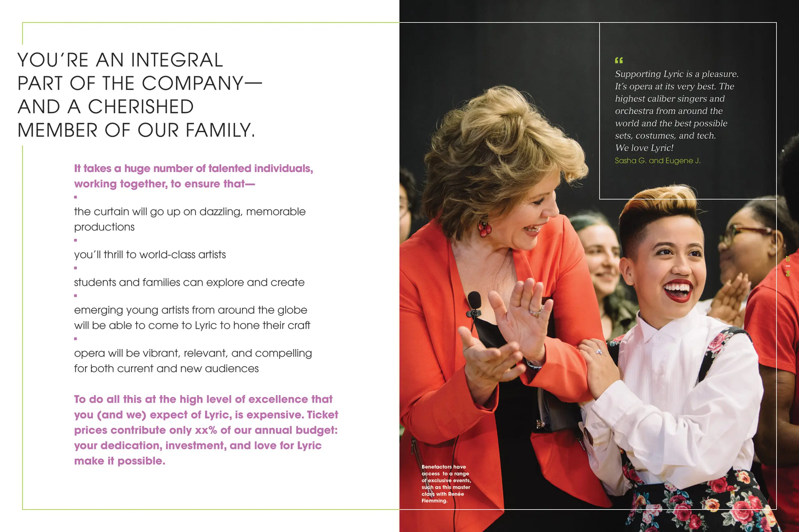
We worked with senior leadership to reimagine an architecture and messaging framework for development communications that advance a culture of philanthropy. Moving away from membership and a transactional approach to giving, we crafted new, fewer levels, and within each made donors feel that they were essential artistic collaborators—part of the Lyric family. The attributes and storylines developed as part of the larger branding project inform the messaging—and within each level “why” one should “invest” is brought forward.
The Friends entry-level piece encourages prospective donors to join the “family.” The next level Patrons piece invites donors to be part of advancing Lyric’s vision.

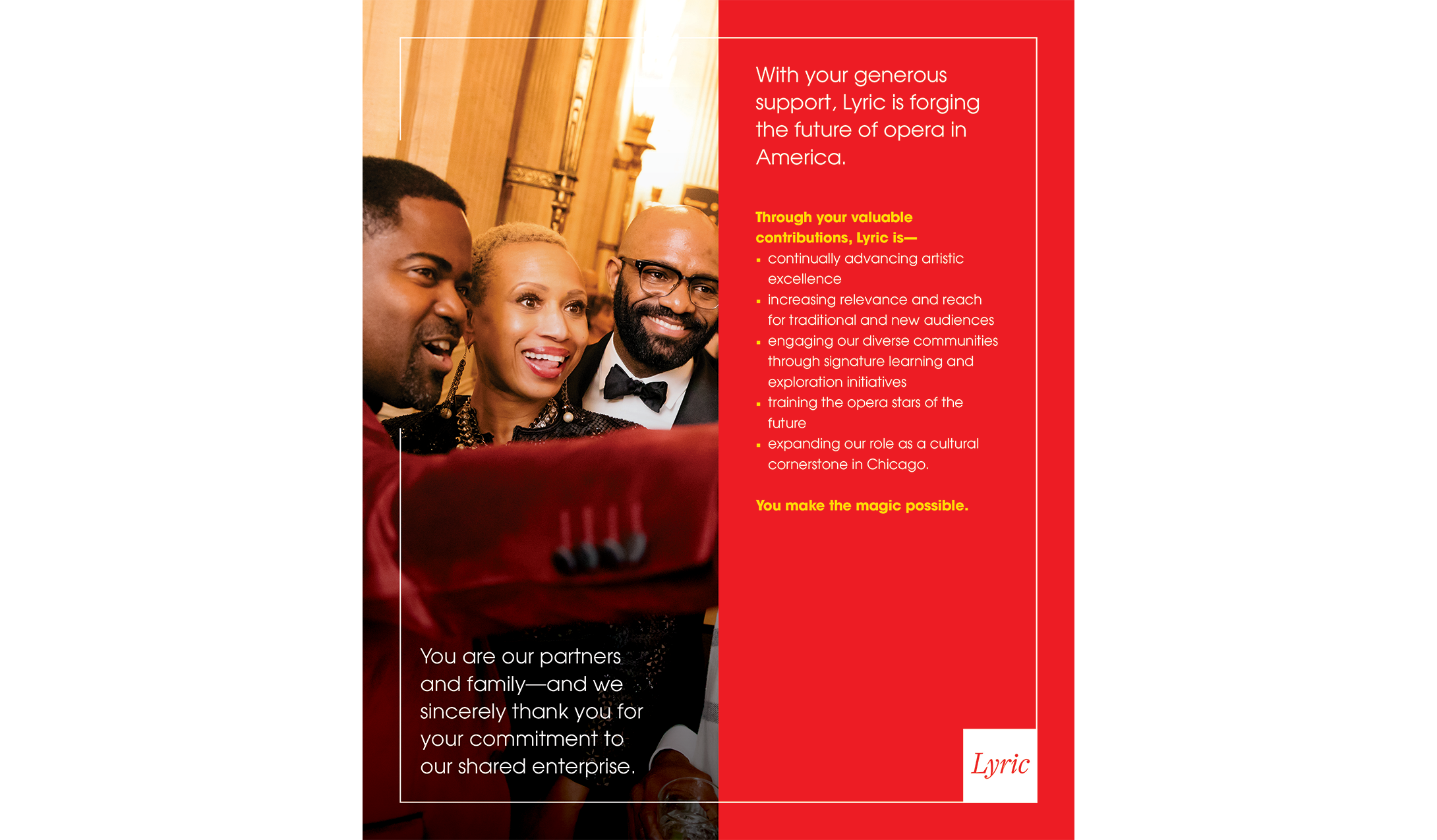

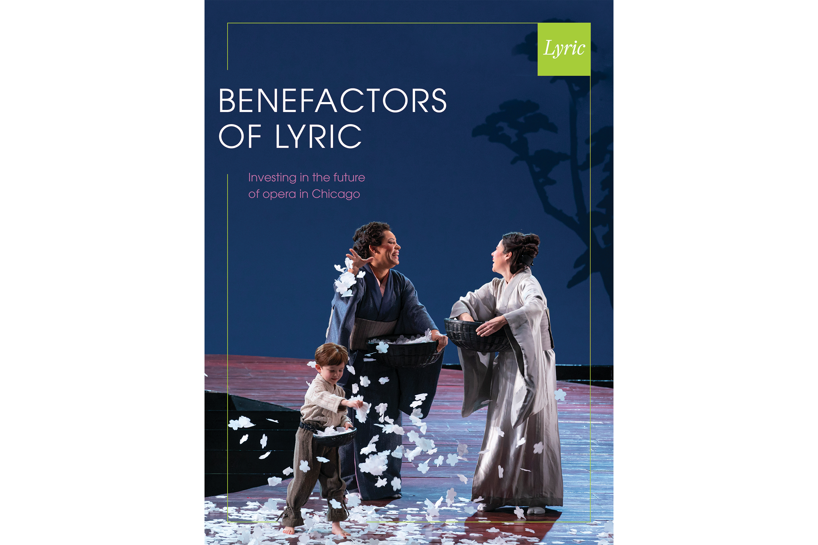
Key to the new strategy of moving donors and prospects away from transactional giving (free coat check... a glass of champagne), the Benefactor piece encourages “investment in the future of opera in Chicago”—and asks donors to be collaborators in “redefining what it means to be a great opera company in the 21st century.”

In parallel with their work on evolving Lyric’s verbal and visual brand, the Sametz team worked closely with senior leadership to devise a new approach to donor and prospect communications, one that provides a more visceral and emotional grounding for philanthropy, demonstrates for donors the impact of contributed dollars, and better engage them in a shared enterprise. The Sametz team has been—and is—a valued partner.”
Patrick Nugent
Vice President for Individual and Organizational Giving, Lyric Opera of Chicago (former)
A compelling, inviting new website
Lyric’s new website provides visitors with quick access to what they’re looking for, while reinforcing an overall brand narrative. Based on extensive user testing and user experience exploration, this Tessitura site makes the complex easily comprehended—and encourages visitors to learn more about Lyric and opera.
The homepage of Lyric’s new site combines impactful imagery, a welcoming high-level message, easily scanned “cards” for each performance, and flexible feature areas that provide overviews of other sections of the site as well as visual navigation.

Everything matters
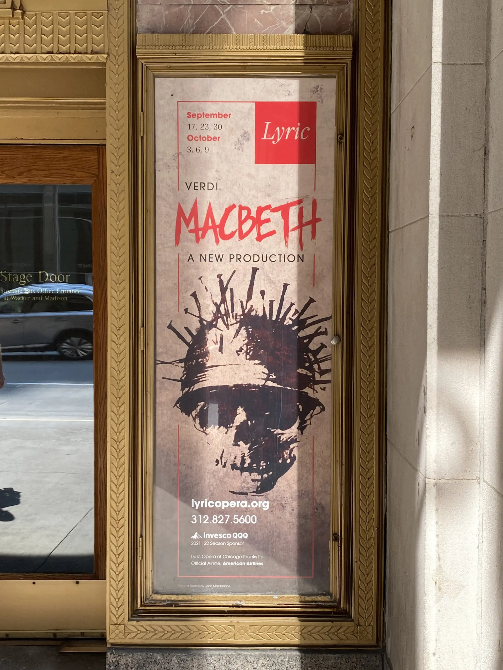
The verbal and visual tenets of the new brand inform all of Lyric’s communications. From the three-sheets mounted outside the Opera House, to immediately recognizable emails (all have the company’s signature “Montepulciano” borders and Lyric brand frame), to social media posts, to digital advertising, all efforts reinforce the meaning and stature of Lyric Opera of Chicago.
Emails
Three-sheet posters
Digital ads
Delivering an asset of lasting value
We comprehensively documented Lyric’s brand system, so that all who commission, evaluate, and create communications have access to shared thinking and tools. Lyric’s brand book lays out the what, why, and how of the company’s brand strategy and architecture, messaging framework, and visual system—all illustrated with examples of their brand in action.
Sametz truly evolved a brand system: our new brand architecture integrates various endeavors into a coherent portfolio, so that we “get credit” for our hard work; agreed-upon brand attributes drive decisions; key storylines inform messaging across departments; and a visual system lives the brand architecture—helping external constituencies to better understand the parts and the whole. Lyric is now positioned as a cultural keystone in Chicago—and a leader in advancing opera in America.”
Lisa Middleton