Gordon Brothers
Gordon Brothers
Helping a global financial brand be better understood and valued by clients and prospects
Gordon Brothers is a Boston-based firm that for over a century has helped partners and clients navigate change. It provides valuations, dispositions, operations, and investments to lenders, owners, operators, investors, and intermediaries—worldwide.
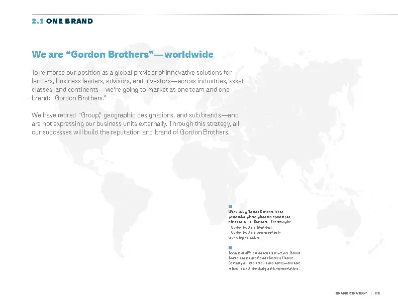
The firm had grown from a small family business to a multifaceted global advisory firm with 25+ offices spread across four continents. Previously known as Gordon Brothers Group, the company included multiple divisions operating under other sub-brands—with an accompanying range of visual identities. While very successful, the company’s expansion and growth had begun to undermine and fragment its image in the marketplace.
Gordon Brothers turned to Sametz Blackstone to reposition and rebrand the firm through reimagined brand architecture, messaging, visual expression, and new print and digital collateral. We collaborated on each aspect of the rebranding: consolidation to one global brand; a go-to-market strategy based on what clients are looking for; a new visual system of expression; high-level and constituent-specific messaging; new print collateral and website; a brand-building advertising campaign—through to planning a worldwide launch.
Objectives
- Accurately and compellingly reposition a 117-year-old family firm to drive continued growth
- Move brand from commodity service provider to strategic partner
- Make it easier for clients and prospects to understand the breadth of services and expertise
- Facilitate cross-selling of services
- Dispel lingering misperceptions: “just retail,” “just liquidators”
- Facilitate global expansion
- Bring brand identity and communications in sync with who the firm is today
Collaboration
- Conducted cross-functional, cross-divisional focus groups around the world
- Developed and executed a new brand strategy to integrate disparate lines of businesses and offices to position the firm as a global provider of solutions to businesses at all points in their life cycle
- Put in place one name, worldwide
- Evolved go-to-market strategy based on what clients were looking for
- Developed brand attributes, key storylines, and both high-level and constituent-specific messaging
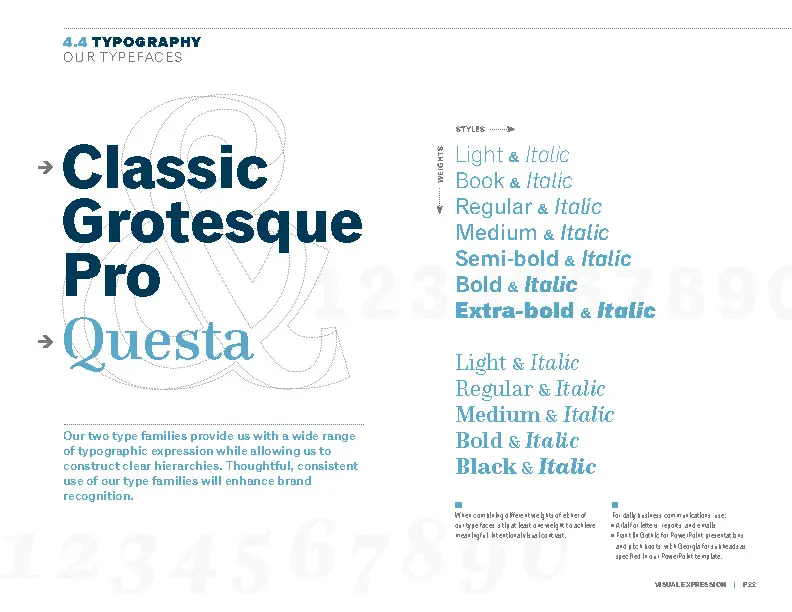
- Created a new identifier and visual system to support the brand strategy and guiding brand attributes
- Planned, designed, and developed a new website, executed in many languages
- Created a differentiating, intriguing advertising campaign that is still going strong eight years later
- Documented system to support efforts of communications and marketing staff
- Planned and executed worldwide brand rollout to engage the entire firm
Scope
- Qualitative research
- Internal and competitive landscape communication audits
- Brand strategy / architecture
- Naming
- Messaging
- Brand identity
- Visual system
- Print collateral
- Advertising campaigns
- Web UX, design, and development
- Conference and event consulting
- Rollout / transition planning / execution
Messaging: building understanding and connection with different audiences
Gordon Brothers needed to connect with clients and prospects whose interests and roles were very different. The messaging framework we developed lays out the company’s high-level promise, who they support, what the company delivers, their main operational areas—and the storylines that can be drawn upon to communicate with these different prospect groups.
With the move from a collection of companies to a unified single brand—with a single graphic identifier and visual system across services and oceans—the company was in a better position to be understood and valued by clients and prospects—and to continue its upward trajectory.”
Cal Shusta
Director of Marketing, Gordon Brothers (former)
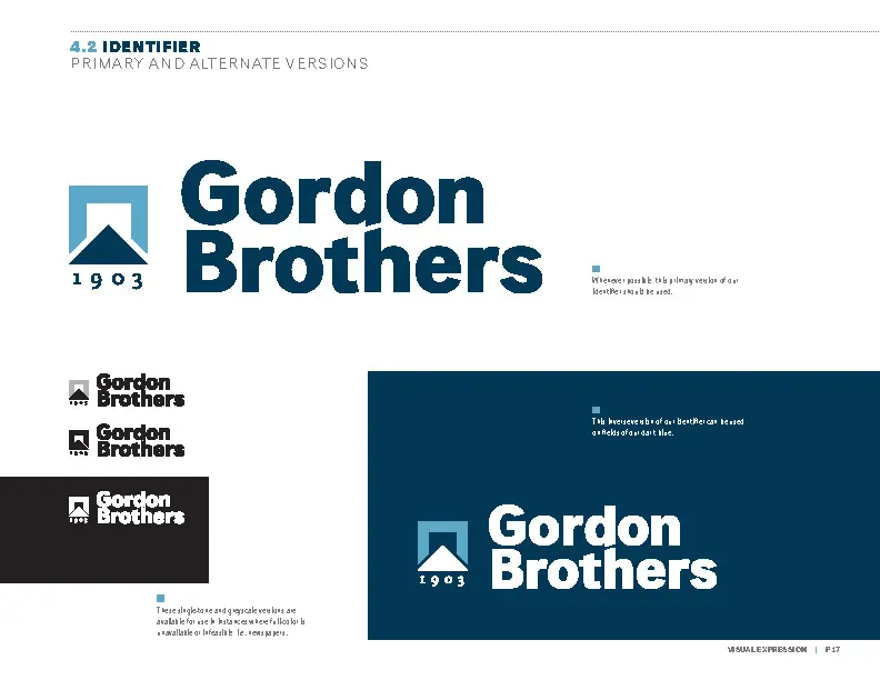
Moving to a single brand and name—and graphic identifier
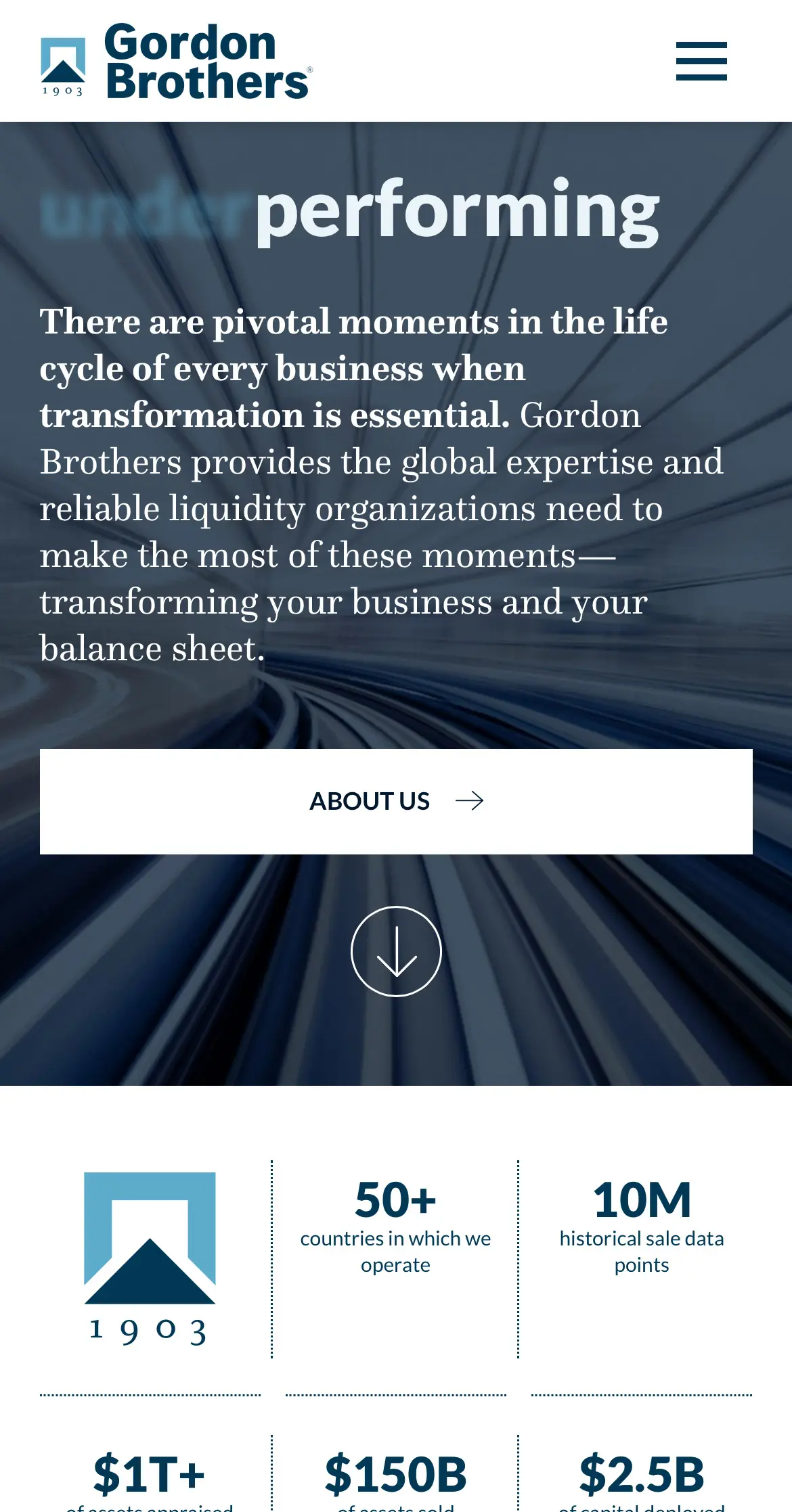
Gordon Brothers’ identifier is comprised of a symbol and wordmark. The symbol includes a “portal” that represents the challenges the firm helps clients navigate through—and a “path” forward toward positive business outcomes. “1903” (rendered in old-style figures) anchors the symbol and reinforces the century-plus of experience that Gordon Brothers brings to all engagements.

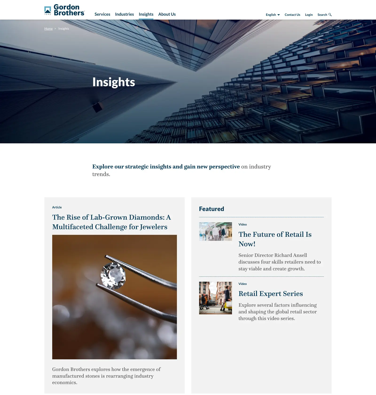
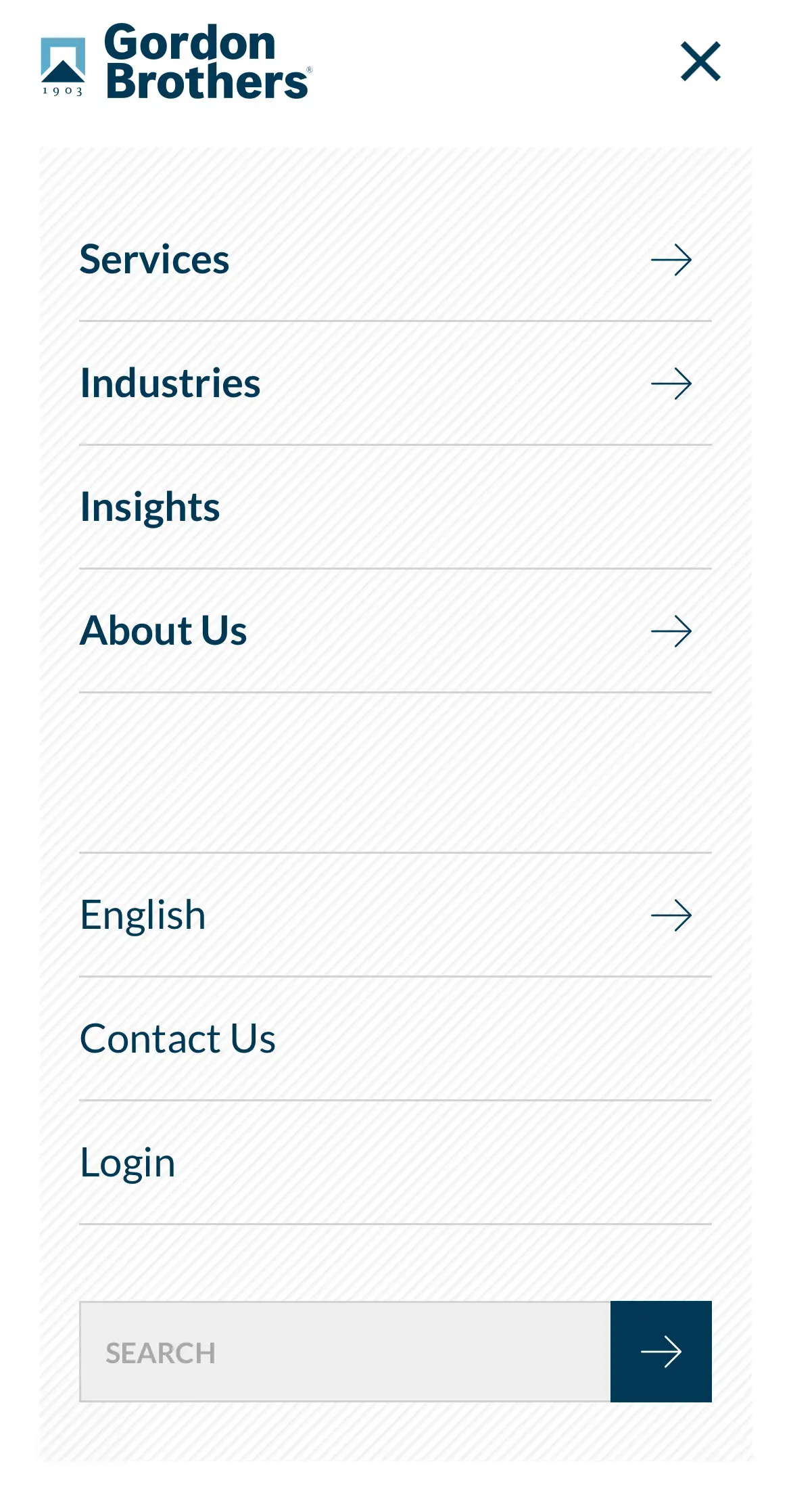
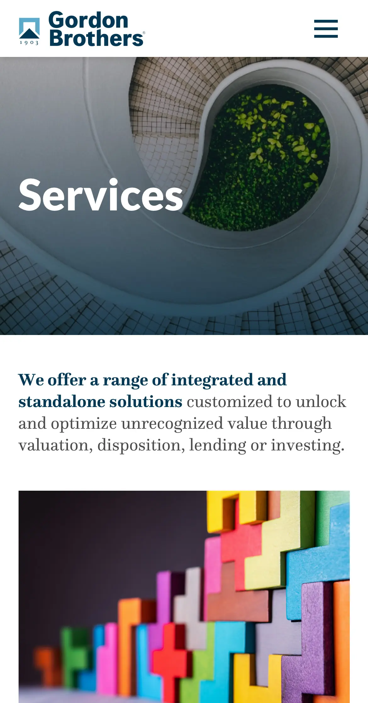
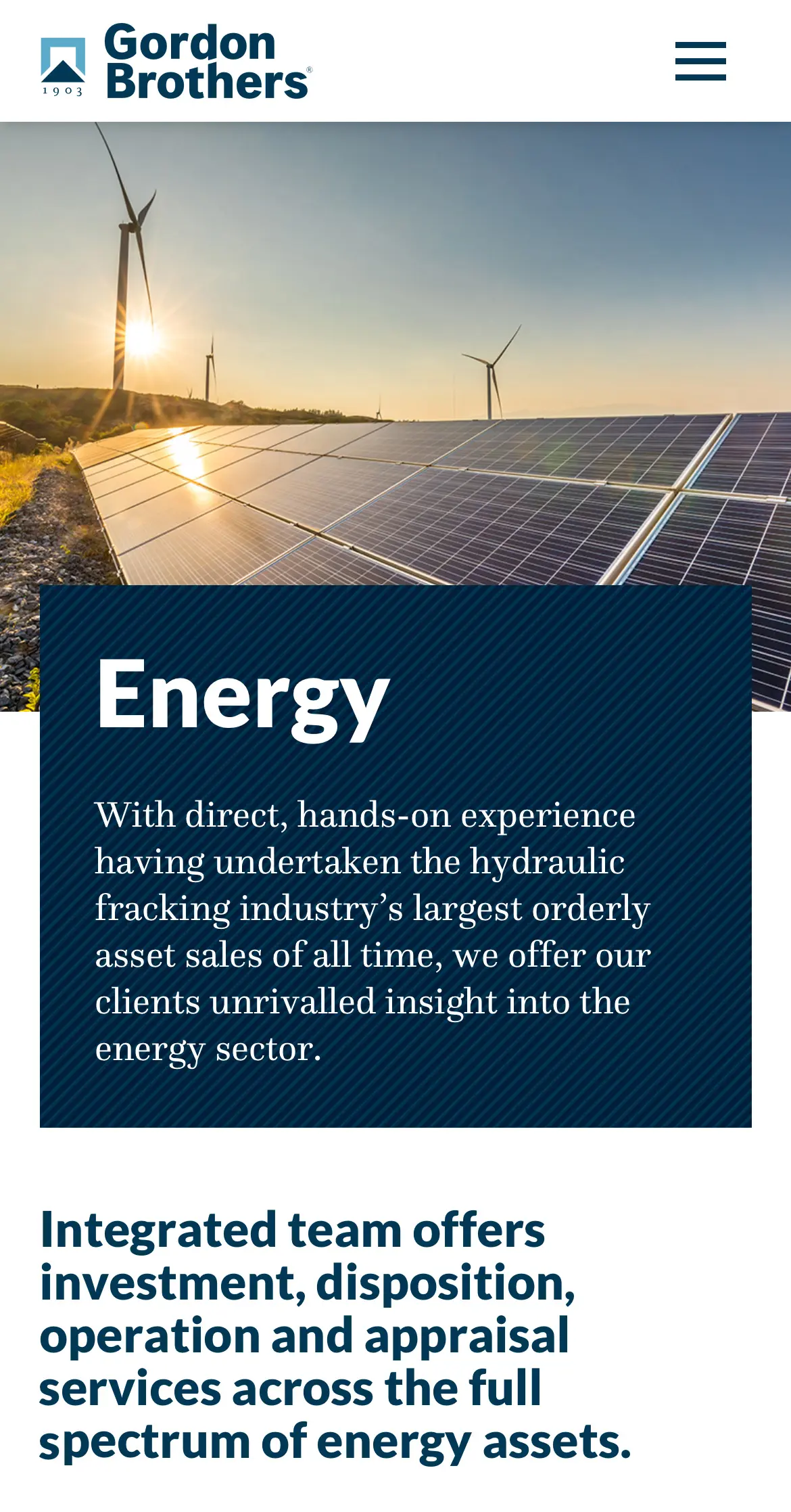
Communicating with constituents around the globe: a new web presence
Gordon Brothers’ new website features graphically arresting imagery and very detailed drop-down menus. “Service” pages combine graphic imagery, text, and bold, story-telling statistics. The site launched in multiple languages.
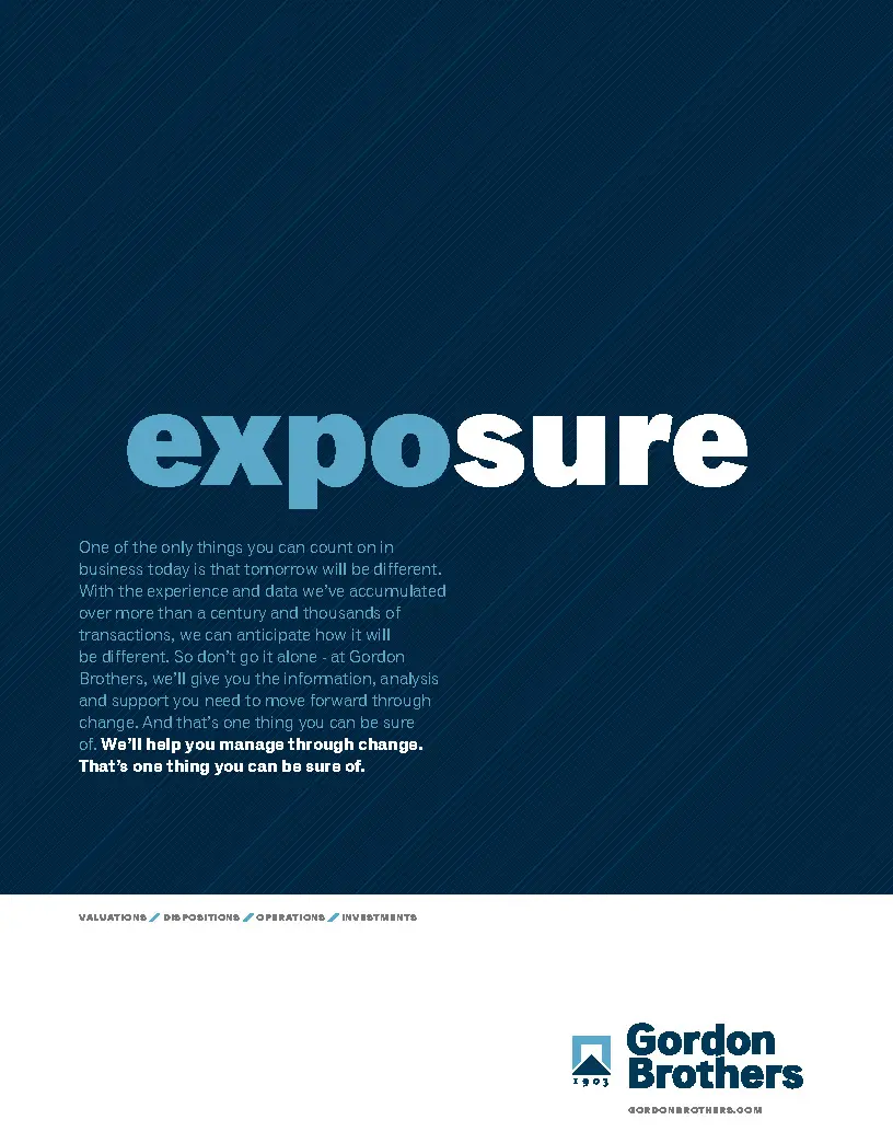
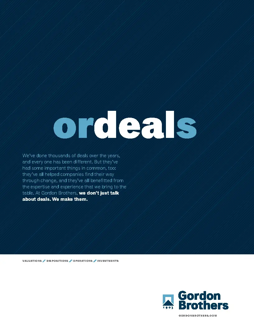
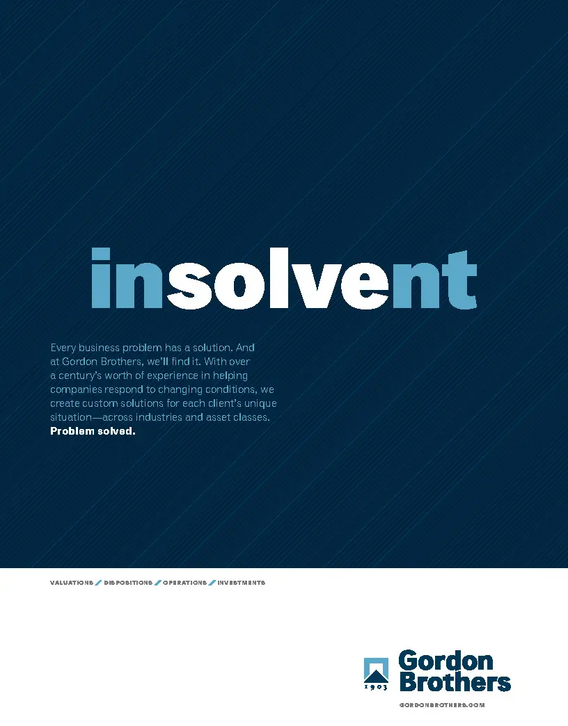
Trade advertising and conferences: separating from the competitive pack
We developed a clever—and differentiating—advertising campaign that demonstrates how Gordon Brothers delivers solutions that transcend industry challenges. Eight years later, version two of this campaign cycles prominently across the company’s homepage.
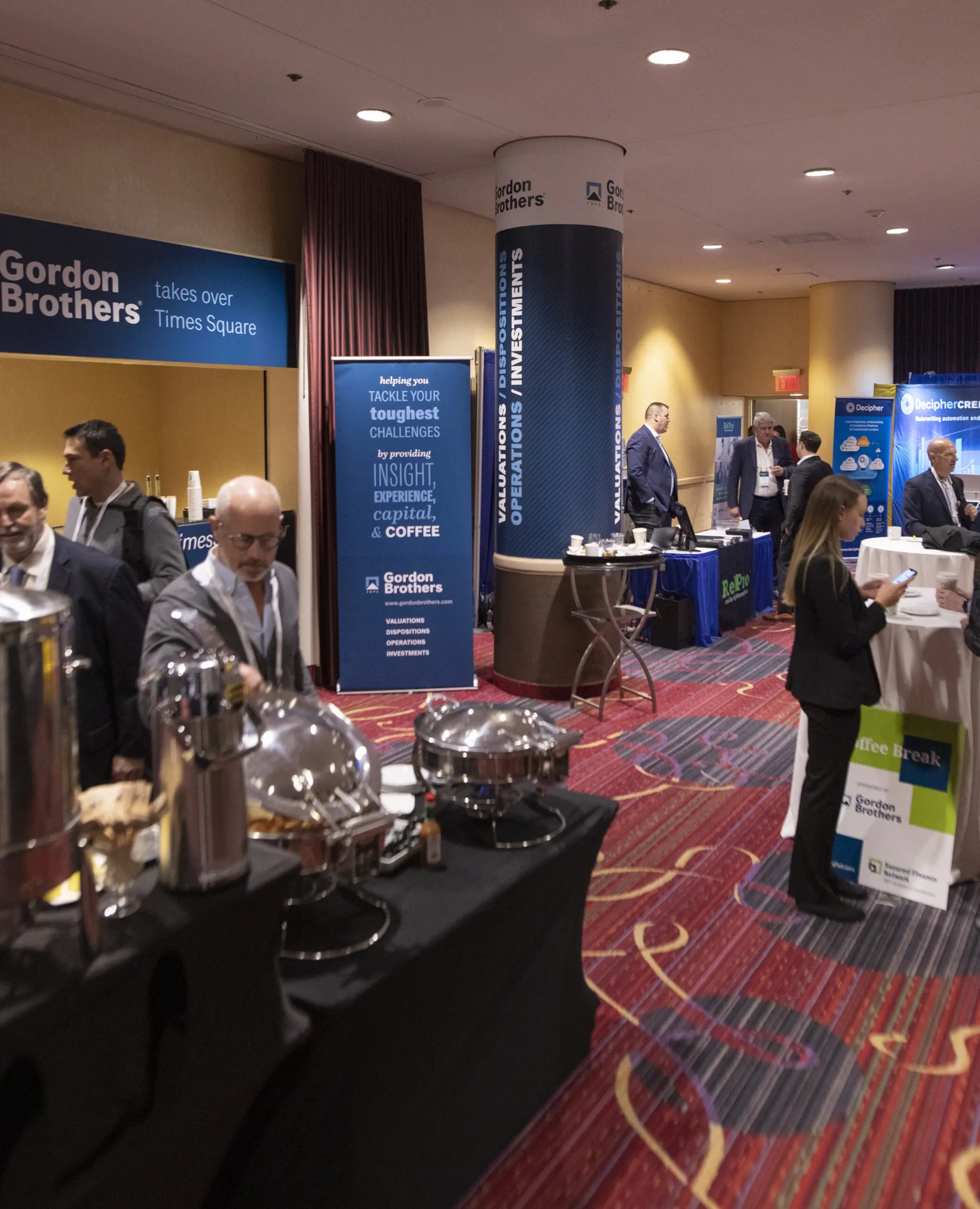
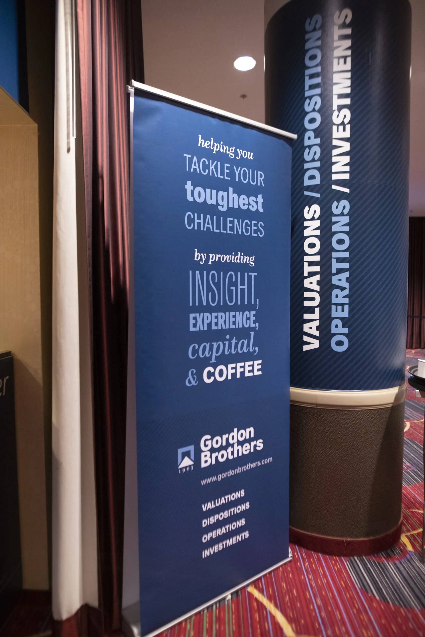
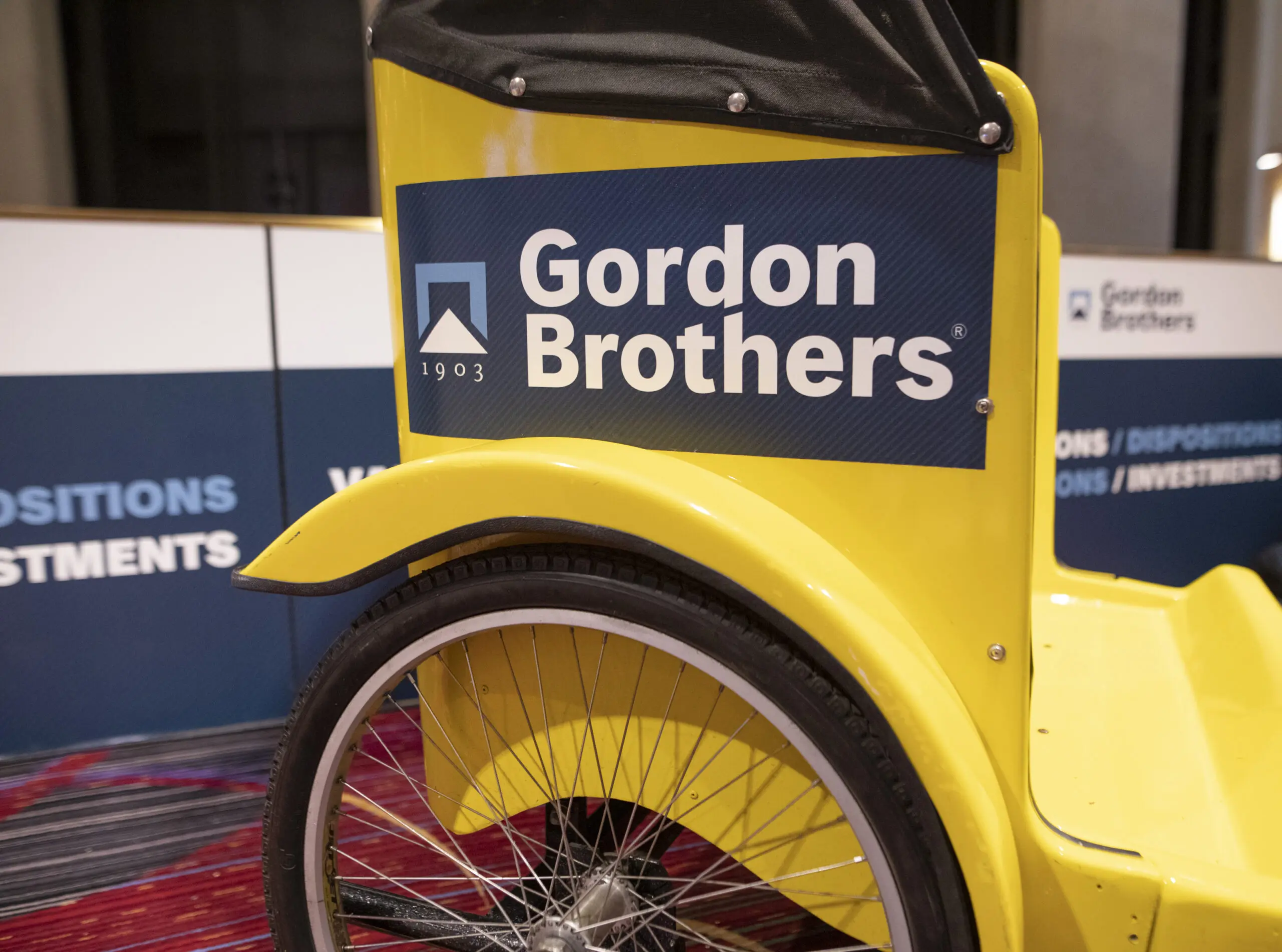
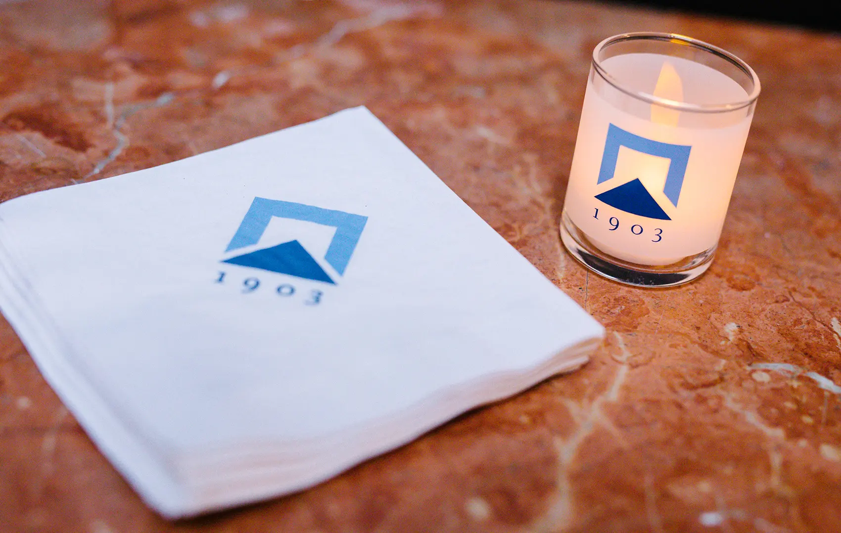
Gordon Brothers has a presence at many conferences and meetings. We developed brand-building tchotchkes, tradeshow signage—and even a Times Square billboard—to raise awareness, connect with clients and prospects, and increase resonance.
Print collateral
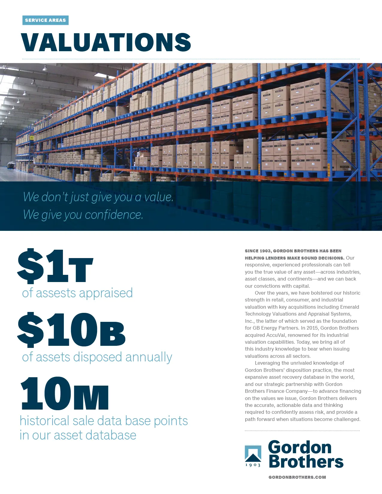
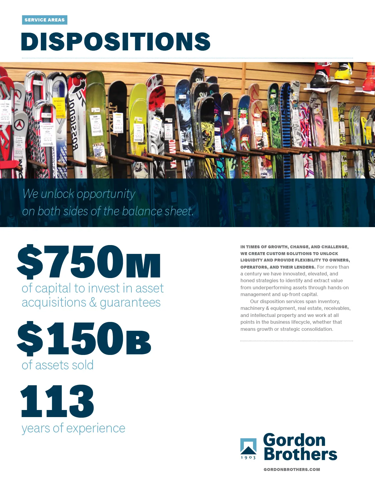
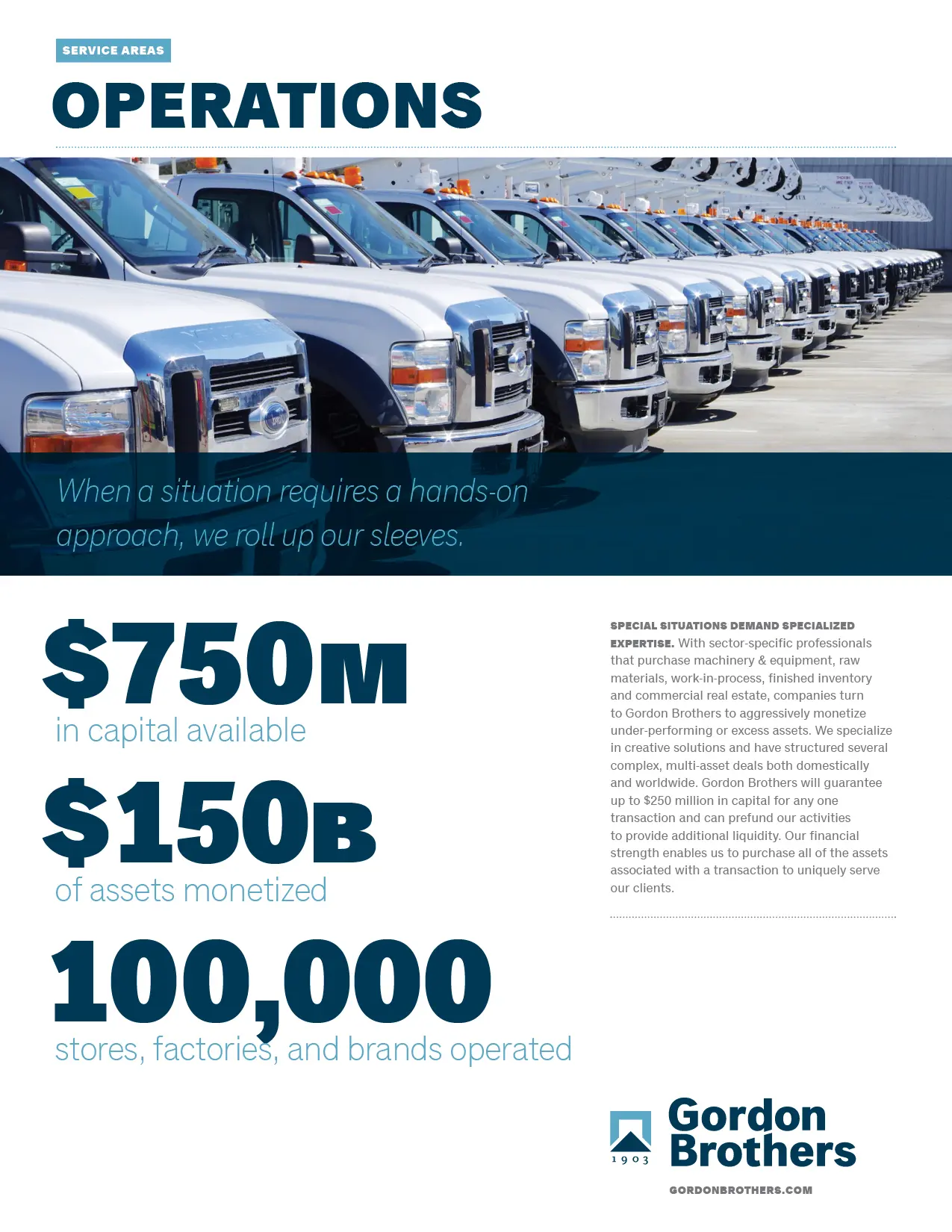
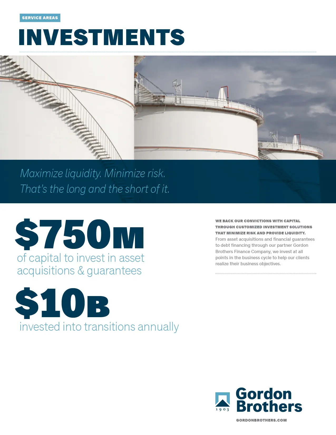
Gordon Brothers has distinct, complementary lines of business. But it was important that sales and marketing staff could show focus—and talk to prospects about their particular needs. Service area overviews—all featuring bragging-rights statistics—can be paired with case studies that demonstrate success.
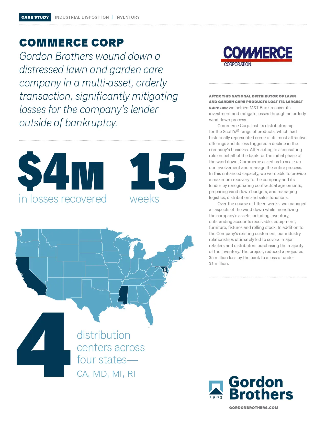
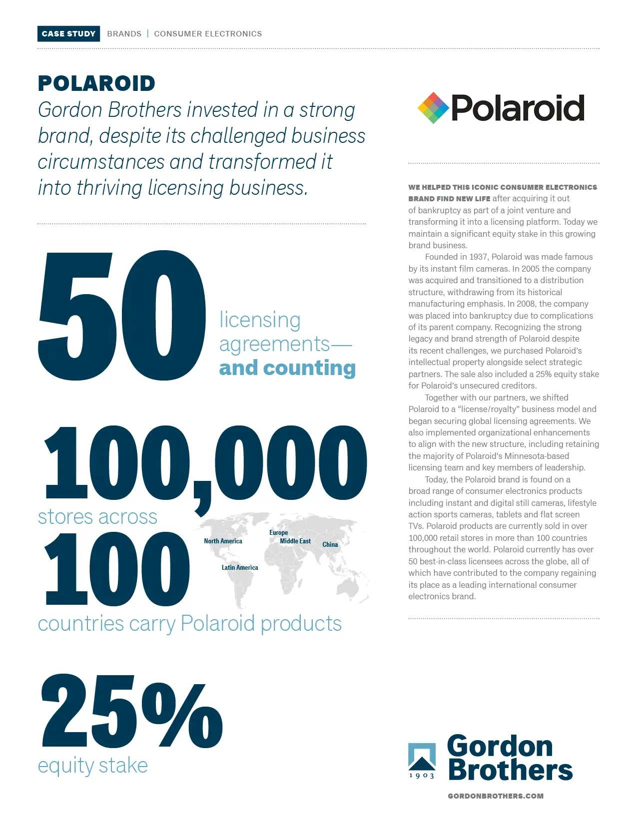
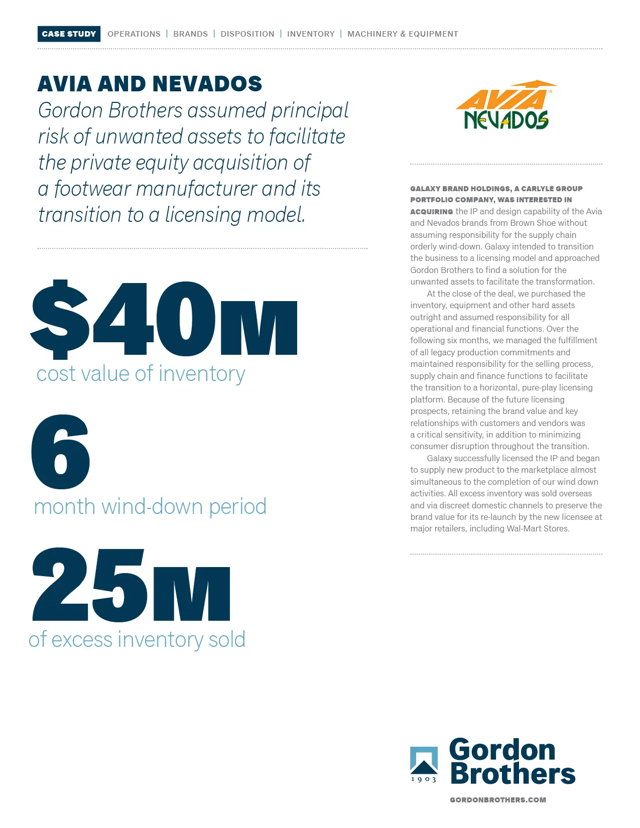
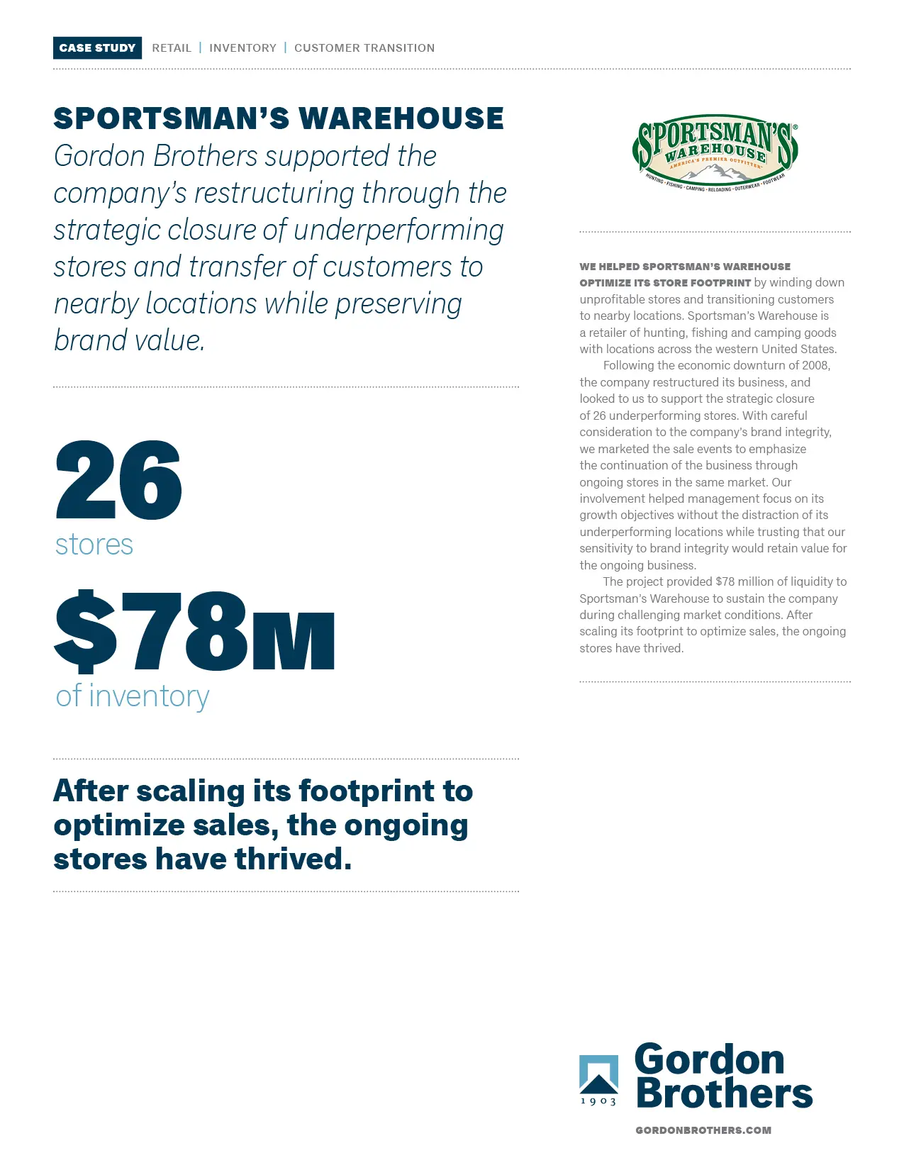
Service area overviews
Case studies
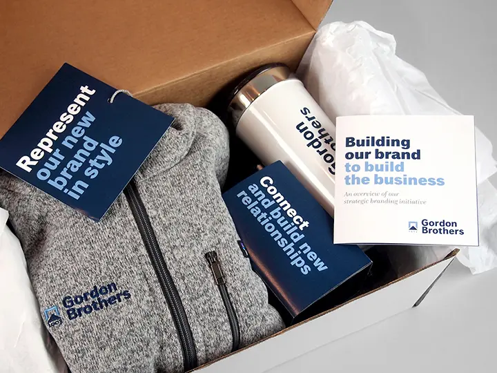
Engaging the entire organization: rollout!
All Gordon Brothers employees—around the world—walked into their offices on the same day to find a rollout surprise. Along with new business cards and practical (and branded) merchandise was a concise six-panel introduction to the new brand. A big hit across the board.


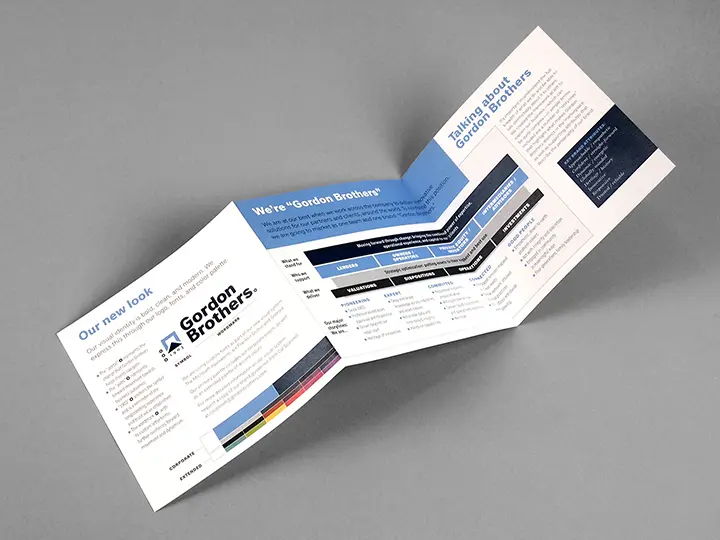
Documenting an asset that will deliver value for years
Comprehensive documentation shares the brand strategy, architecture, messaging, and visual system with all who communicate on Gordon Brothers’ behalf—formally, or from an adjacent plane seat.
Sametz Blackstone was our partner in evolution. Together, we developed a unified, one-company brand strategy, which we then articulated and promulgated through a new graphic identity, messaging framework, and approach to visual expression. Our new website, architecture of print and e-materials, and compelling advertising campaign are bringing the new Gordon Brothers to an ever-wider group of clients and prospects.”
Cal Shusta